


Designing a successful website is largely about driving conversions by creating a super attractive website that is capable of drawing the attention of its target audience. Having the right color scheme on your web page is crucial in attaining a professional, high-quality site that is well- received by viewers. Blue, red, green, yellow — what difference does it make when you choose them for designing your logo or website?
This is a valid question. However, it is very important to acknowledge the fact that the use of the right color scheme and other web design elements can ensure that your website design looks professional and delivers the right message in the right manner.
It is worth mentioning that the choice of the right color combination through color theory is very important in creating a successful website. Hence, make sure that you have done your homework about the color schemes and the prominence of various colors in the world of branding before you make a final selection of them for your website’s design.
If the conversion rate on your website is not as high as you’d like it to be, perhaps it’s time to wise up and start exploring the fascinating topic of color psychology in website designing. You should start studying and understanding basic color theory. This will help you establish the basics of color relationships.
Begin with the color wheel, where you will find three color groupings: primary colors, secondary colors, and tertiary colors. Red, Yellow, and Blue fall under the category of Primary colors because they cannot be obtained by mixing other colors. These primary colors can obviously come together and create new colors. These resultant new colors are categorized under secondary colors. Tertiary colors, also known as intermediate colors, are made by mixing full saturation of one primary color with half saturation of another primary color and none of a third primary color, in a color space such as RGB, CMYK or RYB.
Once you have explored the color theory and the color wheel, it’s time for you to make a move and choose the right color palette. To do so, you will have to understand how certain colors will convey the emotions behind your brand. Next up, identify the current brand color trends and brainstorm through how you can implement them in your website design. Don’t leave the color harmonies behind when you are deciding your color palette.
Studies have shown that up to 90% of a potential customer’s assessment is based solely on color. Colors impact the human psyche, often on a subconscious level, which, in turn, impacts emotions and decision making. The first step is understanding what kind of messages the different colors are conveying, which will enable you to make a more informed decision about which colors would work best for your brand and industry.
Here is an overview of the eleven most frequently used colors and their meanings. Keep reading if you want to learn more about the impact that color can have on your conversion rate.
If you’re in the finance, healthcare or energy sectors, blue is a great choice. It signifies trust and productivity and is perceived as a peaceful and tranquil color. There are many shades of blue, and they can all be used effectively when combined with secondary colors and accents. Blue is also a common favorite color across cultures and genders.
Working with a certain colors works great also when it’s in the same tone as the main industry color. For example, WPDean uses a blue color scheme, the same way that WordPress does. This happens because WPDean is a WP-oriented blog.
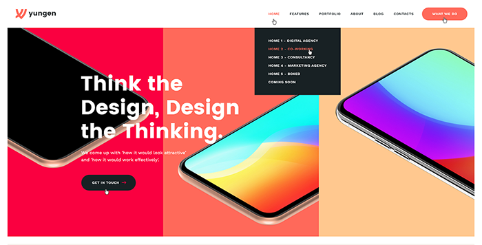
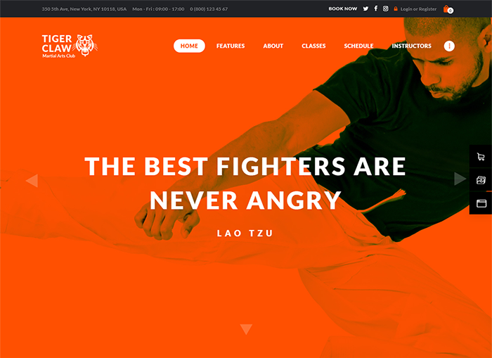
This primary color can really get the heart pumping – quite literally! In some cases people have experienced an increased pulse rate when seeing the color red. No wonder its message is one of passion, excitement and boldness. Red is also the color of love and life. It is a very popular color with brands, especially those in the food, technology and transport industries.
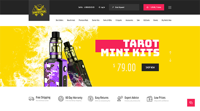
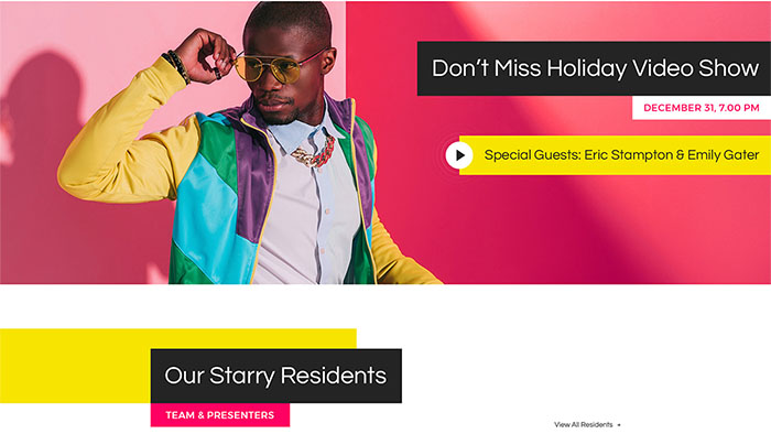
Like the sun and sunflowers, yellow has a joyful and bright effect. It speaks of intellect and energy. Yellow is often used in the food and catering industry as it can stimulate hunger pangs. The fact that this bright color stands out well against darker backdrops makes it an ideal choice for branding, and it’s handy in web design when you want a particular element to be noticed on the page.
Growth and health spring are common associations for the color green, as are adjectives such as fresh, cool and soothing. Green works well for energy, finance, food and technology brands, among others. It gives a sense of wealth and is also associated with environmentally friendly products and services.
If you’re looking for a message of confidence, ambition and enthusiasm, then orange is your color. It works well for healthcare and technology brands but isn’t particularly popular in the clothing, energy and finance sectors. Orange goes well with contrasting colors and can be used effectively to give a youthful and creative feeling.
Depending on the nature of your business and your target market, pink can be a great color choice. This warm and pretty color suggests sensitivity, nurturing and sincerity with a touch of sophistication. It also speaks of opportunities and possibilities, with hope compassion and caring.
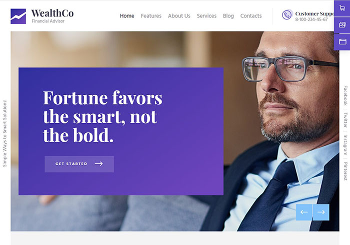
Definitely a royal and sophisticated color — purple is a symbol of wealth and power. If you’re in the health, beauty or finance industry, purple can work very well for you. It’s also great as an accent color or in combination with other colors. In color psychology, purple is known to activate the creativity and problem-solving centres of the brain.
Definitely a royal and sophisticated color — purple is a symbol of wealth and power. If you’re in the health, beauty or finance industry, purple can work very well for you. It’s also great as an accent color or in combination with other colors. In color psychology, purple is known to activate the creativity and problem-solving centers of the brain.
Silver and grey are excellent neutral colors which look wonderful when matched with just about any other color. Silver is the color of perfection while its toned-down cousin grey brings a more practical balance.
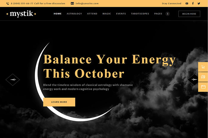
Black is the classic color for elegance, wealth and luxury. But it also carries weight in terms of power, authority and dominance. This intense color can be used to great advantage, depending on your industry. It also works well as a contrast or accent color. Give your brand and web design a professional touch with some discreetly used black.
White is the ultimate symbol of purity, freshness and cleanliness. It also encourages creativity as white space brings freedom and openness which is uncluttered and restful. The beauty of white is that it can be effortlessly matched with any other color.
With the above in mind, have a look at your web design with a fresh eye. Are your colors sending the message that you want them to, or is it time to make a few changes? Once you understand the impact of color you will be more likely to let color psychology work for you, and, most importantly, increase your conversion rates.
Exploring ideas at the intersection of design, code, and technology. Subscribe to our newsletter and always be aware of all the latest updates.
Madan Pariyar, a digital marketing strategist helping clients to resolve their website woes. When not busy with all things, you may find me occasionally watching movies, traveling and blogging at Web Precious.

