Whether you are a web designer or a WordPress site administrator, chances are that you have given your choice of fonts some thought. With so many fonts to choose from in today’s day and age, it can be difficult to pinpoint the best combination for your clientele.
However, creative typography has to be functional and legible above all else. If the opposite is true, your site won’t be as frequently visited as before. With that in mind, let’s take a look at several examples of well thought-out typography which can add value and substance to your website’s content.
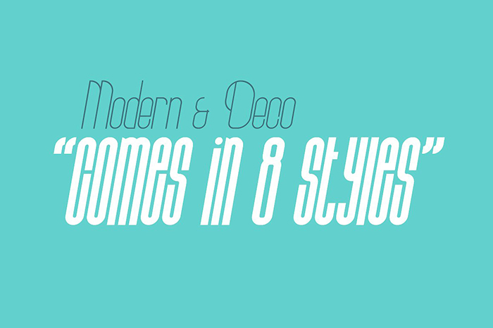
Prestiggio
As the name would suggest, Prestiggio focuses on prestige, professionalism, and subtlety to carry its message forward. The typography within Prestiggio is deliberately made to evoke the feelings of Paris at night, with cats on the balcony and music in your ear.
Steven Mehler, UI specialist at RatedByStudents was quoted recently:
Creating a marriage between two distinctly different fonts is the way to go in web design. If they bounce from each other effectively, people will be far more inclined to engage with your content.
This font can be an amazing addition to your headings, landing page elements and other prominent details. However, it should be avoided for body text since it may be hard to read in the long run.
Stiff Staff
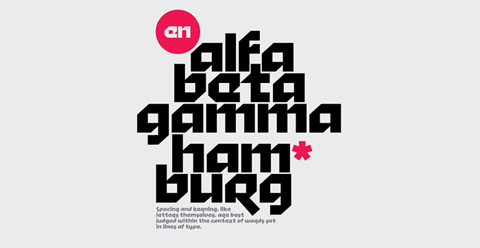
Judging by its initial appearance, you could assume that Stiff Staff was designed by gamers, for gamers. After all, the geometric nature of each line and the lack of serifs indicate a modern take on typography.
WordPress site admins would be wise to take notice of fonts such as Stiff Staff since they can offer a lot in terms of functionality and visual fidelity. No one says that you should only use fonts in a traditional, written form. You can easily use Stiff Staff and other bold fonts as visual elements, pictograms and branding elements for your website.
Archive
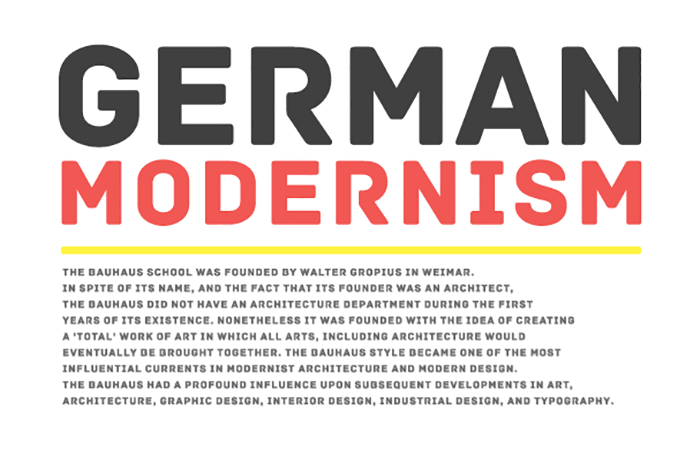
Speaking of geometric forms, let’s dive into Archive and its slick design solutions. The font was designed with both body text and headings in mind, which makes it perfect for mobile viewing and UI implementation.
Neightan White, web design manager at SupremeDissertations spoke recently:
I’ve always believed that three-or-less fonts are enough to communicate a brand effectively. Creating a tapestry of different fonts on the webpage won’t lead to more conversions – just the opposite in fact.
Archive is inspired by the German modernism movement of the 20th century and aims to update the norm by introducing a curved, sans serif typographic design.
Bohema
Bohema boasts itself as a font which successfully married old and new. This font manages to put “retro” and “modern” in the same design solution without any one element looking out of place.
The typographic family includes numerous styles and variants which is important if you want to implement a single, all-encompassing font on your WordPress website. Mixing bolds, italics and light variants of Bohema can make your website stand out from the crowd, no matter the industry you operate in.
Bitter ht
Bitter ht comes at a time when old-school fonts are becoming popular again. Drawing inspiration from the Germanic and the school of Northern European typographers, Bitter ht offers a very slick and legible solution.
The font comes in regular, black and extra black variants, with very prominent and geometric serifs. These are perfect for headlines, subheadings and anything that needs to stand out on the navigation bar or landing page. However, the font family can easily be used for body text as well, albeit in shorter sprints rather than multi-page articles.
Ayres
For those WordPress users in search of early 20th century inspired fonts, Ayres comes to fill the void. This creative typographic solution boats many elements found in the secession movement of Northern and Western Europe. Its elongated, elegant strokes manage to look both professional and inviting to the eye.
Chelsea Ann Dowell, chief copywriter at RewardedEssays spoke recently:
I find that the font carries as much meaning as what is written in the message itself. I recommend choosing the font and writing simultaneously for an added personal touch.
Ayres is a great solution for branding and logotype design as well, given its floral and feminine nature. This font can also be used for copywriting purposes, abstracts and small excerpts but should be used sparingly in long-form content.
Prime
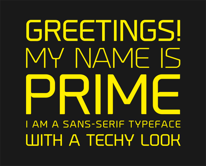
The choice of typography for a WordPress website often comes down to the industry and niche it operates in. In that respect, Prime is a perfect font for IT-centric, programming or tech development websites. Prime features a very modern, sans serif design solution, with straight lines and no fluff.
Each letter is carefully crafted not to look jaggy or uninviting, which was done by implementing subtle circle shapes on each corner. If you are looking for a representative font for your WordPress blog about technology, look no further.
Magnifika
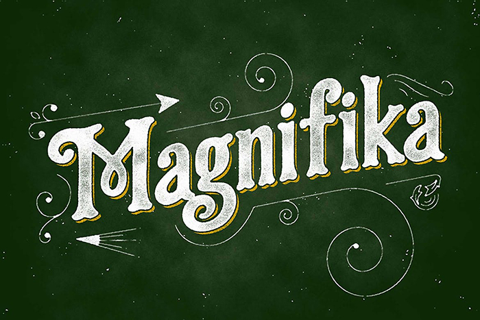
At the other end of the subtlety spectrum, we have Magnifika, a font which alludes to circus plays, celebration, and happiness. Magnifika is a product of a well thought-out, calligraphic approach to type-building. It is vintage, Victorian typography capable of numerous roles within a WordPress website.
You can use it in your branding, as a visual element or even as a main marketing element. However, Magnifika fairs less than ideally when it comes to body text and subheadings. If you strike a good balance between a sans serif font and Magnifika, you will have the perfect duo that can carry your site adequately.
Bahn
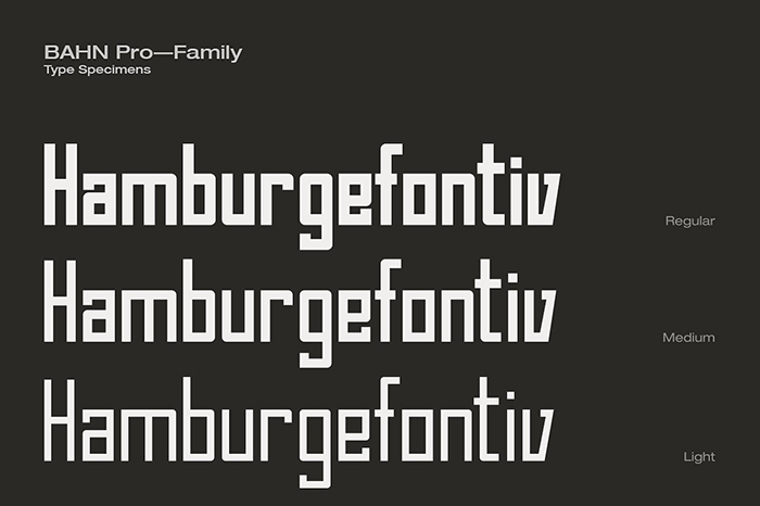
Imagine a font stripped down of every decorative and non-necessary element and you will have a good idea of what Bahn is trying to accomplish. This font is a constructivist callback to the early days of America and the building of modern cities such as Chicago, New York, and Philadelphia.
Bahn is a truly stripped down font which would be impossible to imagine only a few ago. It is perfectly suited for ecommerce businesses, WordPress sites about fashion and apparel, as well as the modeling industry. While it can be retrofitted for other purposes, Bahn serves as a reminder that you don’t need flashy details or serifs to carry a message across.
Rhythmic Dances
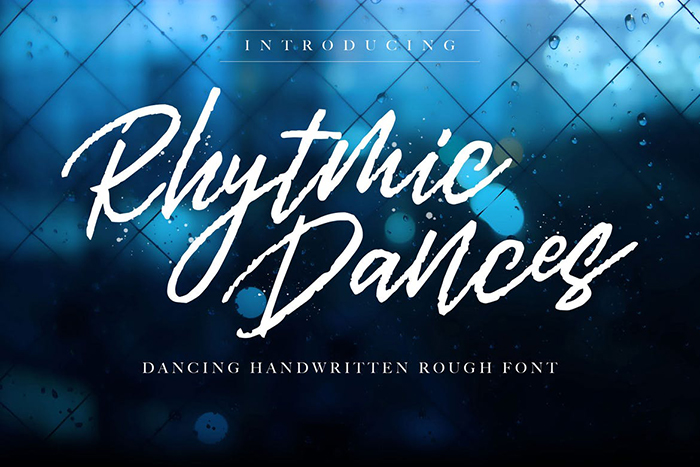
Calligraphy is difficult to pull off in font design, especially with so many modern takes on old typography present on the market. However, those that do manage to pull it off should be commended for their efforts. Rhythmic Dances is a hand-crafted font which features a rough exterior and a warm interior message.
It is perfectly suited for vintage e-commerce stores, millennial-centric websites and apparel storefronts. This font should not be used for body text and its primary purpose is to be featured on creative and marketing artwork. As such, Rhythmic Dances impresses and invites the viewers to come and see what else the website has to offer.
Conclusion
The choice of typography for your own website should never fall down to what the competition does. Your brand is unique both in its identity and products or services on offer. Reflect on your business and choose the fonts which communicate your lifestyle and company goals effectively. Once you do, you will be on your way to attract relevant, loyal customers and clients to your cause.

