
In this competitive world, one should always be updated with the changing trends and developments to remain successful. Typography has undergone a significant change in the past few years, and a lot of research has been conducted in this field. There are hundreds of fonts available which have specific qualities, but not all are useful for every type of design. Here, we will try to cover a few important points that you need to keep in mind while selecting a font for your next design.
Composition
The first thing that you should keep in mind is the composition of the letter fonts, their readability, and legibility. A readable font has a standard composition along with a good flow of words for easy understanding. However, if it is not legible then even if it is readable, you would have to rely on the context of the design. The best way to check a font’s composition is by reading it in a larger size since it would be difficult to see the small letters.
Proportion
The correct proportion has to be maintained while selecting a font for your design since it can either add or reduce your message or design altogether. As you know that the font size should be appropriate for easy reading, but it has to be determined whether you are using a script font or any other style. It is also important to maintain the proportion of the counters inside each letter since they can make or break your design.
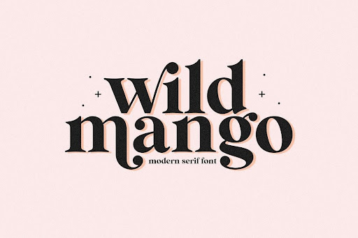
Font Styles
The choice of style depends on what message you want to pass across with your design. For example, if you are designing a poster to promote an upcoming film release in which the actor’s name is printed in bold, then you would need to pick up a font that matches the style in order to complement the text. The choice of the style totally depends on you and it is very important to select an appropriate style in order to make a striking impact on the viewer, whether it’s a sans serif font or serif font.
Size
The size of the font matters a lot in terms of design and composition since it has to be taken care that the text is legible from a certain distance or point. You can check out various styles of fonts by simply taking printouts, then once you have decided on a specific style, you can go ahead and scale the text to the desired size. If you are using an image editing software like Photoshop or Illustrator then you can also play around with different sizes of fonts by simply selecting them from the font family menu.
Color
The color of the font has to be bold and vibrant enough to grab the viewer’s attention. You can use colors to highlight or text, but make sure that your choice of color is working with the design and not against it. Also, keep in mind that the color of a font should complement the image you are using for decoration purposes.
Tracking & Kerning
The tracking of a font makes it look as if the letters are either close to each other or far apart. The best way to figure out the right distance between two words is by selecting a font and increasing or decreasing its letter spacing. You can do this by choosing the ‘dist’ option from your design software’s type tool menu, and then typing in the amount of tracking you need.
As for kerning, it is a process where the space between each letter of a word is adjusted to make a more visually appealing design. So, it has to be checked whether you have used any optical kerning option in your software or not.

OpenType Features
Most of us are unaware that fonts come with lots of extra features, but if you are aware of them then you can get more out of your chosen font. For example, an OpenType feature called ‘Ligatures’ is used to replace two or more letters with a visually appealing symbol. This helps in reducing the clutter on the letters, so it would be better if you use ligatures while designing a logo or other types of graphic design.
Language Support
The language support should also be taken into account, as it will help you determine if the font supports all the languages and alphabets. If you are using a script font for your design and it does not support other languages then most likely you would have to replace it.
Licensed or Free
All the fonts are not free most of them come with a license and if you use them for commercial purposes then you would have to pay extra money to the owner for using them. There is a huge collection of free and cheap fonts available online so do not worry about spending too much money on purchasing fonts.
For more font style options, visit Creative Market.
Conclusion
The font is the most integral part of any design and it requires careful consideration to make a striking impact on your audience. You need to take into account the above-mentioned qualities while selecting cool fonts for your work because each one of them affects how your design will turn out to be.

