
There is no debate in saying that “Responsiveness” has emerged out as an important success mantra in today’s digital arena. Thanks to the abundance of available channels, users now have the facility to access the internet through multiple devices.
The exponential rise in multi-device content consumption is now a new challenge and developers must think of more creative ways to provide users with an optimum experience across all devices. So, let’s have a closer look at web design trends and frameworks that are popular now and will be be in 2027!
The Rise in Multi-device Content Consumption and Changing Web Development Dynamics
In the past couple of years, we have seen a significant shift in traffic switching from desktop to mobile phones and other devices. On average, a user spends 170 minutes on smartphones and mobile friendly web design trends and frameworks is no longer an option, it’s a must-have. Statistics indicate that 53% of users will abandon a website if it takes more than 3 seconds to load on a mobile phone.
Moreover, the competition in e-commerce is also intense, and it’s not just enough for websites to be responsive, but you have to stay top of popular trends as well because there is no other option than to keep up. In order to make a cut through noise and clutter, you must anticipate user expectation and also be fully aware of the design trends that are dominating in 2026.
2026 is expected to be an exciting and innovative year. Let’s have a look at web design trends and frameworks you can expect to dominate the coming year.
Hidden Menus
Hidden menus are predicted to be one of the key design trends of 2026. Though it’s not a new trend and has already been in the mainstream since 2015, however, the gurus predict that it will gain more popularity in the coming years.
The increase in mobile usage has made users very familiar with the concept of hidden menus. Hiding navigation off-screen not only allows the maximum use of space but also keeps the website clean and fully functional.
Hidden menus also help users to only interact with the menu only when required. This serves as a piece of equipment that enhances user experience. By hiding menus, users have the opportunity to use when they want to and find information on their terms.
Gradients and Translucent Design
The use of gradient is now widespread, and it can be found almost in almost every component of the website such as logos, buttons, and background. Contrary to the ordinary cliches, “ “what’s on the inside matters the most” or “never judge a book by its cover”, the truth is those aesthetics do play an important role in web design trends and frameworks, and UX. Users are likely to abandon your website if they find the content layout unattractive.
However, getting done with aesthetics is a tricky part as wrong color selection can adversely affect the overall design and layout. Transparency in your design, if used properly, can enhance the user experience without affecting the page readability.
Interactive Content
2026 is expected to be the year of interactivity and users will have more control over the system. Content will rule, and consumers will demand a more personalized and entertaining experience. Written content isn’t the only form they demand, but you need to totally change the way users connect with brands by introducing polls, quizzes, and games.
2026 is the year of the informed consumer. The type of content that draws people attention by asking them personal and challenging questions and prioritizes informational will deliver the exact experience that the user is craving for.
Importance of Responsive Design Frameworks
Design trends and frameworks go hand in hand. Responsive designs frameworks are becoming critically important for web development. Websites can now be made more user-friendly, and web design trends and frameworks have also eliminated the need of creating separate websites for different gadgets or viewports. Web designers understand the importance of “user experience” that is why web design frameworks are the now the preference of developers as they also help in the development of user-centric applications.
Integrated with CSS and HTML5 tags, responsive frameworks can help developers create phenomenal web designs and farmeworks and provide optimal user experience to visitors. However, there is no one-size-fits-all strategy because every design framework has its pros and cons and which framework is perfect for a particular website is, of course, a long and tangled discussion.
Here are some of the most popular design frameworks of 2026 that are the first choice of developers.
Bootstrap

The reasons to recommend Bootstrap are many. It is adaptable, speedy and extremely easy to use. The latest version “Bootstrap 3” comes with navigational tools and a structured grid system which takes care of most of the technical part and developers can speed up the development process due to the less work at their disposal. Moreover, if you are using WooCommerce, you can also use WooCommerce CSV Import Export Plugin to easily import and export data without unnecessary timeouts.
Here are some other important benefits of Bootstrap.
- The designs can be customized as per the project needs and requirements. The web developers can use Bootstrap customize settings to select the required aspects.
- Bootstrap can easily be added to other distinct platforms, frameworks and on the existing and new sites. Developers can also utilize particular Bootstrap elements along with current CSS.
Foundation
Foundation is an excellent and ultra-responsive front-end framework. It is integrated with HTML, CSS, and JS containing design patterns to create seamless web applications. The ease of use is fantastic and foundation can easily be used by beginners.
Here are some of the outstanding foundation features.
- Foundation allows you to customize your website the way you want so that you make it look different than thousands of other websites using foundation.
- The navigation is adjustable and can be placed on the sides of the website if you want to hide.
- Foundation provides multilingual option and users can select their preferred language.
Skeleton
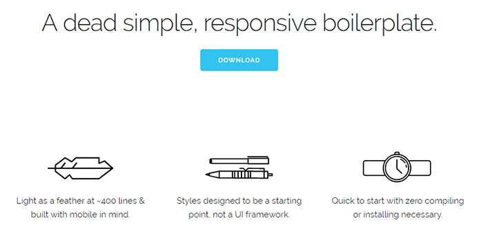
Skeleton is a small, responsive framework but has got all the necessary UI elements, form buttons, tabs, and foundation design as well as an organized file structure. Skeleton is the best selection when you have to build websites in a short time frame. Owing to its lightweight nature and 960 grid based pattern, it is useful for creating aesthetically beautiful websites for every viewport. It possesses superior main types and web layouts with clean and elegant codes. It is highly recommended for beginners and small-scale projects.
Pure
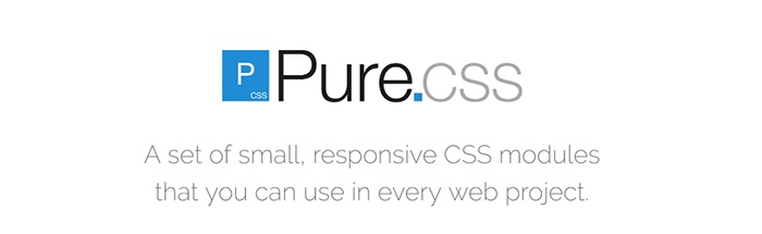
The pure framework is developed with the minimalistic approach; less is more. It is another incredible framework for developing mobile friendly web applications. Pure is built with a well-developed code that is easy to use and navigate. It is also considered to be the best possible replacements for bootstrap. Pure is built on normalize.css which has the ability to standardize the framework’s performance across browsers. In addition, it also preserves useful defaults, corrects bugs and common browser inconsistencies and also improves usability with subtle improvements.
Semantic UI
Semantic UI allows the use of third-party guidelines and can be incorporated into other frameworks easily. Semantic is an incredibly feature-rich framework and has got buttons, loaders, drivers, breadcrumbs and more. Semantic UI is versatile, and various layouts can be constructed, and you can adapt to a varying combination of column and rows. The best thing is that it provides optimum variety to web designers and lets the customization open to developers. Semantic UI has its own official SASS port and owns its own official AngularJS Framework. Owing to the fact that still, WordPress owns a quarter of the websites; Semantic UI has an official WordPress theme. It is a starter kit for WordPress and comes with 3000 plus variables.
Conclusion
Website development was not easy before as it is today. Thanks to the abundance of design frameworks available, small business owners can develop their own websites quickly. However, in order to increase brand reach it is important to stay on top trends and provide users with the best possible website experience across all view ports.