
A dashboard is made to show data in order to give you info and useful advanced analytics. To design dashboards aesthetically appealing and practical, specific UX strategies are applicable.
Special agencies concentrate on dashboard interface design to make them highly attractive. A dashboard can be designed by experts. For excellent efficiency, all components must be used. Multiple data are combined in the dashboard Interface design to make all information clear to consumers.
What are the most important dashboard design guidelines to help you create and maintain any dashboard? Here is the list of them.

Focus on Users
Information that lacks a defined goal is meaningless. It entails questioning them what information people require and what their main goals are. Understanding your target audience’s wants is crucial. Analyzing the information is made easier by the dashboard style UI. It is crucial to understand the circumstance or platform the user uses to access dashboards.
Choose Dashboard Type
There are numerous gadget models. You need to select a dashboard that works with all gadgets. Keep data on one page when creating dashboards for presentations or printouts.
The design of dashboards often uses one of four different forms. Strategic type focuses on inspecting a company’s long-term operating procedures. Operational type is an efficient technique to monitor, manage, and control latest or short-term processes. Analytical helps professionals to verify precise conclusions in order to keep the business running. At the managerial level, it aids in development and deals with large data flows. Tactical includes data that is useful for managing different growth initiative kinds.
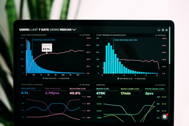
Think Over the Visualization
It depends on the purpose of the dashboard. It is pointless and confusing to overstuff your graphs with meaningless data labels. Use a pie chart, for instance, to display simple data comparison, and a bar chart, to demonstrate comparison with more parameters.
The choice of appropriate colors is the most crucial element in design. There are numerous ways to represent ideas according to benefits. The dashboard uses data in an interactive manner to present information. Additionally, it becomes important to match colors with business logos and fonts. 3-4 colors should be chosen for the dashboard. The user will become puzzled and unable to comprehend the actual data because of oversaturated colors.

Use Relevant Information
Every piece of information on the dashboard must be used. Since the company has different employees, the data must be clear for everyone. Dashboards should be divided into distinct sections using a variety of tabs, drop-down menus, etc.
Your dashboard should present the user with a complete narrative. The metrics should be properly combined, give a snapshot about what is happening, and prioritize the data. The most crucial information has to be shown in a noticeable location on the dashboard. If space permits, you can additionally enlarge your most crucial measure relative to the rest. You can use various font sizes to highlight some points.
Stick to a Minimalist Style
Five-nine visualizations will be enough for a single dashboard.
According to psychologists, people can comprehend around seven images at once. More representations just lead to eye clutter and distraction. Filters, hierarchies, or just dividing your dashboard into two or more independent dashboards can help you prevent this situation.
Round Numbers
It can be attractive to use extremely precise figures when you want the data you display to be correct, but rounded numbers are easier to understand.
In a scientific experiment people had to answer questions, in which it was necessary to make a choice between round numbers and exact ones. For inexplicable reasons, most people have expressed a great fondness for numbers that end strictly in zero. Observations have shown that accurate indicators even annoy people. When the volunteers saw the exact numbers, they made a significant pause. When people saw round numbers, there was no pause. There is an assumption that it is simply easier for all of us to perceive rounded figures.

