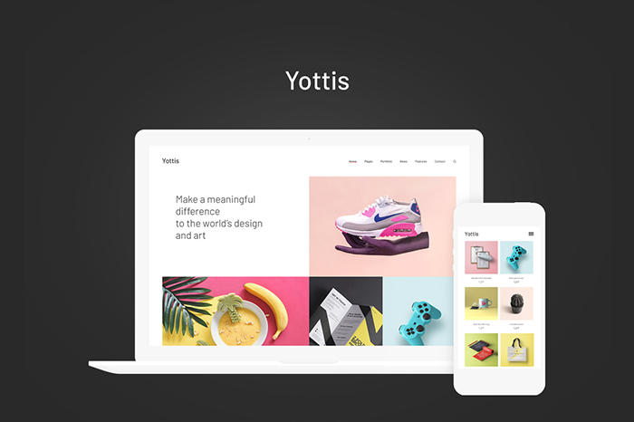
If you know what mistakes to avoid, designing a website layout does not have to be hard. The key is to stick to a couple of tried and tested steps and elements. Even though these tips won’t make you a pro designer, they can help you build a website that’s a pleasure to look at and a joy to navigate.
Think Simple
The more choices people have, the longer it takes them to make a decision. When people spend a lot of time on your site, it’s usually great. Usually. So, what’s the exception? When they are frustratingly trying to figure out what to do with so many options you offer, so it takes them a while.
How do we avoid that? By making your layout intuitive. Make sure the menu isn’t overwhelming. Include common items such as Products, Services, Blog, FAQ, About, and Contact.
Don’t list your products as “Our Bread and Butter,” and don’t call your blog “Ponders.” Vague sites don’t convert well. Use straightforward language and menu items. You’d want to make sure users can understand everything quickly and easily.
Colors Matter

According to Mallee Blue Media, 85% of shoppers claim color affects their purchasing decisions. For a flawless website layout, you need to leverage the psychology of colors.
And, for that, you need to know your target audience. What color schemes will they respond to? Research different options and put them to the test. The right color palette will evoke the right emotions.
If you’re building a business through building a website, the color scheme and logo you use are vital as they are key elements of branding. If you’re setting up an organization, you should take care of this step first as branding is important for every business, be it a seasoned one or a fledgling one. Think Facebook, Google, Vimeo, Quora, Twitter, etc. Your colors can be your foundation.
But, not every color scheme is suitable for all demographics. Use the color wheel to find a color palette that works. Colors that are next to one another (analogous colors) and colors that are opposites (complementary colors) should work best. Such color pallets can make your website layout more interesting and give it depth.
Use Negative Space
Using negative space doesn’t just equate to leaving enough of it between paragraphs and photos. Negative space (aka white space) directs visitors to things you want them to see, such as your CTA (Call To Action).
Google’s home page is the ideal illustration of great use of white space. There is no clutter to confuse visitors. It’s very clear what Google expects them to do.
Since the page doesn’t have a lot of text, images, and other elements, the user knows exactly which course of action to take. That doesn’t mean you should copy Google and make your home page look like a blank sheet of paper. Just make sure to stick to the core principles.
Format Copy

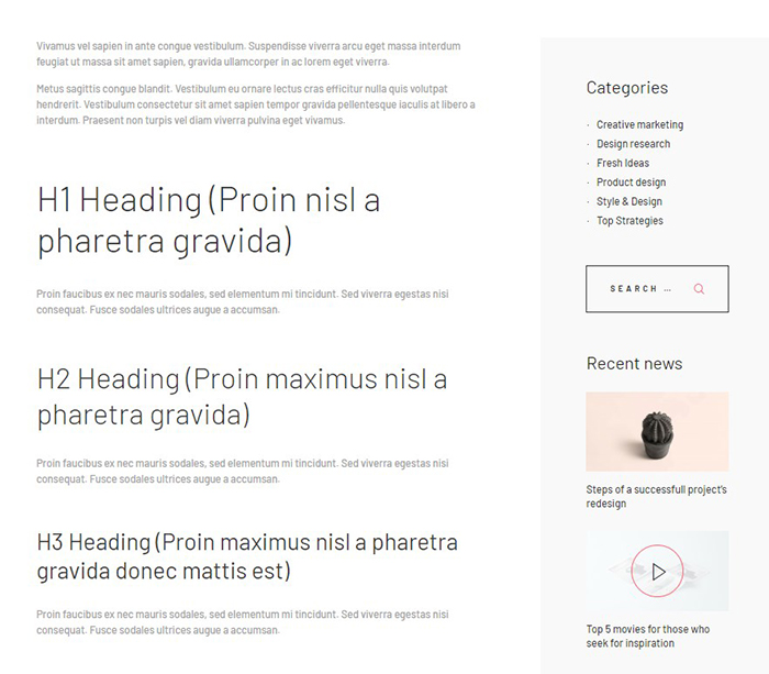
Even though you might want to leave web copy to a professional copywriter, you still need to know where to put text. You don’t need to have proper copy for that. You can experiment with some gibberish, just to find the right place for the copy that will come.
Headlines are vital. On the home page, you should place the headline center-stage. It’s to make sure it will communicate the value proposition of your brand. As for every other page, make sure the headline is relevant to the content of that page.
It’s best to place text in an “F” design. It’s the pattern in which most people prefer to read content online. Parse the content into boxes if you have a lot of it. To make reading light and easy for everyone, format for skimmers.
Be Clear About the Outcome
The best layout is the one that successfully walks the visitor through the process. It’s the one that is designed around the actions you want users to take. You need to make sure your CTAs are in a prominent place. People will notice your CTAs without much effort if they stick out.
Whether you want visitors to share content over social media, fill out a form, or make a phone call, your layout should work as a road map. It should lead them all the way from the start to the ultimate conversion.
Emulate Others

You should know the basics, but you don’t have to know the nuances. At least not straight away. Study other sites in your niche. You can rest assured every well-designed website has seen its fair share of research and testing. Learn from them. Do not be afraid to borrow.
If you like the layout of a particular site, chances are it’s a fairly successful one. To make yours more intuitive and predictive, emulate it.
Feature The Best You’ve Got
And, that would be your team, their smiling faces, and your offerings! Big and appealing photos lead to high conversion rates, according to studies. But, first and foremost, the images on your site have to be purposeful.
A case study done by Spectrum shows that the company managed to improve its conversion rate by 45% by replacing a stock photo on their site with a photo of their crew. Try to feature genuine people will smiling faces, preferably team members. Make sure the photos depict a warm and positive environment.
Choose Your Typography

Opt for one or two typefaces. Anything over that number is usually bad for business, but it may depend on your niche. For large chunks of text, you need a font that is easy to read.
When it comes to titles and CTAs, you can be more playful. Don’t steer away from big fonts. Once you discover the right typography for your layout, use it consistently.
Prototype and Test
Even though extensive research is vital, only your visitors can help you tell for sure which layout is the best. You need to keep testing every element of your website if you want to increase conversions.
For instance, you may discover that you can cause a major bump in signups by simply changing your CTA buttons. After Hubspot had changed their call-to-action on a certain page, their conversion rate improved by 21%. They achieved that through adequate testing.
The best way to test your website layout is through prototyping. We use prototyping to test interactions. You don’t have to be a coding wizard to create a good prototype. Prototyping tools like InVision and Figma can make the job easy.
Use Social Proof Elements and Trust Emblems

People want to know they can trust you. They want to make sure you’ll protect their personal details, cookie information, and credit card information. Moreover, you would want to establish yourself as an authority in your niche.
You can do that by incorporating social proof elements and trust emblems into your website layout. Social proof elements can include positive reviews from clients, testimonials, links and summaries of case studies, client logos, etc. Logos of trusted brands that use your products and services make great trust emblems.
Conclusion
Take the time to learn about your target audience and what they want. If you think your site is not up to snuff at the moment, you needn’t worry. Gradually make small adjustments that are grounded in visitors’ behavior.
Add and test elements one by one. When in doubt, remember: simpler is always better. Over time, you will develop a knack for delivering vital info intuitively and naturally.


