
A landing page is an essential part of a digital marketing campaign. Whether you’re marketing your business on Google Ads, Bing Ads, Facebook Ads or another other paid digital marketing platform, you should avoid sending traffic to your business’s main website.
Instead, you should send it to a separate website that’s optimized specifically for conversions. Known as a landing page, it allows for more profitable digital marketing campaigns.
You can even design a landing page using WordPress. WordPress isn’t limited to blogs. The prominent content management system (CMS) supports all types of websites, including landing pages.
By following these tips, you can use WordPress to design a high-converting landing page for your digital marketing campaigns.
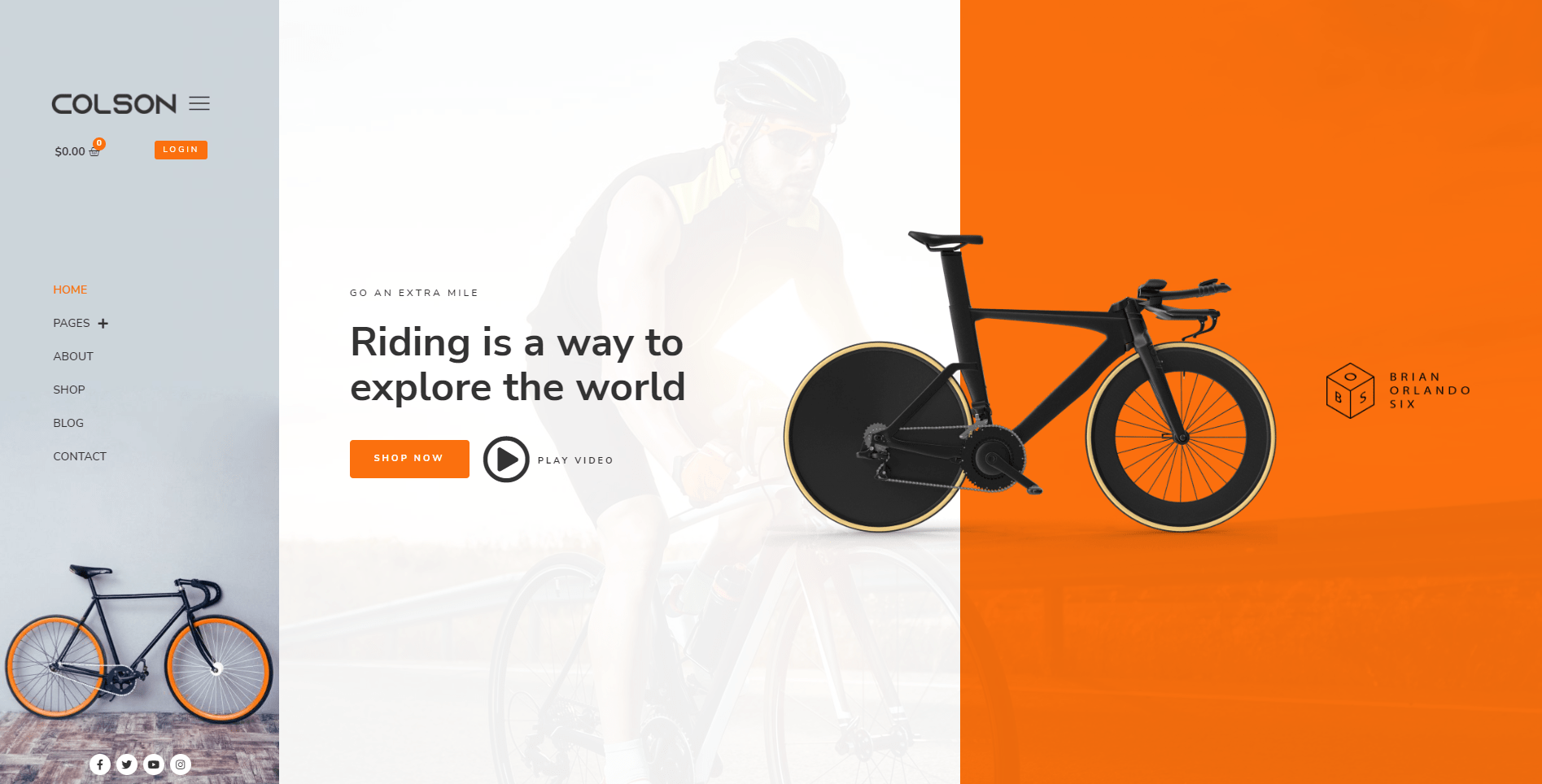
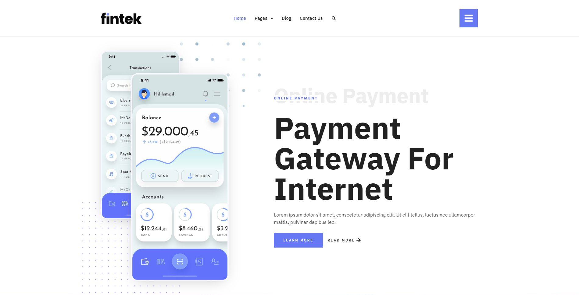
Choose a Minimalist Theme
Designing a high-converting landing page in WordPress requires the right theme. Minimalist themes typically work best for landing pages. They feature a simple and clean layout that keeps visitors’ attention focused on your content. Other types of themes can be distracting. Themes with a complex and cluttered layout, for instance, will shift visitors’ attention away from your content, resulting in a lower conversion rate.
Like all types of themes, minimalist themes are customizable. You can customize the header image, background image, colors, menu placements, fonts and more. Minimalist themes just have a simpler and cleaner layout than traditional themes, making them ideal for landing pages.
Keep The Message Clear And Simple
Most website owners get sidetracked and start trying to create either overcomplicated landing pages. The main issue we see is that the message gets sidetracked and the website loses its identity. Remember to keep things simple and offer a clear message as to what your website is all about.
Creating a landing page involves a few important factors
- The user should understand your message immediately
- Stick to 3-4 Colors and identify your brand
- Add a clear call to action to navigate the user
- Create an offer that encourages engagement
- Your landing page text should only be a few words
Make sure to practice these methods when creating a landing page and users will be much easier to convert and they will also have an easier time navigating your website.
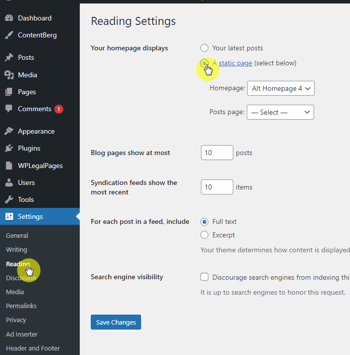
Use a Static Homepage (Its faster)
You should use a static homepage for your landing page. WordPress, of course, supports two types of homepages: feed and static. Feed homepages are those that contain a list of recently published posts — either all of the posts or excerpts of the posts — whereas static homepages are those that contain a single page. For a high-converting landing page, the latter type of homepage is recommended.
Static homepages are better for landing pages because they don’t change. If you use a feed homepage, your landing page’s content will change. If you publish a new post, it will appear at the top of your landing page’s homepage while potentially burying older posts. A static homepage is a simpler solution that consists of fixed content. Unless you manually edit a static homepage, it won’t change.
WordPress websites have a feed homepage by default. To switch your landing page to a static homepage, select the “Reading” tab in the admin dashboard. You can then choose an existing page to use as the homepage.
Remove Navigation Links (Less Options The Better)
Navigation links aren’t necessary for landing pages. You can safely remove them from your landing page with no ill effect. Removing navigation links from your landing page may, in fact, result in a higher conversion rate.
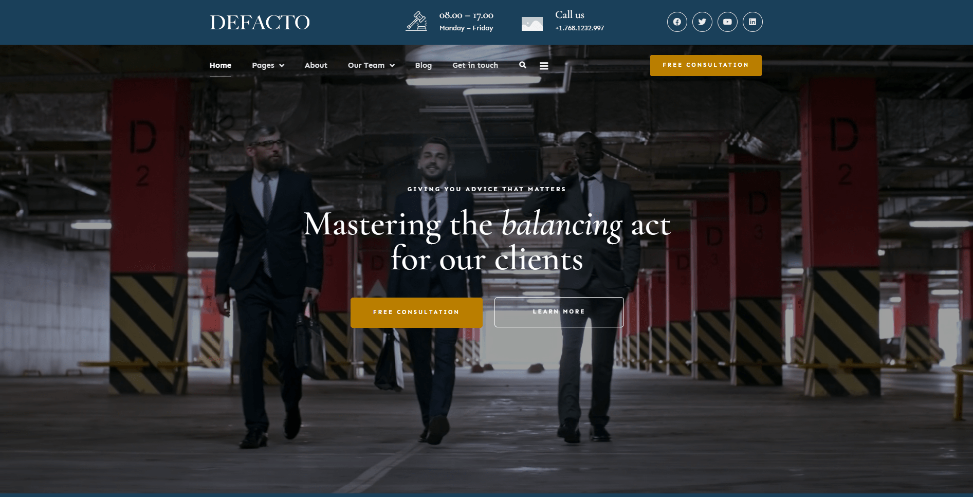
The Less Options, The Better
A recent HubSpot study found that landing pages without navigation links generate more conversions than those with navigation links. For top-of-the-funnel (TOFU) landing pages, removing navigation links offered up to 4 percent higher conversion rates. For middle-of-the-funnel (MOFO) landing pages, it offered up to 28 percent conversion rates.
Most landing pages consist of either a single page or a few pages. Even if your landing page has multiple pages, though, you should strive to keep visitors on the homepage. The static homepage is where you’ll publish sales copy and other marketing content in an effort to convert visitors. The problem with navigation links is that they serve as exit points for visitors. Rather than clicking your homepage’s call to action (CTA) and triggering a conversion, visitors may click a navigation link.
Disable Comments
You may want to disable comments on your landing page as well. Comments consume space. As your landing page attracts more and more comments, these visitor-created messages will drown out your own content. Visitors may then focus their attention on your landing page’s comments while overlooking your sales copy.
With that said, comments are only enabled on posts by default. Assuming your landing page uses a static homepage without any posts, visitors won’t be able to create comments. Nonetheless, if you manually enabled comments on your landing page, disabling them can help you achieve a higher conversion rate.
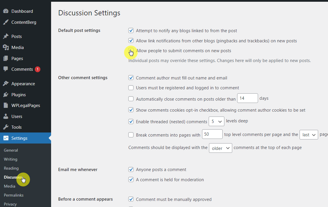
You can enable and disable comments on your landing page by pulling up the static homepage in the admin dashboard. While on the WordPress editor screen, scroll to the bottom to locate a box titled “Discussions,” which contains options for enabling and disabling comments.
Format Content for Readability
When designing your landing page, format the content so that visitors can easily read it. Content readability will affect your landing page’s conversion rate. If your sales copy is difficult to read, for example, some visitors may skim through it or skip it altogether. You need visitors to read your sales copy so that they’ll absorb your marketing messages.
To format your landing page’s content for readability, use contrasting colors for the text and background. The color of your landing page’s text should contrast with that of your landing page’s content container element. If they feature similar colors, the text will look blurry as it blends into the background.
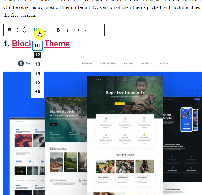
Using subheadings in your landing page’s content can make it easier to read. All posts and pages use their title as an H1 heading, but you can incorporate other, lower-level headings into them. Just write the text for your desired subheading in Gutenberg’s Heading block, after which you can choose a specific type of subheading, such as H2 or H3.
Consider Video Content
Video content can increase your landing page’s conversion rate. According to research cited by WordStream, landing pages with video content generate nearly twice as many conversions as those with only text content.
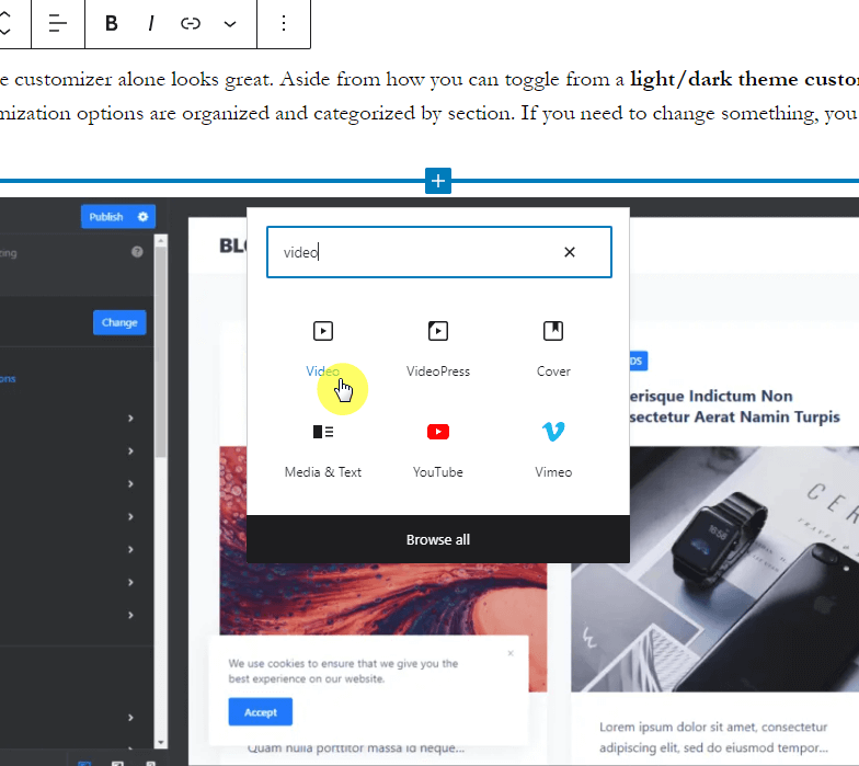
You can easily add video content to your landing page using Gutenberg’s Video block. Go to your static homepage in the admin dashboard and select the Video block for the area in which you want to insert a video. For more information on how to use the Video block, check out wordpress.org/support/article/video-block.
Landing pages are unique from blogs and traditional websites. Unlike their counterparts, they have a single purpose: to drive conversions for a digital marketing campaign. Using WordPress, you can design a high-converting landing page that fuels your business’s online success.

