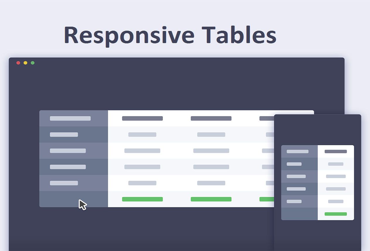
There are several reasons why tables on your site have to be responsive.
1. According to Statista mobile traffic in 2020 is more than 50%.
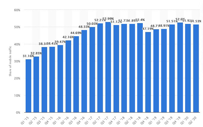
Therefore you want your content to look nice on mobile devices.
2. Responsiveness is an important ranking factor for Google. Other words it is good for SEO when your content is responsive.
3. Mobile friendly tables are good for user experience. Your customers receive the data in a convenient way.
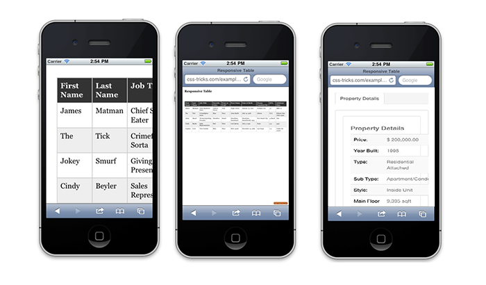
4. It’s just aesthetically pleasant to work with responsive tables. It is so frustrating when you see something like this:
5. Modern WP Page builders like Elementor, Visual Composer (WPBakery), Beaver do not provide perfect solutions for now.
So, let’s review some options to make the tables responsive.
There are several approaches to make your tables responsive in WordPress. Let’s list them one-by-one.
1. Manual CSS Adjustments
If you don’t want to install any extra plugins and you feel confident in your HTML/CSS skills you can make your tables responsive just using the proper styles and markup.
Scrollable tables
One of the easiest options is to make your tables scrollable on mobile devices.
First, give your table an identifier (class or id) and depending on the width of your table choose a breakpoint.
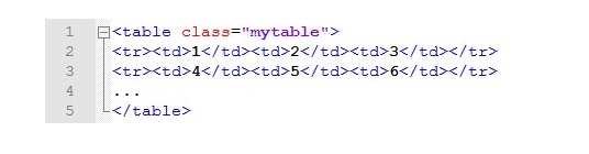
Here is the example.
You can give your table class name “mytable”:
Then you just need to add some CSS styles to make it scrollable on mobile devices:
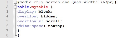
This will make your tables responsive:
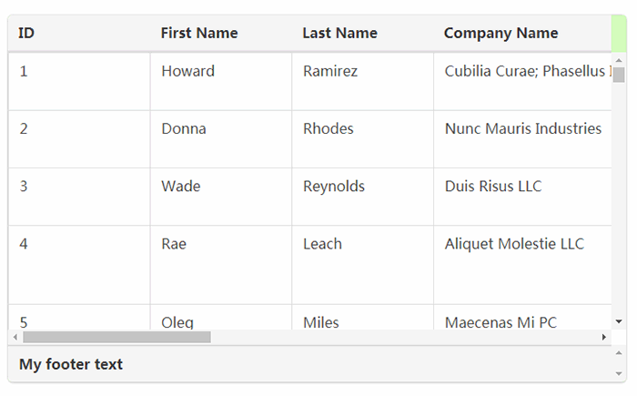
Advantages of this approach are:
- It is fast.
- It is easy.
- The visitor can see all the columns and rows of the table.
Disadvantages of this approach are:
- It is not quite comfortable to scroll back and forth.
- It looks not that good as possible alternative options.
Tables with hidden columns on mobile devices
One of the possible options is to hide the columns (or rows) that are not essential for your visitors.
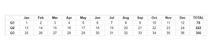
For example, if you have a really long table that shows the numbers within 1 year you can make a table broken down by months on wide screens and show only the total on mobile devices.
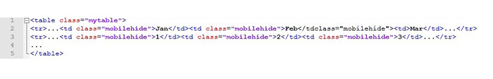
Here is the example of the table on wide screens:
Then you just hide the columns Jan – Dec:
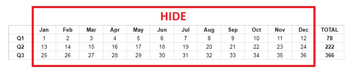
Add the special class to the parts of your table that you want to hide on small displays. It will look like this in HTML:
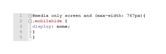
And then simply “hide” the elements with this class on mobile devices using CSS:
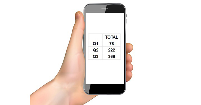
So, on phones this table will look like this:
Advantages of this approach are:
- It is relatively fast to do.
- It is relatively easy to do.
- It looks better than scrolling.
- Disadvantages of this approach are:
- The site visitor will not see the hidden information.
RioVizual – WordPress Gutenberg Table Blocks Plugin

RioVizual is a WordPress table block plugin designed for effortlessly creating responsive tables through the Gutenberg block editor. With its intuitive drag-and-drop functionality, this plugin ensures seamless adaptation to various screen sizes, offering options such as flexible table widths, scrollable or stackable layouts, and dynamic cell size resizing.
In addition to its responsiveness, RioVizual provides a wide range of table content elements, including text, images, buttons, lists, icons, shortcodes, and more. You have complete control over their appearance, allowing customization of color, background, size, spacing, and more.
Last but not least, RioVizual includes pre-designed templates that expedite the table creation process, enabling you to achieve professional-looking results in no time.
TablePress with 800,000+ active installations
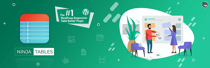
Ninja Tables with 50,000+ active installations
WPDataTables with 30,000+ active installations
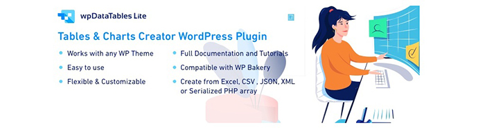
WPDataTables is also a free WordPress plugin for creating WP tables and even charts. It supports import from Excel, CSV, JSON, XML and PHP out of the box.
This plugin also has a premium version with advanced features. One of the paid addons called “Responsive Tables” provides flexible opportunities to customize the look of the tables on tablets and phones.
Data Tables Generator with 30,000+ active installations
WP Responsive Table with 5,000+ active installations

WP Responsive Table – is a super simple WordPress plugin that allows to create responsive tables horizontally scrollable on tables and phones. It creates its own container depending on the screen size.
This is a great option for users that don’t want to deal with manual HTML/CSS adjustments but want to create a responsive table in WordPress. Currently it is a totally free plugin that works with regular HTML tables in Classic editor or in Gutenberg.
Tables help to structure your data and present it to your site visitors in a convenient and readable way. Due to the major shift towards the mobile devices the site owners have to make sure that the tables on their sites are responsive and mobile friendly.
There are several solutions that help to achieve this. It can be done manually or with the 3rd party plugins. The choice will depend on your skills and the type of tables you want to create.
Hope you will find the article helpful. Comment below about your favorite solutions for WordPress responsive tables.