
Several things go into making a website appear aesthetically pleasing. From the arrangement of content to the color distribution, to generate traffic, web pages have to appear organized and well-structured. This is the importance of CSS layout.
CSS layout breaks the default boring pattern of web pages. It gives more flexibility and control that helps the developer have a better grip over the arrangement of elements.
However, is there any need to learn CSS and other languages if you can use web builder software and templates to build your website? Truly there are simple steps to creating websites without coding skills. However, learning basic web development languages helps you to develop your skill set such that you’ll be able to make the slimmest changes that templates may not offer. Hence, the essence of learning how to use the CSS layout.
Much like web design and development, CSS layout has gone through dramatic changes over the years. In this article, we’ll introduce you to the basics of the various custom layouts. This is however not exhaustive, but will undoubtedly be a great guide to your knowledge of page layout. No technique is used in isolation, but an adequate understanding of individual techniques will equip you with the skill required to deploy any of them.
Normal Flow
This refers to the default layout of an HTML page with no CSS applied. There is no control over how the elements are displayed on the browser, the HTML will appear exactly as it was in the source code with the elements stacked on top of each other.
The writing mode of the document determines how the boxes will be displayed. In a horizontal writing mode—in which sentences run from left to right or right to left—the block elements are stacked vertically. In the vertical writing mode, the block elements run vertically. Therefore, the normal flow will lay them out horizontally.
Ensuring your documents are well-structured will help you take advantage of normal flow and present your content in an immediately ready-to-read pattern without additional styling. Structuring your documents properly is equally important for ease of accessibility (people with screen readers). Such that even If your CSS file fails to load, they will still have the content delivered to them in an orderly manner.
Floats
After creating a well-structured document, the Float is one of the first custom layout methods to apply. Floats are used to shift boxes either to the left or the right. Applying it allows the displayed text to wrap around the floated boxes.
To use the float property, set the default value of float as none. You can also set the value to right, left, or inherit as applied to the banner in the syntax below.
banner {
float: none | right | left | inherit;
}
Using the float property changes the behavior of an element, and removes it from the normal flow of the page. When you float an element, the text wraps around it and the line boxes are shortened. As a result, whenever you shorten the line boxes to create space between the floated element and the wrapping text, you must always set a margin on the floated item. Then, every element following a floated item wraps around it until it’s completely wrapped up and the normal flow resumes underneath it.
To prevent this, use the property clear. A value left clears an item floated left and vice versa for a value right. The value of both clears any float.
However, this method only works if you want to start another element after applying float.
Positioning

Positioning allows you to change the default position of an element to a preferred location. The position property changes the static position of elements and shifts them around.
The positioning property isn’t primarily for creating the page layout, but more for organizing and tweaking the positioning of items on the page. They are nevertheless valuable techniques in certain custom layouts that depend on the position property.
The following are the five types of positioning.
Static Positioning
This is the default positioning of all the elements. It refers to their normal position in the document layout.
Relative Positioning
A relatively-positioned element is offset by values that move it away from its regular position in the document layout. To adjust the element’s position, set the position properties right, bottom, left, and top. These will determine its final position relative to its normal place.
The sample css below can be used for relative positioning.
.item {
position: relative;
bottom: 80px;
}
It’s important to note that positioning will only affect the item it is applied to; other items will not respond to its new position of your element. Its normal position will be reserved, so you’ll have to manage the overlaps.
Absolute Positioning
Absolute position removes an element out of the normal flow and positions it relative to the nearest positioned ancestor. This is useful for creating complex custom layouts such as tabbed boxes where different content panels sit on top of each other and are shown and hidden as desired, or where information panels sit off-screen by default but can be made to slide on screen using a control button.
By default, the absolute position sets an item to the top and left of the viewport. You can use offset values for the top, left, right and bottom properties to move it around.
Fixed Positioning
It is very similar to absolute positioning, but with fixed positioning, an element is positioned relative to the viewport, and not another element. It is mostly used to create a navigation menu that will be static on the screen as you scroll through the rest of the content. The fixed element will stay in a position relative to the viewport as the rest of the content scrolls in normal flow.
Sticky Positioning
Sticky positioning is a newer positioning method. It’s a blend between the fixed and relative positioning. A sticky element acts as a relative value until a specific offset position is reached from the viewport, then it starts acting like a fixed value. The user’s scroll position influences the sticky element’s position.
Nevertheless, unlike other positioning methods, sticky positioning is less supported by browsers.
Flex Layout
Flexible Box Layout (Flexbox) is used for one-dimensional custom layouts, i.e contents that are arranged either in rows or columns. The flex property turns elements into flexboxes which makes it easier to create flexible structures without having to use the positioning and float.
To integrate the flexbox layout on a webpage, the first step is to create a flex container where all the flex items will be placed. This container has different properties which include the flex-direction, flex-flow, justify-content, flex-wrap, align-content, and align-items.
The flex-direction defines the main-axis—the direction in which flex-box items are placed within the flex container. Its default value is a row, and this runs in the inline direction. But other values include the row-reverse, column, and column-reverse. The row and column values represent the horizontal-axis and vertical-axis, flowing from the left to right and top to bottom. While the reverse values are structurally the same but flow from different directions i.e right to left and bottom to top. Understanding this relationship will make your use of the flex-layout easier.
The syntax below defines the flex-direction:
.container {
flex-direction: row | row-reverse | column | column-reverse;
}
Other important flex properties like flex-grow, flex-shrink, and flex-basis, are useful for controlling the ratios of the flex items along the main axis of the flex-box. They are mostly used in their shorthand form; flex-grow being the first value, followed by flex-shrink, and flex-basis.
Grid Layout
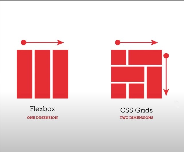
CSS Grid Layout is used for two-dimensional layout. This refers to layouts where contents are laid both in rows and columns. A grid layout consists of a grid container that holds grid items. The grid container refers to the parent element, and the children elements are the grid items.
To create a grid container, set the value of the display as grid or in-line grid.
.grid-container {
Display: grid | inline-grid;
}
You can then set up the rows/columns using the grid-template-rows and grid-template-columns properties.
.container {
display: grid;
grid-template-rows: 100px 100px;
grid-template-columns: 100px 100px 100px;
}
The CCS above will create a fixed size grid and a totally fixed row and column tracks.
Tracks have a default value of auto. If you don’t create any row tracks, CSS creates a row and automatically resizes your content. Website developers commonly create column tracks and allow the grid to create the rows as required. The fr unit also helps to create flexible grid tracks.
Fr means fraction and it represents a ratio of the space available within a grid container. It’s used to set up column and row tracks and it can be done using length units or percentages. The grid auto-distributes the space and ensures your content fits in the container. You can create columns using the fr unit and allow the grid to create tracks for you. The grip-gap is another useful property for spacing your tracks.
The grid layout is referred to as CSS’ most powerful layout, and that is rightly so. With the grid layout, you can customize your design as you desire.
Alignment
This is a tricky tool in web development, as it has limited uses in aligning items in a box. However, the Box Alignment specification is used for controlling alignment in Grid and Flex containers. It is believed that other layout methods may adapt to it in the future. Some of the properties in the Box Alignment specification include:
justify-content,
align-content,
align-items
align-self
place-items
place-content
justify-self
justify-items
place-self
column-gap
row-gap
gap
Alignment works differently across various layout methods due to their varied features.
Conclusion
Without a well-structured site layout, digital marketing efforts to boost site traffic such as integrating effective SEO marketing techniques, or the best link building services, end up a waste. CSS layout patterns make your webpage come alive, and by extension give your site visitors a great user experience. Only then can the digital marketing efforts be effective.
Don’t be afraid to play around with the patterns and select the ones that best display your content. Create a good document structure and ensure that your website contents remain easily accessible even as you try out different layout patterns.
Finally, the internet is a wide space with many ways to make money from it. As a web developer, you can also make money with your website. Some of the most common ways include publishing sponsored posts, content marketing, creating banner adverts, selling digital products, creating an online course, or even becoming an Amazon affiliate. There are many possibilities you can exploit for your benefit, and your website can be a great leverage.