
In today’s world, a digital presence is necessary for any business on every scale. With the rapid growth of smartphones, tablets, and other portable devices, a good and responsive web design has become an essential part of creating a website. You can avail professional seo services from a recognized agency and make it happen.
A web page needs to present itself depending on the user that is looking at it and the device type they are using. Screens are smaller, attention spans are very limited which means that more enhancements need to be put in. Businesses need to be creative, practical and innovative with their web design to attract more people.
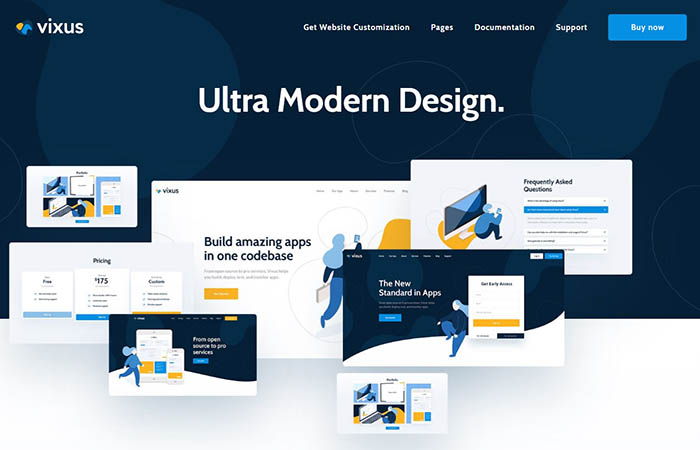
Although website design trends change every year, there are some that stay over time. Using typographic animations, asymmetrical design, broken grid layouts and fluid effects are some of the many trends of 2019. There is a continuation of minimalist, flat, and interactive sites as well that will continue to develop in the next few years.
Choosing a Daring Design Type
Web designers have become more conditioned over the previous years in observing document flow and source order. They have opted to creating layouts by floating blocks and then letting them fill the entire page as if constructing a building. Catering to the advancement of the current day has led this approach to seem quite natural. In case you are interested in trying a planning system for your website design – try slickplan.
However, it is a far cry from print layout where fixed dimensions have led to designers confidently placing text and images exactly where desired. This makes room for more experimental and visually daring layouts. A tool to make this happen is CSS Grid, which helps us bridge the layout gap and get a bit more daring with our designs.
Symmetry and Asymmetry
Each layout starts with a blank new page. Then come the required elements—a logo, menus, text sections, photographs, illustrations, etc.
Where these elements are placed tends to determine the success of the design. Due to this, one of the first things designers do when they start working on a new page is decide what the pattern of the elements arranged will be on the page. Designers employ two basic approaches to space elements: they can either lean toward a more symmetrical arrangement of elements, or towards an asymmetrical one.
Symmetry is a safe choice. It’s easy, non-threatening, and pleasing to the eye. However, it can also be extremely boring. Instead of this designers use an ‘asymmetrical balance’, which makes things more interesting. The design will still be sticking to a grid just for things to be ordered. In asymmetrical design it’s worthwhile to take higher risks to achieve the greater potential.
What is Asymmetry?
Asymmetry is by definition the lack of symmetry. In nature, we see asymmetry all around us, like in tree branches and shapes of clouds. The uses of an asymmetrical design have a wide range. This technique is often employed in creating a sense of chaos or befuddlement.
Asymmetry puts more emphasis on motion and action. It is frequently used to exude a feeling of dominance and focus on a certain point on the screen.
There are no specific rules to design while using asymmetry. Sometimes sites will even mix elements of each in the formation of the big picture.
In the case of professional website design, there is much conversation around symmetry and asymmetry. The discussion refers to horizontal symmetry and asymmetry as well as the part of the site that will appear above the scroll. An example is that of a logo design. Designers will use asymmetry to create a balance or motion within the website. Using a logo maker will usually not lead to this much work.
Techniques for Asymmetrical Design
Some of the most commonly used asymmetrical design techniques are combined with items that have some symmetry. A website with a 350-pixel sidebar immediately creates an asymmetrical outline. This is because the body of the website and sidebar are of different widths. Photo placement often happens off center as well, creating more of an element of asymmetry.
Designers have been implementing grids more and more to ensure that their page layouts appear aesthetically pleasing and drive user attention at once.
Coupled with dynamic effects this proved to be very effective. Nowadays designers opt to break this monotony so they can introduce something beyond the actual grid. How do they achieve this feat? By breaking the grid. It might be quite difficult to get rid of the grid completely since it has already become the norm on the internet.
But it also has been playing an important role in offering a distinct and beautiful experience to the users, all the while enhancing a brand’s prominence and thereby upholding more conversions.
Using Grid Layouts
An asymmetrical layout can be used for organizing text, irregular shapes, and especially image overlapping. The realistic effect of this asymmetrical design will grow within your site with no compromise over the functionality of the website.
A grid comprises of a system of lines which are connected or crossed against each other to form structured content. In the simplest form, grids are networks of lines that cross each other to form a series of squares. Usually in design grids are used to divide pages vertically and horizontally into columns and inter-column spaces.
Essentially, grids are providing a framework that dictates organizing elements on a page. This ensures all UI elements such as navigation menus, images, text boxes and headlines.
They are arranged, spaced, and sized relative to each other by given guidelines. The excellent thing about grids is that they’re useful for designers, developers and users all together.
How Grids Contribute
Grids have a knack of contributing to a site’s content accessibility because they subtly guide the viewer from one section to the next.
This helps them find any information that they are looking for. This helps designers in establishing a firm foundation that allows them to arrange elements in an interesting and practical order. Subsequently, they may also be used to draw attention to some specific elements. Having a solid grid in place will also make it easy for developers to translate an asymmetrical design into a functional website.
The concept of the grid being used in design terms follows an imaginary plane with horizontal and vertical lines. Layout elements will then adhere to the page or screen. With most websites, the grid is quite easy to point out: down on the left side of the website usually. Thus the user can see the logo, title, and content, line up together, for the most part. If there is a broken grid then items are pushed around on this plane in a way that makes the grid feel less rigid.
Such a bold design favors the unexpected and pushes boundaries. The experimentation this gives to mold with asymmetry has been around for a while now. And it will continue to be used as a technique to draw attention and stand out.

