
In 2021, the total number of SaaS companies worldwide was approximately 25,000. This is based on a report presented by Statista regarding the SaaS organizations by country. In the same year, BusinessWire estimated the world’s SaaS market size to be at $272.49 billion. With the overall SaaS market expected to keep on growing, how will you keep up?
Many organizations are now using SaaS solutions to help their business in various functions, including customer relationship management, efficient customer product adoption, and eCommerce. And most of these B2B buyers consider quality website design as key to converting users to customers. That is, the better a website design is, the more it will attract potential customers.
A website is probably the first interaction a business will have with its users or potential customers. It’s the face of your business. If your website design is excellent, it increases your chance to impress your users and the ability to turn them into customers. This means high conversion rates and more revenue.
Are you curious about how you can make a SaaS website that helps you get ahead? Here are seven website design strategies to help you create the best SaaS website that your potential clients will like. We also include some examples to help you see how it works.
Make it clutter-free
If a SaaS website is complicated, its users will not spend a lot of time on it. They will leave quickly. This is why making a site free of unnecessary elements and distractions is essential. Make it clear, clean, and user-friendly.
A clean and simple website is responsive and allows fast loading on mobile. Clean graphics and minimal text also let your copy stand out, so don’t try to overcrowd your web pages. An example of a minimalist website design that works is that of Evernote. Although it has lots of white spaces, it still keeps its branding.
If you’re not sure whether you can pull off such a design, you can try using web design services to help you create beautiful, clutter-free customer-oriented websites.
Be sure that it’s easy to navigate
Aside from making sure that a SaaS website is easy on the eyes, it should also be easy to use. A website should be accessible, readable and helpful. Whether it’s referral program software, messaging software or office software that you need, a SaaS website should make things simple for its users.
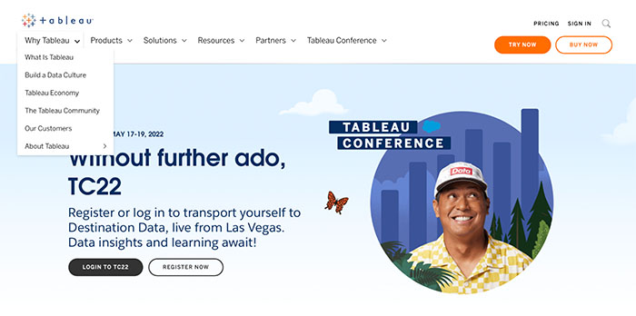
For example, a navigation bar and sub-navigation menu enable users to explore the site with ease. Tableau, a visual analytics platform, uses a sub-navigation menu that allows you to navigate a bit more about it. It helps you quickly find its integrations, community and customer stories.
A footer menu that directs to the important parts of the site is also helpful.
Ensure that it’s mobile-friendly
With 68.1% of all website visits coming from portable devices in 2020 globally, shouldn’t you consider having your website well-designed for mobile?
A responsive website that works great on all devices definitely has great appeal. If it loads swiftly and steadily on mobile, that’s a great website user experience. Otherwise, you’ll lose your potential customers. Take note that 40% of users leave a website if it needs more than 3 seconds to load. This is how much users care about speed now.
Unlike desktop computers, mobile devices also have limited space. So, your SaaS website should be readable on phones and tablets; it should have menus that are simple and easy to understand on mobile. Doing so can help you gain potential customers.
Make your call-to-action creative but clear
What is one of the most crucial elements of any website that helps convert visitors into customers? Call-to-actions, yes. This is why a SaaS website should have CTA buttons that are clear and direct.
For example, a “Shop Now” button will encourage them to start scrolling through the product offerings and buy them immediately. A “Sign Up” button will prompt them to try what you are offering. If you have a referral program or refer a friend program, be sure that your buttons are not only creative but also compelling enough to convince them to take action. They should let the users easily understand the offer and know the benefits they will receive upon taking action.
Remember that you want to generate higher revenues with your SaaS website, so consider using SaaS spend management software to easily monitor your budget.
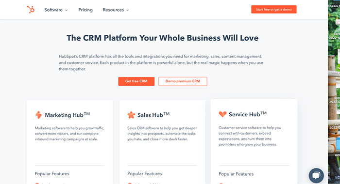
If your website contains several CTAs, streamline the CTA copy so that users won’t be confused and you’ll get increased conversions. For example, Hubspot has various CTAs on its homepage, but it’s clear whether it’s for a free trial or a premium version. The CTA buttons are also cohesive with the overall look of the website.
Be personal with the user
A great SaaS website design talks directly to its target users. It should serve the needs of its users. Its message should resonate with their pain points, as well as communicate the value proposition and purpose of the product or service offerings.
For example, Zendesk, which offers digital solutions for enhancing sales, customer engagement and customer support processes, emphasizes a reality on its homepage: a fast-paced customer service that’s hard to keep up with. It’s something that the audience can relate to. So they invite them to become faster using their software.
What makes Zendesk’s design effective? Compelling copy. It speaks volumes to the target audience and hooks them to their homepage by providing clear solutions to their pain points. When the pandemic happened, Zendesk also updated its copy to relate to the users while matching the times.
Incorporate social proof
Better social proof improves a site’s credibility. This is why SaaS businesses should have social proof, in whatever form, to help your users be at ease and know that you are reliable. Whether it’s positive user reviews, testimonials or a list of client companies, it will help you gain trust. There are also ways to leverage social media for this purpose.
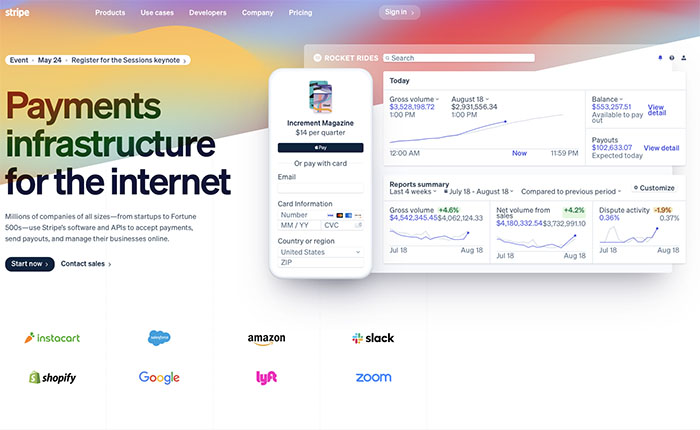
For example, Stripe, a payment service provider, provides a list of global brands using its software, including Google, Amazon, and Shopify. Seeing these names on its home page is a great invitation for users to join them.
Use appealing visuals
The visual content on a SaaS website can be the difference between having users engaged and losing them. With a website, you only have milliseconds to get your user’s attention and create a great impression. And appealing visuals play a crucial role in this.
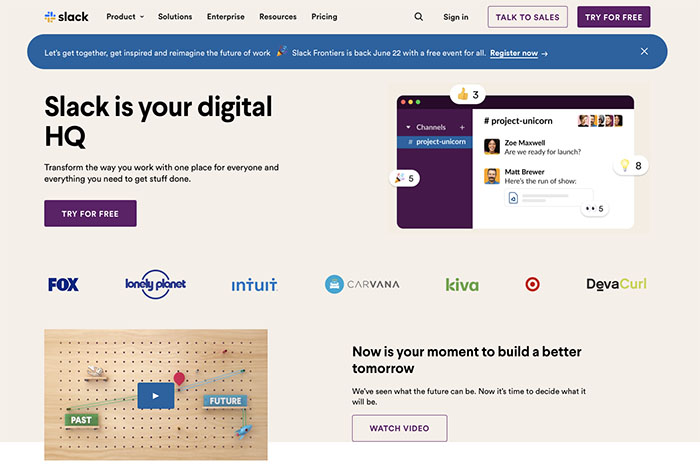
Slack, a messaging app, effectively uses visuals to draw its user’s attention. The visuals on the homepage are friendly. The website’s design and colors mirror the application itself. With the use of logos, images and other graphics, it does an excellent job of showing and giving users a feel of how it works.
When it comes to a great SaaS website design, what will work is still the one that understands its target users and provides helpful solutions and experiences. It should provide what the users are looking for.
With these design strategies, you should be well on your way to getting more conversions and generating higher revenues with your SaaS website.

