
According to research, humans learned drawing some 40,000 years ago. We understood our surroundings through symbols. It was only fairly recently, around 5,500 years in the past, that humans learned to write. Nowadays, we still prefer symbols over written words because it’s faster to understand than going through an entire wall of text, making graphs the perfect way to communicate data quickly and coherently.
With the advent of many graph maker apps and computing power, anyone can make elegant charts. Venngage, for example, has ready-to-use templates for your chart needs. Unfortunately, lacking data representation design principles can make data confusing and problematic.
If you’re about to start your graph-making adventures, you should know more about common ways graph makers, writers, and even experienced data analysts misrepresent and mislead their audience.
Misleading Graph Examples
Non-Zero Baseline: Deceptive Graphs Showcasing Inflated Figures
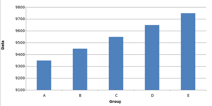
All data begins at zero – it should follow that graphs should start at zero, too. However, some chart makers want to inflate the positive data rise by beginning at the smallest data point rather than point zero.
Truncated graphs are a bad practice. Something insignificant can look enormously crucial because the designer omitted point zero as their baseline. The omission can make sure information jumps up as if it had doubled or tripled the differences between data categories.
Always start at zero. Don’t ever begin from the smallest point to create bias.
Narrowing The Positive Vertical Results: Incorrect Graphs That Omit Information
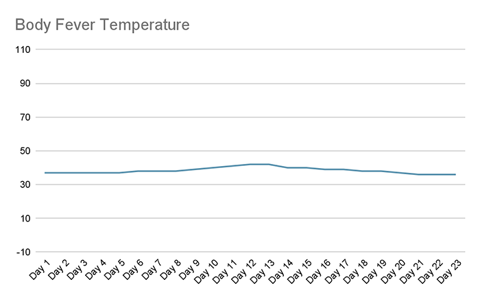
Flat vertical lines mark data stability in any chart. If it plays towards the objective’s success, then narrowed positive vertical results indicate zero fluctuation and reliability. By narrowing positive vertical data, some creators can deceive people with no data variations with their current endeavor.
For example, if you start data at -10 up to 110, you can easily omit major fluctuations. In this example, you can see a flat line that makes the 36-42 degrees Celsius body temperatures seem insignificant, making this chart misrepresent the data’s criticality and downplays its value.
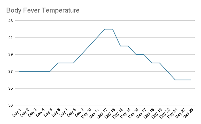
In this example, the body temperature changes on the vertical axis perfectly represent its criticality:
Misrepresenting Dips: Confusing Charts That Show False Success
As you may have noticed, everything about graph misleading is about omitting data and time changes to alert and confuse people with insignificant data to serve a particular agenda. However, some misleading designers take it to the next level by removing data that disagrees with the design.
For example, you have a new work policy poll split into “agree” and “disagree” data categories. Having two categories does not reflect the office’s true sentiments. Those who feel they “somewhat agree” automatically agree to the new policy, while those who slightly disagree become part of the “disagreeing” category.
The best solution: use multiple data categories where possible to illustrate your point objectively. Remember, charts paint data, and data will tell you how many categories or crucial are certain figure changes and fluctuations.
Miscoloration: The Most Common Ways Graphs Can Be Misleading
Our visual habits make darker colors feel much more intense than lighter colors. Intensity often equals higher density for most people, which makes colors extremely important. Using light colors to signify density isn’t going to sit well with many people, and it will leave them confused and believe that lighter symbolic areas had less density when they weren’t.
Wrong Graphs: Need We Say More?
A pie chart illustrates the division between the various parts that make up a whole figure. For example, everyone ate pie, but dad and mom ate the least amount, and you ate the most. However, it can never illustrate the proportional changes through time.
Another example: dad and mom drove the car longer than you, and you drove it once this week. A pie chart won’t accurately show the data difference during the last seven days, but a line chart easily can. It’s easy to confuse and deceive people if you use the wrong graphs.
Below, we’ve listed the best graphs for particular objectives, according to Toptal:
- Line: Value comparison over time
- Bar: Quantitative changes over time
- Pie: Show parts of a whole
- Column: Comparing quantities between different entities
False Correlation: Political Graphs Love This
Both political sides love using charts that correlate two wildly different incidents because they’re virtually aligned to each other. For example, you can create a chart showing that US Defense spending surged highly when education spending dropped while an Asian country renewed its US joint arms agreement because their line chart data align with each other.
In doing so, you can conclude that the US Defence dropped education spending because it has an Asian war to fight, which is inaccurate.
The best solution is to reassess your data and decide against showing this graph and section on your article or presentation because it’s a cheap and misleading way to commit confirmation bias.
Clarify Your Objectives and Use The Right Charts!
Graphs are symbolic and easy to understand. But, if you don’t take time to represent your objective data as transparently and truthfully as possible, it will confuse and deceive your audiences. Plus, always use the right tools to create the best-looking and easy-to-understand graphs!

