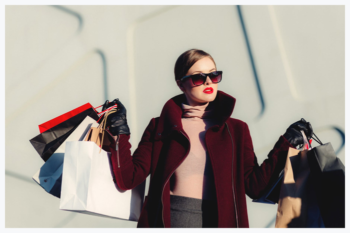
It’s a must for fashion blogs, portfolio sites and eCommerce projects to look trendy. Just like new fashion trends that we can come across in the magazines and on the catwalks, fashion sites should be built in regards to the modern-day web design trends. The audience of such sites is very picky. If site visitors reach a poorly designed page that doesn’t look striking, they are likely to leave to never come back. In order for this not to happen, update your fashion WordPress blog with style and make it look trendy.
There is a common practice among business owners to launch blogs and sites with the help of some WordPress themes for fashion blogs. There is a range of the ready-made solutions that are suited to be applied to personal and business projects. The thing to remember is that the fashion WordPress theme should be built with the latest web design trends in mind. Hence, WordPress blogs should be up-to-date.
The purpose of writing this post is to help you choose the best WordPress themes that will help you build a trendy and appealing fashion blog.

Photo-Based Designs
When we are talking about fashion-related web projects, we imagine photo-rich layouts demonstrating trendy outfit and pictures taken during the most recent catwalks.
Building photo-rich websites is one of the leading web design trends for 2018. There’s no doubt in the fact that a picture is worth a thousand words. The concept of has gained great demand among web designer this year. It’s become trendy to use large hero images on the front pages of online resources. You can also see image used in the backgrounds and simply supporting different pieces of texts.
Pictures can be used in literally all parts of a site. There are plenty of tools, plugins, widgets, and extensions that can bring a more effective presentation to the visual data. For example, you can organize images into galleries. You can also add a separate portfolio page to your site and enhance it with the smart filters for better use. Moreover, you can use images alongside some cool animation effects. For example, the parallax scrolling effects applied to the page-width background images will add the feeling of depth and 3D illusion to your web resource.

Duotone Elements
The trend is not new. It was presented back in 2017. Some of the sites started to adapt it to their design, playing with the color here and there. The technique was appreciated by the demanding web community, We started to come across more sites implementing it on their layouts. In 2018, the number of websites designed with the duotone technique has increased manifolds.
The trend can be seen in both entertainment and business sites. Fashion and beauty websites are no exception. The main reason why web designers opt for the duotone effect on their web pages is the possibility to add more contrast to the content. Placed on the vibrant duotone background, typography looks more outstanding, without compromising on the readability.
Microinteractions
The trend is not new. It’s been in demand for a couple of years already. Not only do blogs or eCommerce sites make use of it on their pages. You come across micro-interactions every day, without even noticing it. Popular social media platforms, apps, and websites make clever use of micro-interactions with the major purpose to improve the user experience.
Microinteractions are presented by the small animated design elements that you can see after completing a specific action on a web page. For example, an icon can change the color or rotate as you hover over it.
Using micro-interactions on your fashion blog you can encourage the users to interact with your site more actively while making them take specific actions and seeing the immediate feedback.

VR-Based Designs
We live in the age of the rapidly evolving technological progress. Virtual reality in the essential part of it. VR has become a mainstream, which finds its reflection in games, devices, virtual tours, and other things that we come across on the daily basis.
WordPress already supports such VR devices as Oculus Rift and Google Cardboard. There are yet not so many fully-fledged VR WordPress themes available, however, the situation is likely to change in the near future.
2018 has only started and we are anticipating to come across fashion WordPress blogs and sites that are integrated with the features for VR gadgets. Until the moment the WordPress community gets expanded with new RV themes, you can enhance your fashion blog with VR image galleries, videos, and online tours achieved by means of the VR plugins.

Mobile-First
It happened in 2014 when mobile Internet usage overtook desktop devices. At the end of 2017, more than 80% of Internet users shifted to handheld devices in 2017. The percentage is expected to grow even bigger this year. Taking this into account, web developers have shifted to the new web design paradigm.
Mobile-first websites are built with the primary focus on smartphones and tablets. Such web pages stand out with the more thought-out and well-balanced layout structures. Provided that smartphones provide less space for the web content, web designers need to think twice before they decide what data will bring the maximum value to the web users, and what can be omitted.
Wrapping up
A fashion blog should look smart and trendy in order to attract the wider audiences and keep the users coming back over and over again. Keeping a close eye on the modern-day web design trends, you can feel more confident in the choice of the best WordPress theme for your future online project.
Are there other web design trends for 2018 that you think are worth being considered as you build a fashion blog? Please share your ideas via the comments section.
