

When it comes to rebranding, companies start scratching their heads whether they aren’t making a mistake. It happens for a reason, as there are so many examples of absolute rebranding failures (that should have never occurred).
That is why, in this article we’re going to examine 20 most known disasters famous companies made during their rebranding. Check out and avoid making the same mistakes!
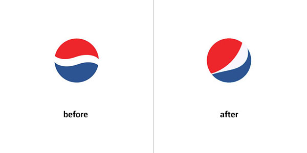
A never-ending battle between Coca Cola and Pepsi often results in Coca Cola winning. A recent rebranding Pepsi underwent is just another example. The logo has already been changed for more than 10 times. However, their last one is not only a failure, but also cost $1 million. This strange smile already got meme interpretations, as you can see below and definitely didn’t help build Pepsi integrity better.
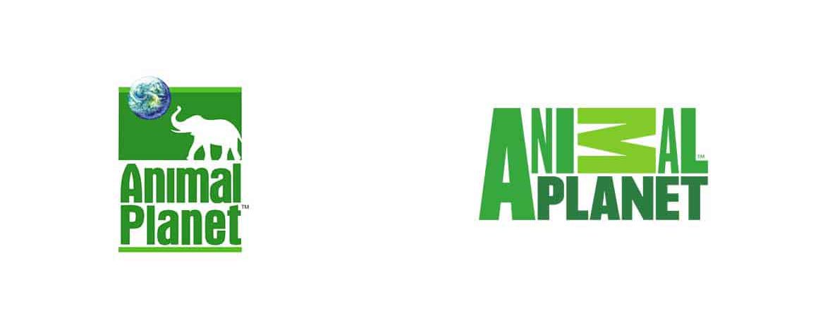
The former logo was a perfect and simple representation of Animal Planet Channel, while the latter lost its identity and the font that varies in size and position only made it even worse. As all the important elements were eliminated (we mean the animal, and the planet), the tv station name itself has no significance.
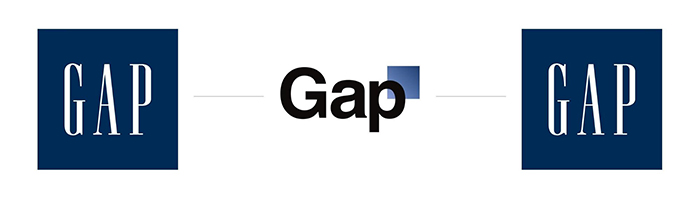
Gap rebranding is one of the best examples of fast feedback reaction. On October 9th Gap decided to absolutely change their logo: another font and weird blue square in the right corner. As there was no previous warning of logo change (and the fact it was a disaster), it raised tons of criticism from customers. Luckily, within 3 days the company decided to return their old logo back that still exists. Yet, this failure cost $100 million.
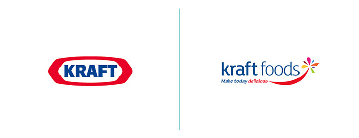
Another example of a company going back to its senses after a failed rebranding design. As soon as they announced their new logo, they faced tons of criticism. Let’s analyze why their new logo was awful. For one thing, it lost the monumentalism and power. The former logo was simple, vivid and energetic. The latter one, for one thing, with the word abundance lost the meaning whatsoever. “Foods, make it delicious” — it’s just too much information. For another thing, the famous “swoosh” sign has never done anything good (well Amazon is the exception, because it has the meaning).
There’s even no use explaining. You can see everything yourself. The Bluebirds team has the new red emblem with a huge red dragon on it. Once again BLUEbirds and RED dragon. No matter the significance designers wanted to pay to the symbolic Welsh dragon, it was a wrong choice. It’s just misleading and confusing. Most importantly, the logo lost its identity the very moment it has the red dragon as the main character.
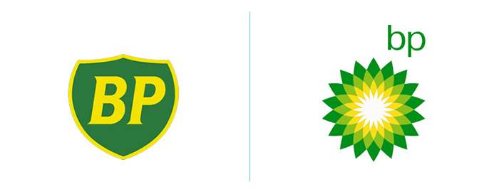
Even huge experienced companies made disastrous mistakes. British Petroleum is one of them. Their former logo existed for more than 70 years. It was solid and powerful. Plus, it was simple and pleasant to look at. The new “Helios” design is just a failure. Not only is it less appealing visually, but it’s also controversial. A petroleum company relating to sun, green and yellow colors — seems like someone is trying to pull wool over people’s eyes.
There’s one word that best describes the rebranding design of BestBuy — boring. It lost its idea and appeal. The former yellow tag price was enough to understand that you can buy a bargain. The former design already had everything a good logo needs, as it was simple and iconic. Luckily, they’ve returned their previous logo within some time. However, through years, they’ve started experimenting again and came up with a great new solution.
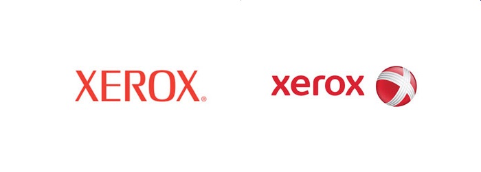
Does a company selling copying machines have all the rights to copy another company’s logo? As let’s be honest, their new “ball with the letter X” reminds something precisely, doesn’t it? We’re talking about Xbox. Maybe it was on purpose, still the lower case font and the new sign next to it was a total failure. It has no identity, no novelty and is just senseless.
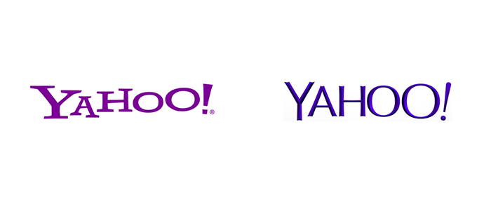
Yes, the former logo was a bit quirky. Still, it has its individuality. Somewhat childish and having a daring exclamation mark, their logo was memorable. Whereas, the new choice of font was highly inappropriate. It would have suit a boring lawyer consultancy, but not a brave and novel brand. Not to mention the diagonal lines that made the “Y” letter way more heavier than the rest of the word.
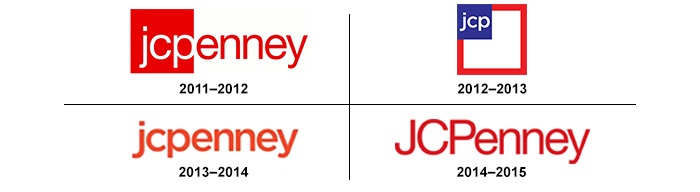
J.C.Penney has been through lots of rebranding stages and in the end it returned to the very first one. However, there was one logo that truly stands out as a disastrous one. Before 2011, the logo looked like it looks today. In 2011 a novice designer who was a student at that time came up with a new design — having letters “jcp” in a red square and the rest with no square. Not only making it all lower case was a bad idea, but also placing “jcp” together made it difficult to read and understand — a company known as J.C.Penney had become the “jcp” enney, or what?
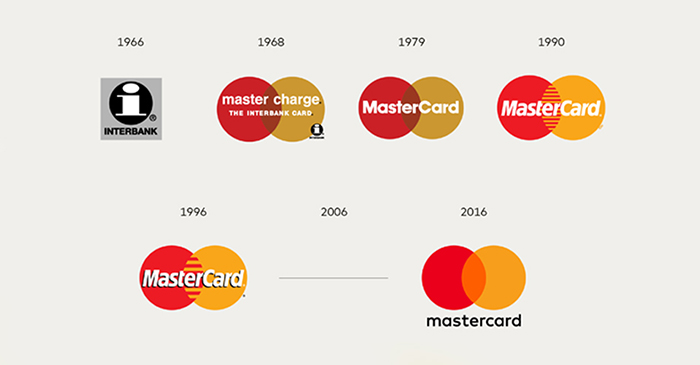
Sometimes trying to reach the ideal logo, companies don’t notice that they already have one. It happened to Mastercard, as their logo was iconic and simple for many years. However, the recent change suggest some kind of disastrous design. The shiny circle and tons of gradient has nothing special and is just too much to handle. It has become chaotic and definitely lost its original significance.
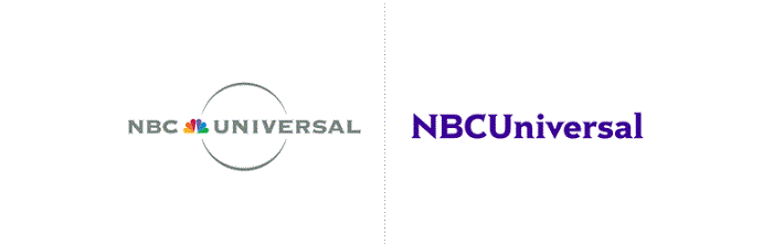
NBC Universal is another company losing its iconic image and becoming boring. The famous peacock tail disappeared leaving the new logo with now special identity. What is more, the font was a bit changed, and the way they’ve placed upper and lower font is once again misleading when it comes to pronunciation. Is it “NBCU” “universal”’ now?
On the one hand, the new logo My Space came up with isn’t a total failure, as it’s quite modern and rather fine-looking. Still, they’ve waited too long for rebranding. After losing many visitors, and changing their memorable logo to the new one, it only became worse. Those people who still somehow remembered about Myspace, wouldn’t recognize it by the new logo.
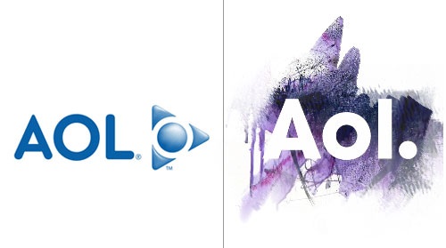
Another example of waiting too long for rebranding and then doing it truly bad. At least their old logo arouse some nostalgia, despite the fact that they were already losing tons of users. On the other hand, their rebranded logo is a complete disaster. Some scribbles with no meaning or idea whatsoever.
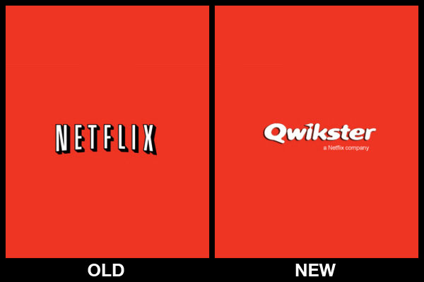
There was the time when Netflix wanted to divide their online and offline activities. Thus, making their online resource known as Qwikster. Luckily, the majority of customers found it confusing and pointless. Furthermore, luckily, Netflix listened to its clients feedback and followed their desires. This is how, millions of people these days can’t imagine their quiet lie-in evening without “Netflix” not some strange “Qwister” (that is even difficult to spell).
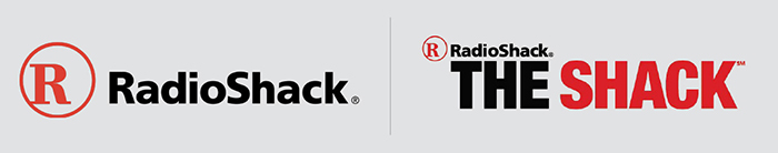
Millions of dollars were spent on this rebranding. The company wanted to become trendier and certainly attract more customers. However, their strange and meaningless attempt became terrible. “RadioShack The Shack” has no idea and significance at all.
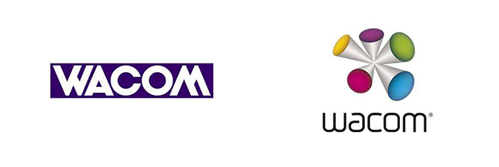
Once again we’re wondering what makes companies think they have a bad logo and want to change it? Wacom had a perfect minimalist logo. Anyway, they decided to rebrand and ended up with a disaster. Not only it’s difficult to understand what this figure means, but it’s also fail to be as memorable as the former logo.
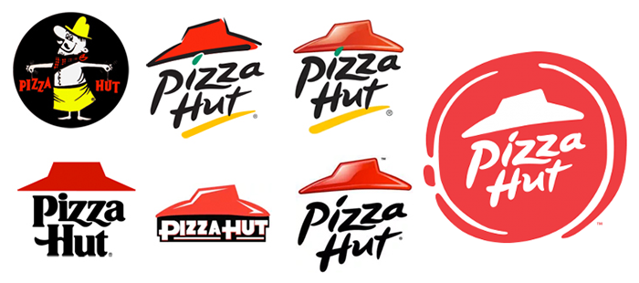
On the one hand, the idea to lose all the gradients and tons of elements was the good one. On the other hand, the shape of the logo and the combination of red and white is a bit weird. Is it a ketchup seal, or should it remind customers of a pizza? In any case, the new rebranding idea is a failure, as this change didn’t reach any goal.
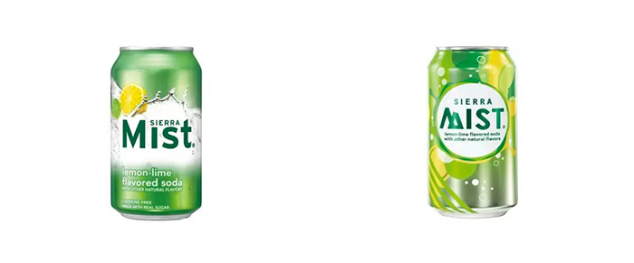
Despite not being the most popular soft drinks, Sierra Mist had its audience and their logo was quite recognizable. However, in 2010 the company rebranded their logo, eliminating any connection to the previous one, and thus losing all the identity. Their new logo became as boring as the majority of other logos. To make things even worse, the strange name appeared — Mist TWST.
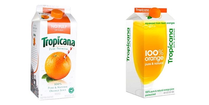
Tropicana had its ups and downs. Their worst rebranding was changing their appealing orange with straw to a glass of some orange liquid. This kind of image lost the identity of a fresh squeezed orange. For this reason, within some time they’ve returned to their original package.
That’s all for now. We hope you’ve enjoyed our list of 20 rebranding disasters, and learned the lesson what kind of mistakes you’d better avoid.
Exploring ideas at the intersection of design, code, and technology. Subscribe to our newsletter and always be aware of all the latest updates.
Rhonda Martinez is a marketing manager, education blogger, and writer at LegitWritingServices review website, where she reviews sites like PaperHelp and other popular essay writing services. She also teaches branding and strategy marketing courses at the University at Albany. Rhonda believes that strong branding is one of the most important elements of a successful business.

