No matter what your website niche idea is, it’s more likely you have thought about creating a landing page. With a short lifespan of 8 seconds, it’s important to hook the attention of your target audience and deliver your brand message fast and landing pages are here to help.
A good landing page aims at helping your website visitors solve their problems, so it is not just about advertising your business, but it’s also about sparking interest in your product and increasing brand loyalty and trust.
Creating various landing pages help most companies see a 55% increase in leads and achieve different business goals:
- Tell more about a specific product or service: If you want to promote a product or service, keep a focus on it and provide your landing page visitors with detailed information.
- Generate leads: Your landing page can also help you collect contact information from visitors who have an interest in your brand or product. Using the right forms, you can generate leads like email sign ups, phone numbers, and social media profiles.
- Convert leads into sales: Practically every website owner aims at growing revenue. When done right, you can create landing pages that sell and it can turn your website visitors into leads and customers.
- Understand your target audience better: If people visit your landing page, this means they are your potential customers. To understand your target audience better, you can offer incentives in exchange for filling out simple forms and then analyze user data.
However, deciding on your landing page goal isn’t enough to make it effective. You need to know how to make a good landing page that grabs the attention and improves the conversion rate.
What Makes a Good Landing Page
At first blush, it seems that creating a landing page doesn’t take much time or effort: It’s shorter than other pages on your website and it keeps a focus on one product.
But it’s not true. To increase the effectiveness of your landing page, you need to pay close attention to the details. Here are the key elements of a good landing page:
- One goal
- Clear message
- Well-written headline
- Relevant keywords
- Eye-catching design
- Noticeable CTA
- Contact methods
Now that you know what makes a good landing page, it’s high time to take a look at best practices and find out what works best for different landing pages.
Here are 13 great landing page examples for your inspiration:
Drift
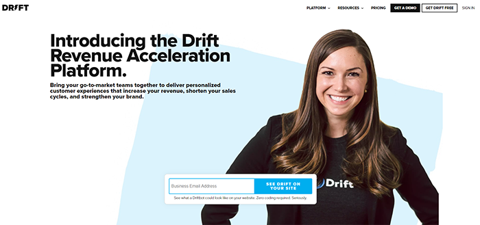
This landing page is a great example of applying brand principles which helps to increase brand awareness and generate leads. Not only does the page tell visitors about the platform, but it also provides a social proof as it has a picture of a happy customer or employee, wearing a brand logo sweatshirt. With the contrast colors and the centric positioning, the entry form is obvious, so it’s more likely visitors won’t miss it out.
ThemeRex.net
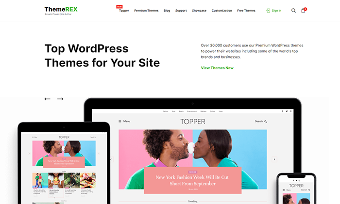
This minimalistic landing page design has it all. It has an eye-catching headline, relevant imagery that must look good on all devices, and information about happy customers which serves as social proof. It also reminds visitors that website customization matters and encourages people to take a look at the WP theme collection after clicking on a contrasting CTA.
Sitter City
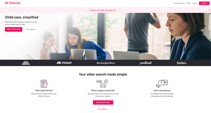
The landing page from SitterCity is a great example of combining all important elements. The headline offers a problem solution, short yet descriptive copy tells about the server, and press features increase brand trust. There’s information on how to use the server and there’s also a time-limited discount code for signing up via a landing page immediately which encourages visitors to take desired action faster. Although the primary goal of this landing page is to target parents in search of sitters, it also has information for sitters looking for a job which helps the company kill two birds with one stone.
Clek
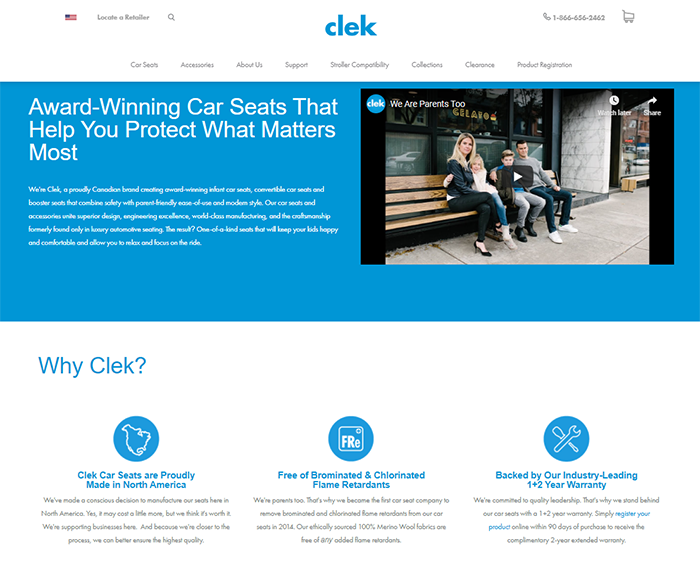
Clek is another example of a great landing page design that converts. Although the company uses its landing page to tell more about its principles and products, it helps to spark interest in learning more about the collection as it tells visitors everything they should know about what bothers them most. Not only does Clek use customer testimonial video, but it also provides visitors with more reasons to choose the company. With the right word-of-mouth marketing software, you can set up a referral program and feature peer recommendations on your websites which can serve as a social proof, too.
Pixpa
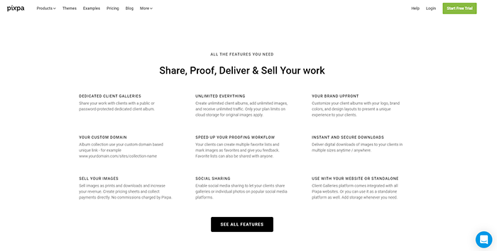
If you’re a fan of longer landing pages, take a look at Pixpa. Starting with a descriptive headline and a CTA, the company walks visitors through its benefits, examples, social proof, etc. For example, the screenshot shows that Pixpa features the list of features the company offers as well as a website chat system that allows interested visitors ask their questions and get replies in real-time. Although people have to scroll the landing page which can turn them off, it also allows the company to tell the brand story and include all relevant information that can convert visitors into customers.
MC2 Bid4Papers
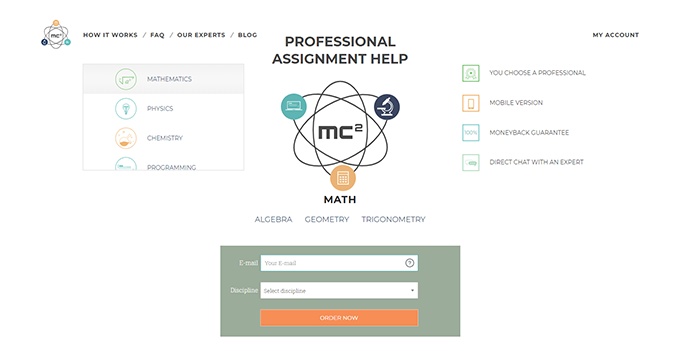
To draw inspiration on how to convert more leads with a minimalist landing page design, let’s take a look at MC2 Bid4Papers. The company puts its brand logo in the center of the landing page and puts its list of options and benefits on the sides which makes its landing page straight to the point. It also puts a short form below the logo and adds a contrast CTA button to grab the attention before visitors decide to leave the page.
Octane AI
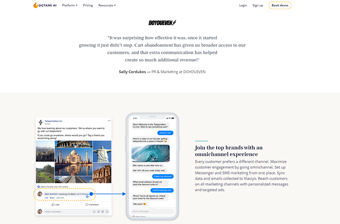
With the choice overload, it’s no secret that customers crave social proof. Octane AI knows the importance of it, so the company uses its landing page to tell more about its products and shows potential customers that other consumers are satisfied with the quality of its services. Not only does Octane AI feature client testimonials in a form of quotes, but it also shows how some of their clients have used services to improve shopping experience. The company also encourages visitors to book a demo so that interested visitors could understand whether they can make the most out of these services or not.
HelpCrunch
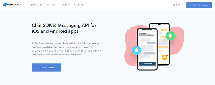
The reason why this landing page is on our list is because it’s simple yet effective. HelpCrunch combines the power of descriptive headline and persuasive copywriting to turn hooked visitors into leads. For most people, numbers speak louder than words so the company uses statistics to explain the problem and show visitors how to get rid of their pain points. Just a quick look at this landing page helps people understand what they can expect from signing up for a free trial, so it works well for the audiences with shrinking attention spans.
CandyBar
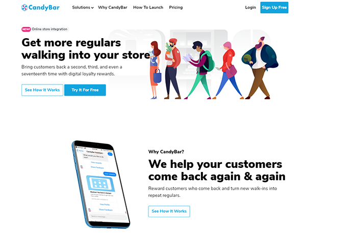
Another example comes from CandyBar, a referral program for retaining and acquiring customers. With the minimalist design, the company keeps a focus on delivering its brand message. Its headline shows visitors how they can solve their pain point (get more retaining customers) and its copy invites people to tap on one of two CTA buttons for those who want to learn how it works or give it a try. To ease the worried minds of potential clients, the company also features the list of reasons why use Candybar which also helps to improve landing page time spent.
Crello
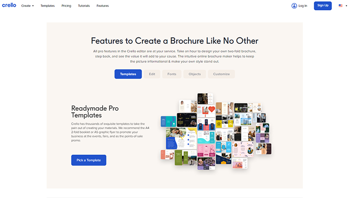
In honor of the new product launch, Crello has created a separate landing page for people who want to make professional-looking brochures with ease. Since the number of graphic design tools is quite big, Crello has to show visitors what makes it any different from other competitors. Thus, the company lists key benefits it has to offer as well as the previews of its templates and invites visitors to choose a template by clicking the contrast CTA button.
Postmates
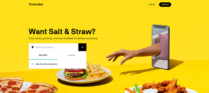
Who else finds animated visuals to be interactive and eye-catching? The example from Postmates shows how a good visual with the right brand color and animated design can turn a minimalist design into a high-converting landing page. Since the headline is constantly changing, it allows the company to a). Show the variety of delivery services it has and b). target a wider audience. Moreover, the picture illustrates what users get when ordering food on Postmates and the form allows interested visitors to see what delivery options the company has in their location area.
SignalHire
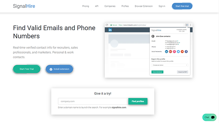
SignalHire is worth being on the list because it puts much effort into solving customer pain points. The headline tells visitors what they can get when choosing the tool, but the company also has a short copy that explains more about their services and an animated visual that shows how to use the Chrome extension and get quick access to its main features. What is more, the landing page has 4 CTA buttons for segmented audiences so that every visitor can find a solution that suits their needs and wants. It also helps SignalHire make sure people will click on one of these buttons to find out more information.
NapoleonCat
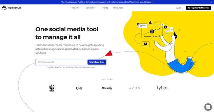
We all know the importance of custom website design, so it’s no wonder that NapoleonCat is on our list. This landing page example has all important elements: a descriptive headline, informative copy, eye-catching visuals and CTA buttons, well-designed web form, and badges. Not only does the company use custom brand visuals, but it also puts a red arrow as a part of its web page design that drives visitors’ attention to the web form and therefore helps to generate more leads.
In a Word
As you can see, there’s no one-size-fits-all solution when it comes to creating great landing pages. However, all high-converting landing pages encourage visitors to take desired action and therefore achieve business goals. Thus, the best advice is to find inspirational examples that meet your expectations and let your creativity run wild.

