
Optimizing your landing page is one of the best ways to help better the performance of your pay-per-click campaigns and simultaneously, maximize your return on investment. Over the last couple of years, we have tried to compile several dozens of tips and tricks that will help improve campaigns on your landing page.
Read on to find out some of the best tips that include both small tweaks and bold visitations – each change will help you make an immediate and noticeable impact on your existing conversion rates.
Understand Your Campaign Goals
One of the most common and troubling issues among all landing pages is that they are not focused on one particular call to action or goal. The key is to create a landing page that focuses on one main aspect or offers a singular solution. In this manner, your customers are less likely to lose sight of what they want or get confused.
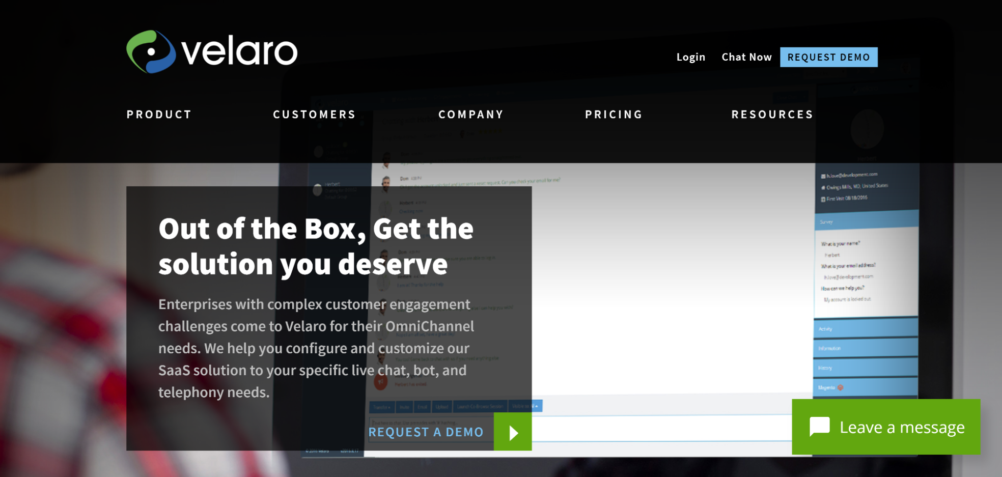
For example, the landing page that the guys at Velaro Live Chat have come up with contains a guide that explains how and why live chat is essential. Ultimately, the purpose of the landing page is to generate leads – and when users download this guide, this is exactly what they achieve.
Your Landing Page Forms Need to Be Mobile-friendly
Mobile ads are extremely effective today due to their appeal and the fact that they convince so many consumers to make the purchase then and there. This means that your mobile landing pages, as well as the forms they contain, need to make it as convenient for the consumer as is possible. This heightens the chances of conversions while users are on the go.
For example, Progressive makes it basically effortless for the visiting customer to enter their information – technically, even sending a plain text message is bound to take longer.
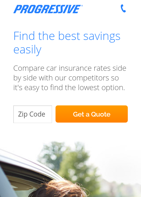
It is quite obvious that this kind of form isn’t providing much information about the user to Progressive, but let’s not forget what the point of all this is. It’s all about the user, right? By making the entire process easier, you give your prospective customers exactly what they’re looking for. This, then, makes them much more likely to convert.
Use the Required Keywords in Your Landing Page Copy
WordPress Developers sometimes consider design to be the paramount aspect that brings success to a landing page – but the copy that it contains is just as important, if not more. One of the easiest ways to compel your visiting customers into converting is by using the keywords “the voice of the customer”.
You would have probably come across way too many website landing pages as well as other marketing materials that are loaded with some of the most unnecessary marketing keywords that are “buzzworthy”.
Some enterprise-level businesses consider that the usage of indecipherable language is the way to go – but we’re here to tell you differently. Speaking the language of your customers is a far more efficient way to increase your conversion rates.
Employ CTAs that Make Users Take Action
CTA buttons arguably consist of the most important elements of a landing page, as it is the easiest way to get your visiting customer to take action and potentially convert. To a layman, it may just appear as any other button, but you and I know that everything about this button matters towards getting users to take action.
- Colour: Make sure that the CTA button is made up of a color that contrasts with the background. Usually, orange, blue, or green CTA buttons work the best.
- Size: Keep in mind that the size of the button isn’t very small so that users don’t lose sight of it. Conversely, it shouldn’t span across the width of the page and end up scaring the users away. It should be just right – and in sync with the format and layout.
- Message: The message being conveyed through the CTA should truly emphasize the importance of the CTA and simultaneously instill a sense of urgency or need for the product/service you wish to sell
Write Simple and Straightforward Headlines
It’s the cold, hard truth that in this world of minimal attention span, you have a generous few seconds to grab your visitor’s eye. It’s essential to keep your headline in a bold font, and make it to the point. Clean and simple is the way to go.
Come Up with a Compelling Flow of Text
No one wants to continue reading the contents of your page if the beginning of your copy doesn’t contain a copy that satisfies and compels them. For more conversions, you need your landing page to have a copy that is convincing, to the point, and of course, genuine.
On the landing page on Lyft’s website, there is a noticeably clear flow of information that is useful for the drivers to acquaint themselves with before they sign up. Ultimately, however good-looking your page is, users are not going to convert if your content does not convince them.
Invest in Live Chat - It Really Does Work!
It’s time to put ineffective, an unconvincing live chat that makes you feel like you are obviously communicating with a robot behind us for good. Today, advanced chatbots fuel most of the 24/7 live chat apps and are a great tool for businesses. They have long surpassed the simple expediting of access to information, and now act more like engaging links to content, which therefore brings about layers of access for driving users in order to make the best buying choices for them.
They act like a personal shopping assistant that knows enough about you to find the exact products you need. Consequently, you find buyers returning to the brand that they trust.
Optimizing Your Form Fields
The main purpose of a landing page is to be able to receive and make a record of a visiting user’s contact details, and that’s virtually impossible to achieve without the help of a form.
A general rule is that if your target audience doesn’t comprise enterprise clients, try and stick to just asking for the customer’s email address. It helps to use a multi-page form that smoothens the transition of users into leads.
The logic behind this? Initially, you get to ask the customer to take some kind of action without asking for any details, and once committed, they give up their contact information.
A/B test Your Landing Pages
Among all the steps, testing is one that’s mandatory to help improve your conversion rates through landing pages. Keep in mind that when you use the right tool to test your page, you get the opportunity to change your conversion rates and increase them by about up to 300 percent.
One of the biggest problems that marketers face is the lack of tools to test the landing pages. A/B testing thus helps you experiment with the many different landing page layouts as well as content – and understand which one clicks best with your target audience. You can try A/B testing by categorizing your audience; but by adopting a dedicated tool, you get to analyze your results in a far more efficient manner.
Conclusion
Landing page optimization is often viewed as a tough task, due to the fact that there is no proven, tested method for getting it right. The above guide should help you come up with a foundation that frames each element of the landing page, leading to improved rates of conversion.

