
When it comes to design, people bring expectations, emotions, biases, and instincts into every click, scroll, and pause.
Visual design organizes information to enhance the overall experience. It also sets the tone.
Most decisions, whether it’s to stay, leave, trust, or ignore, happen before the content has a chance to make its case. That decision is often driven by what users see.
The wrong color creates distance. The wrong font changes the tone of your message. Poor spacing causes friction. Off-brand imagery disrupts trust.
Let’s deep dive into visual design for emotion and what triggers an emotional response. We also discuss actionable strategies to help you grow your brand with emotion.
The Science of Emotional Design
Emotional design can affect every interaction between your brand and your audience, from the first scroll to the final click.
Here’s how that process works:
How Humans Process Visual Information
Before people analyze, compare, or decide, they see. Visuals are the first input the brain registers and often the most influential. This is known as the picture-superiority effect, a well-documented phenomenon where people are more likely to remember and respond to images than to words alone.
The human brain processes visuals 6 to 600 times faster than text. The range depends on complexity, context, and familiarity. But the takeaway is the same. Images get through quicker. This is why a single visual cue can influence behavior without users realizing it.
The Role of Emotions in Decision-Making
Many people believe that emotions are merely a byproduct of decision-making. You make a decision, and you deal with the consequences of that decision. Those consequences can cause you to feel some sort of emotion, whether good or bad.
While this is true, emotions can also play a significant role in decision-making.
Studies show that emotions heavily influence decisions under uncertainty and risk, which covers most digital experiences. Should I click? Is this worth my time? Do I trust this brand? These are emotional questions, even if they appear to be logical ones.
In business settings, emotional response also affects decision-making, speed, conflict resolution, and risk assessment. If a potential customer is visiting your site, they may weigh the pros and cons. But they’re also looking for signals of trust. These signals can be the difference between them continuing to interact with your site and clicking away. How they feel while browsing your site can greatly influence that decision.
For example, a rushed layout can trigger hesitation. When there’s not much white space, navigation feels disjointed, or content seems like it’s crammed in without intention, site visitors will pick up on it. Even if they can’t name the problem, they know when a site’s organization doesn’t meet their expectations.
This creates hesitation and makes them second-guess your credibility.
If you visited a site with text tightly packed together, like the example below, would you keep reading it, or would you get frustrated?
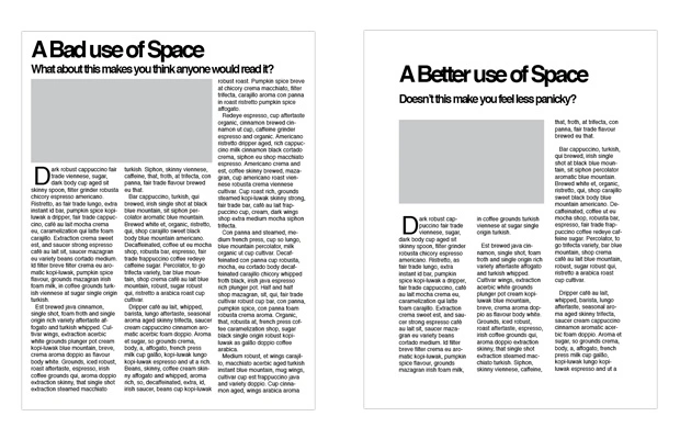
Putting yourself in your audience’s shoes this way can help you look at things from their point of view.
Let’s consider another example. A bold color palette can imply urgency. If you use color strategically, it can drive action or reinforce energy. However, if it’s too aggressive or the contrast is too sharp, it can create an overwhelming user experience (UX).
People associate visual cues with emotional tone. Harsh reds might work for a flash sale, but feel out of place for a financial planning service.
On the other hand, pale pastels might create a calm atmosphere, but they can also suggest a lack of authority if used in the wrong context, such as a banking website.
The point is that every visual decision sends a message. It either builds trust or introduces friction.
Key Elements That Trigger Emotional Response
Every element on a page has the potential to influence how users feel and what they do next. From color to layout, these choices create a mood, send a message, and either build trust or erode it.
Color Psychology
Color is one of the fastest ways to trigger an emotional response. People form opinions within seconds, and up to 90% of initial judgments about products are based solely on color. That snap judgment influences everything from brand trust to perceived value.
Specific colors evoke different emotional responses:
- Blue: Blue signals trust and calm. It’s popular in finance and tech for that reason.
- Red: Red evokes urgency, excitement, hunger, or danger. It grabs attention.
- Green: Green suggests health, growth, and balance. It’s common in wellness, sustainability, and food industries.
- Yellow: People associate it with feelings of optimism and energy.
- Black: Black conveys sophistication and control.
Typography
Fonts do more than carry words. They shape how people perceive those words.
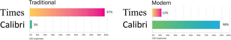
Studies like the Type Tasting Font Census have shown that serif fonts like Times New Roman are commonly associated with authority, tradition, and knowledge. People perceive sans-serif fonts like Calibri as modern, casual, and more approachable.
Imagery and Videos
Images and videos reliably elicit emotional responses. They carry emotional weight that words often can’t. A well-chosen image or video can signal tone, set expectations, or even shift the viewer’s mood. ‘
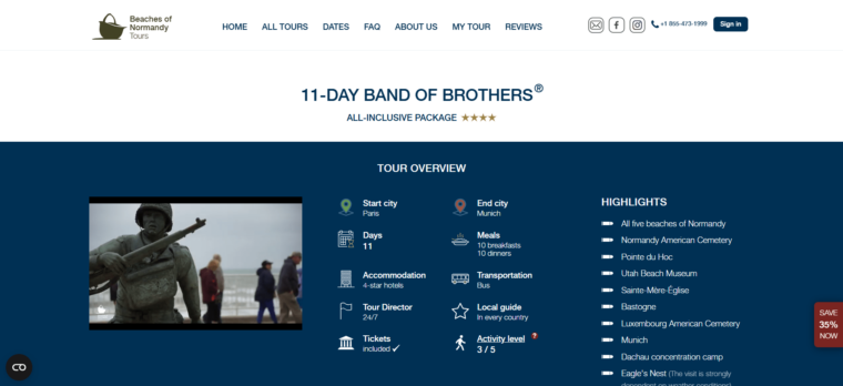
One standout example is Beaches of Normandy Tours, a historical tour company. It made a clever move with its Band of Brothers tour, inspired by the HBO series “Band of Brothers.” Its website features a beautifully curated video that masterfully showcases evocative footage of travelers touring historical locations and enjoying realistic reenactments of the events surrounding World War II.
With this video, Beaches of Normandy aims to excite those interested in historical recollection while preparing them to experience one of the greatest events in human history firsthand.
Layout
Elements such as spacing (whitespace), visual hierarchy, and typography in layout significantly impact how users feel, affecting their trust, comfort, and overall satisfaction.
Whitespace provides the eye with room to rest, helps define relationships between elements, and makes the user experience more seamless and intuitive.
Visual hierarchy guides movement through the page. A 36px headline above 18px text tells users where a section begins. Subheadings help break up information into smaller, manageable pieces.
Visual cues like font weight, color, and positioning help prioritize content. Without hierarchy, people have to scan the page manually to figure out what to read first, which creates friction and slows them down.
Typography inside the layout plays a big role in the overall experience. Small font sizes or tight line spacing make reading a chore. Misaligned text, inconsistent margins, and poor contrast make content look unprofessional, even if the message is solid. A simple layout with clear headings, enough padding, and legible type will help your audience stay focused and reduce the chances of them abandoning the page.
Layout decisions don’t stop at screen design. They extend into how you present and share visual assets.
When crafting visuals like infographics and pictures, be sure to use a PDF merger to combine them all in a single file. This will help you keep your branding materials organized and will make it easier for everyone to manage.
How to Evolve Your Brand With Emotion: 5 Actionable Tips
Emotional design is all about making decisions that influence how people respond and behave. These strategies help turn visual elements into emotional cues that guide users through your content or product.
1. Matching Visual Pacing to Cognitive Load
Online users don’t scroll at a constant speed. Their pace depends on how mentally demanding each section is. Use visual pacing to guide them. Break longer sections into digestible chunks. Add breathing room between distinct ideas.
Use repetition to establish patterns and vary spacing or visual weight to shift momentum when necessary.
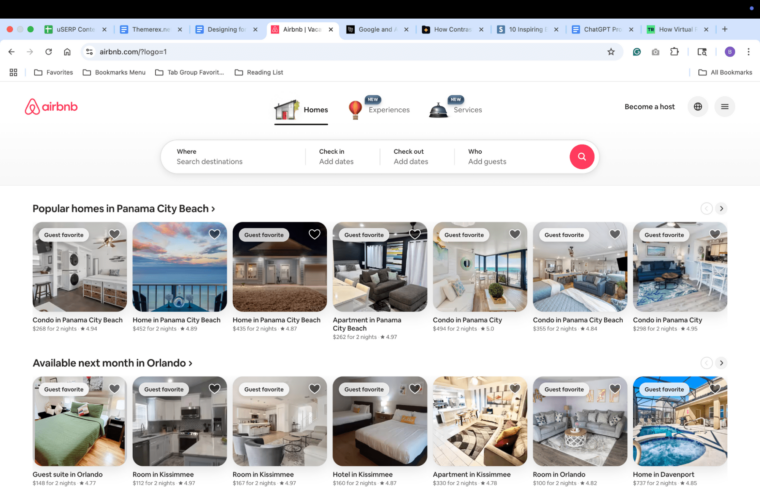
Airbnb’s homepage effectively manages visual pacing by breaking content into digestible sections with ample white space and clear headings.
2. Using Tension and Rhythm to Spark Emotions
Design can feel flat when everything looks too even, too expected, too clean. Human emotion thrives on contrast—on a sense of build-up and release.
Use visual tension to create interest. This could involve introducing asymmetry in a layout, interrupting a repeated pattern, or employing a slightly off-balance composition.
Then, resolve that tension with a payoff like a centered image, a clear call to action (CTA), or a visual that brings the page back into alignment.
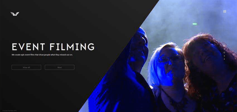
Event Filming – NewFlight website uses asymmetrical splits created with diagonal lines. This creates visual tension that grabs attention.
3. Challenge Assumptions With Contrast
Most users arrive with certain visual expectations based on product category, device type, or brand history. You can use contrast, whether visual, tonal, or structural, to break those patterns in thoughtful ways.
Pair a formal layout with casual, direct language. Use a bold, graphic color treatment inside an otherwise minimalist product page.
Place imagery in unexpected spots or break grid conventions to spotlight an important element or message.
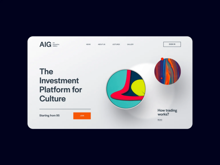
The AIG Investment platform uses bold color contrasts, combining bright 3D elements with a neutral background.
4. Create Moments That Stay With People
Most interactions are forgettable. The most memorable ones tend to include some emotional charge, such as surprise, comfort, connection, or even humor.
A small design flourish, a perfectly timed animation, or a message that sounds like it came from a real person can create a lasting impression.
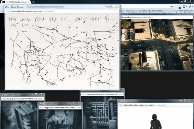
Google and Arcade Fire’s “The Wilderness Downtown” is an interactive music video project. It personalizes the experience by incorporating the user’s childhood home address into the narrative.
Endnote
As you navigate how to evolve your brand, remember that emotional design communicates before your content has a chance to. Every layout choice, type decision, and interaction sets the tone for how your audience responds and interacts with your brand.
Understanding the science behind how powerful visuals influence human behavior and using techniques that evoke specific emotions helps you craft experiences that resonate with your audience and guide them to take desired actions.
If you’re looking for more visual design resources to help you connect with your target audience emotionally, head to ThemeREX. The website offers a lot of free resources with actionable strategies!

