When building a mobile header in Elementor, you can customize the display options of individual Layout sections, based on which device they are viewed.
In order to do this, click on the Edit Section button, go to the Advanced tab, and open the Responsive panel.
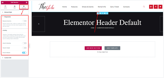
Using the visibility settings, you can decide whether to show or hide your section on the desktop, tablet, or mobile devices.
Here’s the full list of available resolutions:
- Desktop – larger than 1680px
- Notebook – from 1168px to 1679px
- Tablet – from 768px to 1167px
- Mobile – lesser than 767px
You may also choose an independent mobile header style in Theme panel > Theme options > Mobile. Here is example:

That’s it! Now you can easily create the desired mobile header in Elementor.