Layouts Builder is a free extension that comes with the ThemeREX Addons plugin. It allows you to use the Visual Composer’s interface for building headers, footers, and custom website blocks, which you can further place into any part of your page.
Layouts is a recent feature, that’s why you can find it in most of our themes created starting from 2017.
Although there are a lot of things you can do with Layouts Builder, today we’re going to concentrate on one of the most widely used elements, which is header.
Getting Started
First, we need to choose a theme that we’re going to use as an example throughout the whole tutorial. I decided to choose the Eject theme.
If we open any of its additional pages, we can see that it has the following header style by default:

Let’s say, we want to change it entirely. I’ve came up with an approximate wireframe of the header I’d like to build for our website.

We can see that the header consists of two rows. The first row contains the logo element on the left-hand side, and two text blocks on the right hand side. The second row includes a menu and a call to action button.
Now it’s time to open our admin panel and see what we can build.
Creating a New Layout
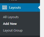
First, lets create a new header Layout by clicking Layouts > Add New in your WordPress dashboard menu.
In the Item Options panel, select Type – Header, which will make the Layout show up in the list of other header Layouts of our theme.
Switch to the back-end editor and you’ll see the familiar Visual Composer interface.
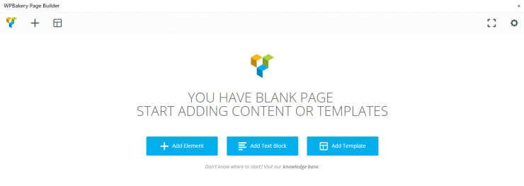
1. Adding Rows
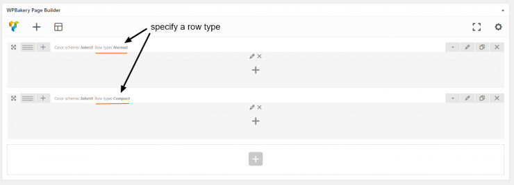
The first thing we need to do is to add 2 rows to our Layout. For each row, specify its type in the row settings under Custom Layouts tab. I’ll go with ‘Normal’ type for the first row and ‘Compact’ for the second one.
We want our elements to be positioned on a white background, so in the row settings under the Design Options tab, specify the background color. I’ll choose #FFFFFF for the first row and #F6F6F7 for the second row.
2. Content Area
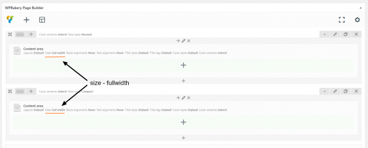
Content Area is a handy element for enclosing the row content. Add it into each of the rows, and in the content area settings, select Size – Fullwidth.
3. Inner Rows & Columns
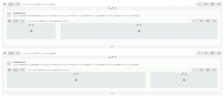
The next step is to add inner rows and divide them into columns. Add a row into each of the Content Area shortcode, and in the upper left corner of a row, choose the column structure. In my case, I’ve chosen 1/4 + 3/4 for the first row, and 2/3 + 1/3 for the second row:
4. Adding Shortcodes
Finally, let’s add shortcodes to our Layout. I’ll add the Layouts: Logo shortcode into the first column of the first row, and chose a dark logo in order for it to be visible on a white background.
Next, insert two Layouts: Iconed Text shortcodes into the second column. Since we want the content of that column to be positioned to the right-hand side, choose Column Alignment – Right in the column settings under Custom Layouts tab,
The next step would be to add content to the second row. Add the Layouts: Menu shortcode into the first column, and the Button shortcode into the second column. As with the previous column, align the button to the right by choosing Column Alignment – Right in the column settings.
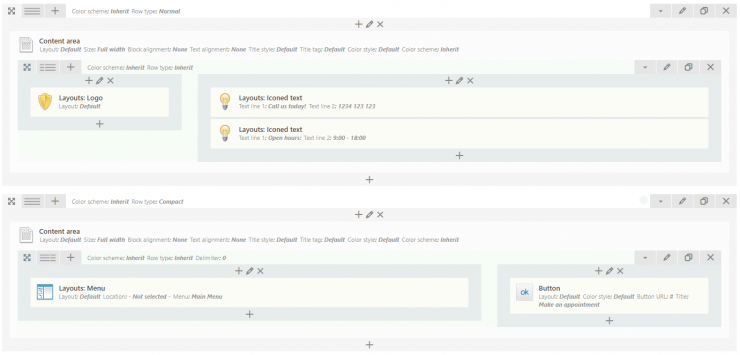
Our header Layout is now ready. Let’s see how it looks on our website.
The Result
In order to see the new Layout in action, go to Appearance > Customize, open the Header panel, and select your new Layout in the Header style drop-down list. Here’s how our it looks like on the front end:

As we can see, the structure of the Layout is very similar to the initial wireframe. We’ve managed to add all the required elements, all of which have the original theme styles.
Conclusion
Layouts Builder is a flexible tool for building header variations, and although you need to know a few tricks to use properly, the result is definitely worth it. In this tutorial, we focused on creating a header Layout, however you can use this tool to build footers and custom website blocks as well.
Hopefully, this guide helped you to get a firmer grasp over Layouts, and now you have a better understanding on how to create and customize headers for your website.
