When thinking about creating an eCommerce store, the most common question we have observed being asked is, «where do I start»?
With eCommerce, it’s easy to get lost and confused among the myriad of information out there. You might have the best of ideas, done your market research, and invested resources into the project. All of that, however, will fall short if you don’t know how to implement that plan.
To ease your confusion, and not overwhelm you with too much information, we’ve created this step by step guide to help you get started with your eCommerce journey.
So, let’s begin with the very basics.
Going Digital: Why Should You Opt for an eCommerce Website?
Suppose you’re selling products and services using offline, traditional methods of commerce. Your business is thriving, and revenues are steady. So why should you, of all people, invest your energy and resources in eCommerce?
Well, the benefits are endless. There are plenty of reasons you should opt for an eCommerce set-up today. Some of them include, but are not limited to, the following:
- Consumer Preference: Nowadays, most consumers don’t wish to purchase from regular stores. eCommerce stores give them the convenience of buying products directly from their homes or offices. Provided with the option of choosing an online store or a regular store, they are more than likely to purchase products from the online store.
- Costs: Compared with the costs of opening up a retail outlet, the costs of opening up an eCommerce store are significantly lesser. While a traditional store takes days, and even months to set-up, you can create an eCommerce store in just a couple of hours.
- Omnichannel Benefits: By giving your customers the option to purchase either from your physical location or your online store, you’re creating an omnichannel retail system that helps you gain more conversions and loyal customers.
- Increase Your Reach: Your physical expansion efforts into other regions would be more successful if you already have an eCommerce store that’s catering to customers from said region. Since everyone is online nowadays, creating awareness for your brand beforehand is an excellent tool to use.
- Inventory Management: Your website is the best place for organizing and managing your inventory. As a website owner, you can manage your inventory on your own with the help of an inventory management system.
The Best Ways to Design your Ecommerce Website

First, choose the right solution to build your e-commerce website
When building an e-commerce website, you generally have two options. You can hire a freelance web designer or a web agency to create a fully customized, turnkey site—though this approach often comes with a significant price tag. Alternatively, you can use an AI-powered website builder to create your own personalized online store. These tools allow you to design and launch a professional e-commerce site yourself—even without technical skills—at a much more affordable cost.
- Make Your Site Mobile Responsive
Responsiveness is a crucial element in eCommerce site design, and with web performance in general.
Nowadays, everybody is on the internet. They’re connected either through their tablets, PC’s, their mobile phones, and even smartwatches! The vast majority, a whopping 62% of smartphone users, purchase products through a mobile device. You don’t want to leave such users stranded when they visit your site only to find that it’s not mobile responsive.
For eCommerce, the repercussions of having a non-responsive website go way beyond the regular performance issues. In the future, if you wish to implement an omnichannel strategy for your site, you’re going to face severe operational problems when your website is not responsive on mobile devices.
Fortunately for you, mobile responsiveness won’t be an issue since there are plenty of premium themes for WordPress and many other CMS’s that have built-in mobile responsiveness.
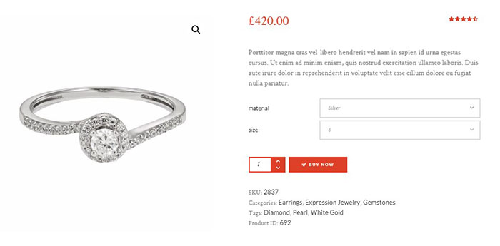
- Make Your Cart Icons and Checkout Buttons Visible
Well-designed eCommerce stores have one thing in common: their cart icon and checkout button are neatly placed to be visible on every page. Ideally, both of them are placed next to each other on the navigation menu of your site.
The primary benefit of this visibility is two-fold. On the one hand, your customers can keep a check on the products they are adding to the cart through clicking on the icon. On the other hand, with a checkout button in constant sight, they can check out from your store whenever they feel as though they’ve done enough shopping.
By enabling them to check out whenever they want to, you are also reducing your store’s shopping cart abandonment rates.
- Make Your Search Bar Prominent
Giving your customers the ability to search for products from any part of your site can help make the customer experience a lot better.
To add more value to the search, you can integrate a smart search function that provides auto-suggestions. On top of that, you can add an advanced search functionality that allows customers to search for products based on specific attributes like the product category and product type.
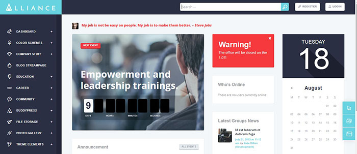
- Make Your Navigation Menu Clear
A clear navigation menu is an important consideration when designing an eCommerce store.
Suppose you’re selling all sorts of apparel items in your store. Four people, with four different apparel requirements, land on your store. Without a clear navigation menu, each customer would face equal difficulty navigating to their product of choice.
With a clear navigation menu, the journey becomes a whole lot easier. Visitors can use the navigation menu, and its associated drop-down menus to search for the product categories with a lot more ease.
For example, within the Men’s Apparel menu, you can create drop-down for Jeans, T-Shirts, Dress Shirts, etc.
- Make Your Contact Information Available
You want to be available to your buyers on every single page. To reduce their anxiety mid-purchase, you have two options: either include a contact us page at every page or introduce a live chat functionality on your site.
Being in constant contact with your customers gives them the satisfaction of having support when they are stuck with a purchase decision.
- Integrate Payments
The last phase of the checkout process, where a customer has to pay for your products, is the most crucial.
It is important to remember that not every customer is the same. Each of them will have their preferred method of payment through which they feel the most comfortable.
Now, you can’t satisfy every other customers’ preferred payment method. But what you can do is integrate several payment gateways like PayPal, Stripe, Square, or Authorize on your store. By combining so many payment options, you are essentially allowing your customers more freedom in terms of selecting the payment option of their choice.

- Make Your Customers Trust You
With all the news about online breaches, it’s logical that customers won’t trust a site that has a shady outlook from the get-go. If you are a legitimate business looking to sell products to customers, you must first gain their confidence.
Here are some of the things you can do:
- Add testimonials from other store customers.
- Add a brief note on why customers should shop with you.
- Create a privacy policy page detailing the steps you’re taking to secure your customer’s information.
- Create a page showing your logistics information and how you plan to deliver the product. Within that page or a separate page, you can also add your return policy.
Whatever way you feel will be more beneficial to your store, do it. Whatever the case, you should ideally link them together. The most common practice is to include all this information in the footer section of your site.
- Make Your Images Stand Out
Images are an essential part of your site. Since visual information can entice users into purchasing your products, you should utilize it to the maximum.
When you’re designing a site, you should always consider using appealing photography for your product pages. It is, perhaps, best exemplified in the images of travel and tourism websites since they capture images of people enjoying the moment in the various hotels, resorts, or travel.
Conclusion
Last but not least, no sort of design will get you sales if you don’t take the extra effort to promote it. Some of the best ways to integrate a design to promote your products are to include a “top-selling”, “featured product,” or a “recommended for you” functionality on your store.
In addition to that, you can also include a pop-up asking your customer to refer products to their friends, family members, and close acquaintances.
This article discussed some of the various ways we design a website for eCommerce. While incomplete (since there tons more design strategies you can use), we feel that these steps would prove very beneficial to your store when you’re first starting with designing your store.
We wish you good luck with your eCommerce journey!
If you’re looking for a developer to develop & design an eCommerce store with all the things mentioned in this article in mind, then you can hire an eCommerce developer for your business.


