
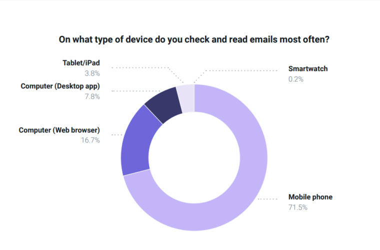
A recent Mailjet survey revealed that 71.5% of consumers primarily access their email on mobile devices. So, here’s the deal: if we want people to actually engage with our email marketing campaigns, we must deliver mobile-friendly, responsive email template designs.
This responsive email design trend raises many questions for businesses and email marketers. Here are the two we want to answer in this blog: One, How does responsive email design affect click-through rates? And two, What design elements can boost click-through rates in a mobile-first world?
Let’s get started.
What Is Email Click-Through Rate?
Let’s talk about click-through rates (CTR). It might sound a bit technical, but it’s pretty straightforward and incredibly important for your email marketing success.
So, what exactly is CTR?
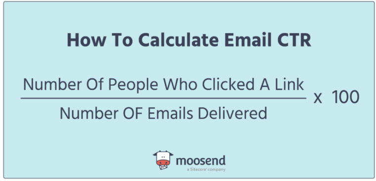
Click-through rate or email click rate measures how many people clicked on a hyperlink, call-to-action (CTA), or image within your email. A high CTR means your email reached the inbox and resonated with the recipients, prompting them to take a specific action.
To calculate CTR, divide the total number of clicks by the total number of delivered emails and multiply by 100. This number gives you a clear picture of how effective your email content is at engaging your audience and driving them to take action.
GetResponse says the average CTR across all industries is around 3.25%. But don’t fixate on this number. Your “good” CTR will depend on factors like your industry, the type of emails you’re sending, and your audience’s preferences. The key is to compare your CTR to industry benchmarks and track your performance over time.
Why Is Email CTR Important?
Imagine sending out a beautifully crafted email campaign. You want to know if your audience is engaging with it, right? That’s where CTR comes in.
Unlike the click-to-open rate, which measures activity only from those who opened the email, CTR tells you how many people out of everyone who received the email actually clicked on something. It provides a broader view of your email’s impact.
Now, you might be wondering, does CTR really matter? Absolutely!
Especially now that we can’t rely solely on open rates anymore. In the past, marketers focused heavily on open rates—the first stage of the conversion funnel. If your open rate was good, you were on the right track. However, with changes in email privacy and tracking, open rates have become less reliable. That’s why email CTR is now your go-to metric for email campaign performance.
Think of it this way: even if your open rate is above average, it doesn’t mean much if your audience isn’t clicking through to your website or taking the desired action. The ultimate goal of any email campaign is to drive engagement and conversions. If few people are clicking through to visit your website, it means you’re falling short of that goal. CTR measures this user engagement accurately, providing valuable insights into your audience’s interest in your content over time.
A high CTR signifies that your audience finds your email templates interesting enough to take the first step towards conversion, whether making a purchase, downloading a newsletter, or exploring your website. It reflects active user engagement beyond just opening the email. Most newsletter platforms offer drag-n-drop template editors that create responsive templates automatically.
On the other hand, if your CTR is low, it suggests that while people may be opening your emails, they aren’t finding the content compelling enough to click through. There’s room for optimizing email click-through rates. Perhaps your CTAs must be more enticing, or your design needs a revamp. A performance-driven email marketing agency can help refine your approach, ensuring your emails are optimized for higher CTR and driving more conversions.
Remember, the ultimate goal is to drive revenue or conversions. Even if you’re getting some sales, a below-average CTR indicates that you’re not fully tapping into your potential. More clicks generally mean more opportunities for sales.
In summary, CTR is essential for understanding how well your email strategy works. It directly reflects how your content drives your audience to the desired outcome.
What Is Responsive Email Design?
People are glued to their phones. They check emails on the go, during breaks, and even before bed. But here’s the thing: if your email newsletter looks like a tiny, squished mess on their screen, chances are, they’re not going to stick around. That’s where responsive email design comes to the rescue.
Responsive email design means your emails automatically adapt to any device, phone, tablet, or desktop. This ensures that your content always looks sharp and easy to interact with, no matter how your audience views it.
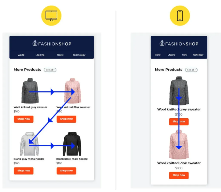
Let’s see an example. Here’s the desktop image of a promotional email I received.

It’s beautifully laid out with stunning images, clear CTAs, clickable icons, and neatly formatted text.
Now, look at the image of that same email on the phone.

Thanks to responsive design, it still looks fantastic—images are resized, text is readable, and everything fits perfectly on the smaller screen.
Without a mobile-friendly email design, that desktop layout would force users to zoom in and out. They’d quickly lose patience and might even consider unsubscribing.
You don’t need to be a coding expert to create responsive emails. Many email marketing platforms offer pre-built email templates that automatically adjust to different screen sizes. You can design your email and preview how it will look on various devices right within the software.
How Do Responsive Emails Impact Click-Through Rates?
Mailchimp reported a significant boost in mobile click-through rates for responsive email campaigns. Unique clicks jumped from 2.7% to 3.1%, a nearly 15% increase.
Here’s how responsive email templates make a significant difference:
Enhanced Mobile Optimization
Given the surge in mobile email usage, responsive design is essential for capturing and engaging this audience. By ensuring clear fonts, ample spacing, and intuitive navigation on smaller screens, responsive emails enhance readability and accessibility.
This optimized mobile experience keeps users engaged and increases the likelihood of them taking the desired action, such as making a purchase or signing up for a newsletter, ultimately boosting conversion rates.
Improved User Engagement
Responsive design significantly enhances the user experience by preventing email abandonment. Poorly formatted mobile emails often lead to immediate bounces, a problem effectively solved through responsive design.
The responsive design encourages deeper engagement by presenting a clean, professional, and easily navigable email regardless of the device. As users spend more time interacting with your email, they develop a stronger perception of your brand as reliable and customer-oriented.
Enhanced Call-to-Action Performance
Responsive design significantly improves CTA by ensuring they are prominently displayed and easily accessible across all devices. Clear, compelling CTAs with ample breathing room encourage clicks and drive conversions.
Responsive emails directly contribute to higher click-through rates by making it effortless for recipients to take the desired action.
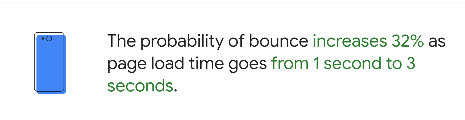
Faster Loading Times
Responsive design helps your emails load faster by dynamically adjusting content to fit the screen size. This means no more creating separate templates for mobile and desktop, reducing file sizes, and speeding up load times.
Responsive Email Design Best Practices for Higher Click-Through Rates
Want to boost your click-through rates? Let’s make sure your emails are top-notch with these responsive design tips:
Keep It Simple
Also, using the BIMI record generator can help enhance security, but ensure the layout remains simple and user-friendly.
Highlight Your CTAs
Make your call-to-action buttons stand out. Use bright colors and ensure they’re at least 44px x 44px, making them easy to tap on mobile.
Optimize for Mobile
Start with a mobile-first approach. Use responsive templates to ensure your emails look great on all devices and test how they appear on different screens before sending them.
Choose Readable Fonts
Use a font size of at least 16px for body text for readability without straining your readers’ eyes.
Include Ample White Space
Add plenty of white space and keep paragraphs short. This improves readability and prevents your email writing from feeling cramped on smaller screens.
Write Short Subject Lines
Keep your subject lines between 40-60 characters. This prevents them from getting cut off on mobile devices and helps grab attention quickly.
Test Before You Send
Preview your email on various devices to catch and fix any issues. Most email tools provide this feature, so make sure to use it.
Wrapping Up
Picture this: an email that looks flawless on every device—whether you’re on a phone, tablet, or desktop. Imagine your content-easy to read and interact with, no matter the screen size. That’s the magic of responsive email design.
With responsive design, your emails adjust seamlessly to fit any screen. Say goodbye to endless zooming, panning, and scrolling. Instead, your audience gets a polished, user-friendly experience every time.
Implementing the tips we’ve covered—like using a single-column layout, optimizing for mobile, and ensuring fast load times—will enhance user engagement and boost your click-through rates.
So go ahead and give your email templates the upgrade they deserve.