
When someone lands on your website or app for the first time, the design is one of the first things they evaluate. The layout, typography, spacing, and visual consistency all contribute to your brand’s online credibility.
Good design helps users feel comfortable taking the next step, whether that’s signing up, making a purchase, or simply continuing to browse.
If you’re looking for practical steps on how to evolve your brand, improving design should be at the top of the list. This article breaks down the specific ways design affects trust and what to focus on if you want to make a stronger impression online.
How Web Design Helps Build Online Trust: 7 Key Ways
Design is one of the first things people notice when they land on your site. It either builds trust or loses it. Here are seven ways smart design decisions help your brand come across as credible, consistent, and worth taking seriously.
1. First Impressions Are Visual
48% of people say web design is the top factor they use to judge a business’s credibility.
That initial glance at your site, before they’ve read a word, often determines whether they trust you enough to keep going.
Most users decide within seconds if they feel comfortable interacting with a brand. They’re scanning for cues that your business is trustworthy. So, if the design seems outdated, disorganized, or inconsistent, visitors start to question its quality.
Good design makes a site easy to use and a pleasure to interact with. It shows you’ve put care into how your business presents itself.
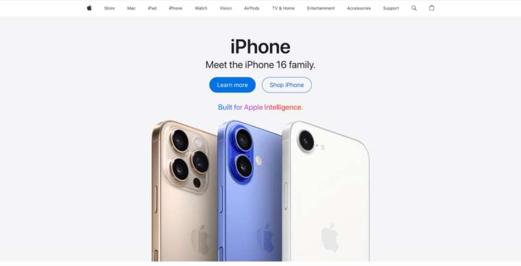
Apple’s homepage is one of the most recognizable examples of first-impression design done right. The design is clean, modern, and sharp, the moment the page loads.
There’s a clear hierarchy, generous white space, and high-quality visuals that reflect the brand’s focus on minimalism and quality. You don’t need to scroll far to know what Apple is offering. The overall layout immediately gives the impression that the brand is polished, premium, and trustworthy.
2. Consistent Branding Builds Recognition
If your design changes from page to page or looks different across platforms, people lose track of who you are. They start to wonder if they’re in the right place.
Keeping branding and design consistent makes it easier for people to remember you. It removes friction.
And suddenly, after your target audience sees your consistent branding across platforms a few times, they can easily recall your brand later without having to think about it.
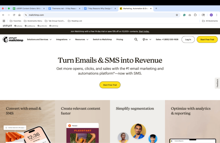
Mailchimp’s branding is consistent across its website, emails, social media, and product UI. That’s why you always know when you’re looking at something from Mailchimp, even before you see the logo. That level of consistency has made the brand easy to recognize, even in a crowded space.
3. Clean Layouts Create an Intuitive User Experience
People trust when they can understand. If your site feels overwhelming or complicated to navigate, visitors may start to second-guess whether they’ll be able to find what they need or whether they even want to try.
A clean layout makes information easier to process. It helps users move through your site without stopping to figure out how it works. Well-structured pages, with clear headings, even spacing, and logical flow, make it easy for users to find what they need quickly and effortlessly.
So, how is this done?
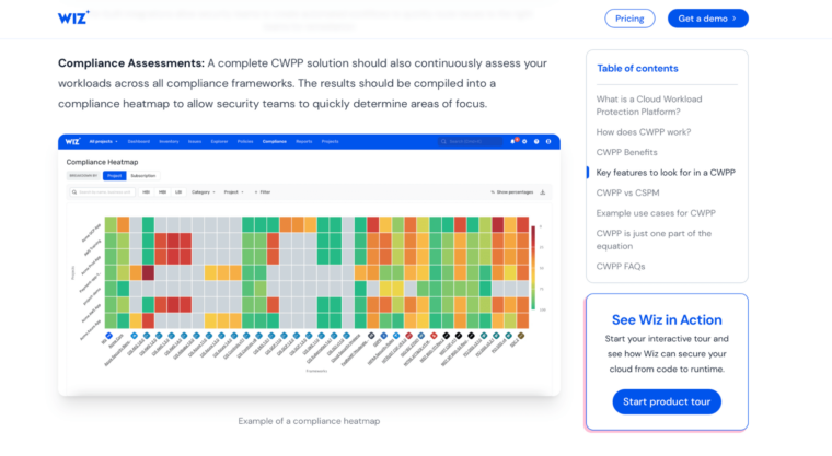
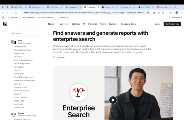
One way to build trust through design is by making complex systems feel understandable. A good example is how Wiz visualizes CWPP through clear, interactive diagrams that show relationships between cloud components, helping users grasp where risks exist and how they’re managed.
4. Visual Hierarchy Guides User Action
Most people don’t read websites like books. They glance, scroll, stop on an element that stands out, and decide in a few seconds if they’re interested.
A visual hierarchy provides people with a clear path to follow. The headline should be prominent. The key points should be short and near the top. The next step (e.g., sign up, buy, contact) should be impossible to miss.
Take landing pages, for example.
A great landing page instantly communicates value, builds trust, and drives action.
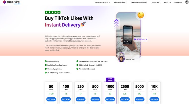
For example, take a look at Superviral’s TikTok likes page, which makes purchasing TikTok likes feel easy and credible with a bold headline, clear benefits such as instant delivery and real users, and strong trust signals, including reviews and a money-back guarantee.
The design is clean, pricing is transparent, and CTAs are prominently placed.
5. High-Quality images and Media Show Authenticity
People pay attention when your visuals are striking, relevant, and meaningful. A photo of your product in use provides visitors with a tangible connection point. A short video of someone walking through a feature or unboxing an item helps potential customers understand what they’re getting before they commit.
Showing your team at work, your office, or your process builds familiarity. Good lighting, sharp focus, and thoughtful composition make your images look more professional and stand out from the generic stock photo.
Certain web design choices, like consistent images or branded thumbnails, reinforce the impression that your brand pays close attention to detail.
Notion uses sharp, purposeful visuals that mirror how customers use the product. Its website features short, focused videos that walk through real use cases, such as team collaboration, project planning, and knowledge bases.
And they’re all presented with clean UI recordings and minimal distraction.
6. Design Reflects Attention to Detail
Speaking of detail, when a site feels well-designed, people assume the rest of your business is handled with the same level of care.
Clean alignment, consistent spacing, readable text, and thoughtful layout send a message. Details such as matching button styles, uniform padding, balanced color use, and consistent image sizing all contribute to creating a seamless user experience (UX).
Stripe’s site is a masterclass in precision. Every element is intentional. Typography is sharp and clear. Spacing is exact. Interactive elements behave smoothly. The color palette is minimal but striking.
Even the smallest UI details, like hover states and loading animations, show that the team thought through every digital interaction and built the experience with care. Each design element mirrors the attention Stripe puts into its actual product.
7. Accessibility and UX Design Show That You Care
Did you know that users with disabilities can expect to encounter an accessibility error in one out of every 24 home page elements?
This data came from a 2025 analysis of one million home pages.
That’s a lot of friction for many users.
The good news is that websites that prioritize accessibility and UX design can turn things around and show they genuinely care about users’ needs and value their online presence.
When your site is easy to navigate, readable, and inclusive, it removes barriers and creates a welcoming environment for everyone.
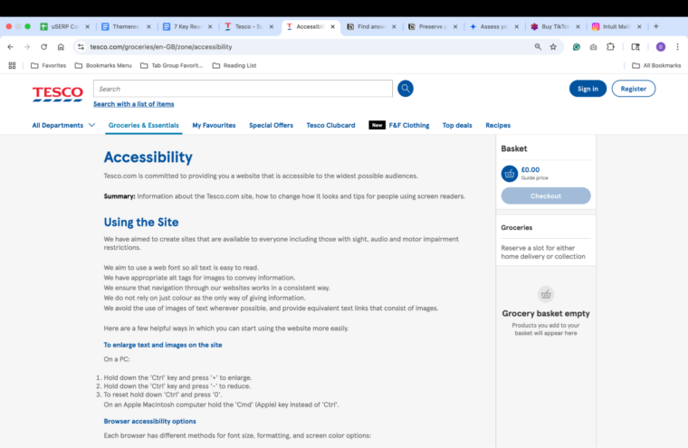
Leading organizations, such as Tesco, have demonstrated that investing in accessibility improves usability for people with disabilities and enhances the overall experience for all users.
For example, Tesco’s collaboration with accessibility experts led to a 350% increase in online sales. If that’s not building trust, what is?
For more information about Tesco’s commitment to web accessibility, take a look at its accessibility page.
How to Evolve Your Brand and Build Trust With Irresistible Design
When visual choice is intentional, your brand becomes easier to trust — and harder to forget.
Here’s how to evolve your brand and stand out from the crowd:
- Create microcopy that reflects your tone: The words on your buttons, error messages, and tooltips should sound like you. Even the small bits of copy help shape how your audience experiences your brand.
- Design for edge cases: Consider what happens when something goes wrong, such as a failed payment, a 404 page, or a form that doesn’t submit. Clear, human responses in these moments build user confidence than perfect scenarios ever could.
- Use animation with purpose: Subtle movement can reinforce feedback, guide attention, or make transitions feel smoother. Do this well, and your site will feel more polished and alive.
- Build trust signals in overlooked places: Instead of cramming all your reviews or guarantees into one section, spread them out next to pricing, website forms, or feature lists. These are areas where people might need extra reassurance.
- Incorporate user input into your interface: Show social proof, usage data, or customer favorites directly within your product or website. People trust brands with products that real customers use and value.
- Start onboarding with one clear path: When a visitor visits your site for the first time, don’t give them too many options. Guide them toward one specific action, such as reading a post, exploring a feature, or viewing pricing. It builds trust by removing friction and demonstrating that you’ve planned for their next step, rather than leaving them to figure it out on their own
Final Thoughts
If you want to learn how to evolve your brand and build customer trust, visual design is one of the most effective places to start. The way your site looks, reads, and functions tells visitors what to expect from you.
A clean layout demonstrates your ability to communicate effectively. Consistent branding shows you’re organized. Clear navigation, high-quality visual elements, and thoughtful structure show that you care about your visitors’ UX.
Once you get the design right, the rest of your site has a chance to convert those visitors into customers.
Head to ThemeRex and explore our themes offers for any type of business.

