Do you remember how e-commerce websites looked ten years ago?
It was a lot different than they look today. They are more engaging and attractive. Of course, they are faster. They give you a better idea of how the product looks and works. The overall customer experience is improved. In fact, it won’t be wrong to say that overall online shopping experience is now closer to the actual store shopping experience.
No wonder, more people are trusting online shopping than ever before. It is no surprise that the number of online shoppers across the world is projected to surpass the 2 billion mark by the end of this year. In terms of revenue, global e-commerce revenue is expected to cross 4 trillion in 2020.
If there is one thing we can extract out of these numbers, it is the fact that e-commerce should be the primary focus of any business. Even if you have a brick and mortar store, you need to be able to cater to that huge chunk of customers who prefer shopping online.
Since your competitors are also on the same page, you need to really invest in a site that can stand out. Invest in a custom web design, but make sure it has the following essential elements.
Your Brand Insignia

One thing that is essential for your brand identity is the brand logo. Take a look at your site again. How noticeable is it in the first glance? For online shoppers, a prominent logo is a sign of trust. It presents your business as a brand. A brand that is proud of itself. As your business grows, your logo is bound to become a valuable asset.
While all of this sounds like common knowledge, you will be surprised to know how many businesses often overlook this important detail. We have seen numerous stores that do not have a big and prominent logo right where it can be seen. We will think twice before trusting those stores.
Product Details
Are you selling a unique product or is it something many other stores have as well?
Either way, you need to make the product seem better than what everyone else has. If you have your own unique product, your description should be able to distinguish it. If you have a product that is available at many other stores, you need a powerful description that describes the product better than any other store can. This will make your customers more confident about the buying decision.
- Think Beyond High-Resolution: As for the image, don’t limit yourself to simple images. You can now utilize the 360-degree image option to give customers a better idea of how the product actually looks and feels. It is a great idea to include a video but that should be an addition and not as a replacement for images.
Include Reviews: 70 percent of online customers check for reviews before they make a purchase. Naturally, they trust customers more than the business. Nearly 60 percent are more comfortable buying products from sites that include reviews.
Navigation Elements
Simple navigation is more intuitive. You don’t want your visitors to get all confused and leave. Effective e-commerce design is, therefore, all about simplicity. You should make their experience as easy as possible. Anything they need, they should be able to find without going through numerous pages and products. It is crucial for the overall user experience. It can play an important role in improving conversion. If your site’s navigation isn’t easy or simple, it will send your visitors bouncing off.
Now, we can dissect the term navigation and break it down in features that matter:
- The Navigation Menu: We have all been on sites that have an awful navigation menu. That usually happens when people try to get too creative with navigation. It is better to stick to something that people are already used to unless you have a breakthrough that can make navigation even easier and simpler.
- Search Bar: Ironically, the search bar is often the most difficult element to find on some sites. Make sure that isn’t the case with your site. The search bar should be on the top of every page.
- Categories: Give your users the freedom to easily navigate through categories and subcategories. This will help you refine the search option as well.
Simple Checkout
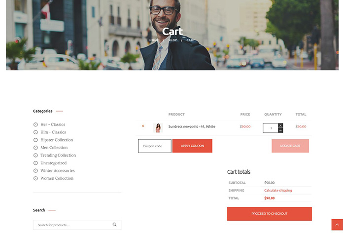
The cart abandonment rate is still quite high for e-commerce stores. A large number of users abandon the cart because of the length and complicated checkout process. This has been one of the biggest e-commerce web development challenges we have to answer.
Creating a positive checkout experience has two main advantages: it reduces the abandonment rate and it makes them come back for another purchase. Make sure they are able to clearly see what’s in their cart and what they will be charged. There are two features that can enhance the checkout experience.
- Guest Checkout: Some customers are more skeptical than others. Some just don’t like filling in a lot of information. Guest checkout gives them the freedom to purchase without providing too much information or going through the sign up process.
- Multiple Payment: Your e-commerce site should accept multiple payment options. Make sure the payment is secure.
Trustmarks
Security is still a huge concern that keeps people from trusting online stores. Trustmarks give you a chance to tell them that you have invested in keeping them secure and safe. Trustmarks are logos of companies and organizations committed to keeping e-commerce secure. These include BBB, McAfee, GeoTrust, etc.
You can earn those trust marks by fulfilling the security criteria these organizations have set. You can pass the tests and display all those certificates on the site to win your customers’ trust and confidence..
Social Media Integration
Many e-commerce store owners don’t realize the importance of social media integration. Around 87 percent of the users believe it is extremely important for their decision. They surf the social profiles of business before they decide to make a purchase.
You need to show them that you are not just present but also active on social media. You can add social icons on every page, but there is an even better way to leverage the power of social media. You can include your FB, Twitter, or Insta feed on your site. These features can bring an influx of user-generated content that can work just as well as user reviews and feedback.
Live Chat
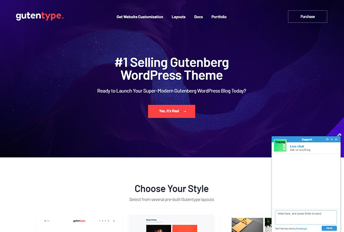
No matter how elaborate your product descriptions are and no matter how descriptive your images and videos are, some prospect may still have queries. How you answer those queries says a lot about how trustworthy you are as a business. The easier it is to get in touch with you, the better the overall customer experience of your website. That is why Live Chat is such an essential feature.
The popularity of Live Chat is understandable. People generally prefer texting overcalls. It is why 50 percent of your customers are more comfortable with chat support as compared to phone or email support.
Conclusion
The key to creating a high converting e-commerce website is to make it user-friendly and trustworthy. That should be your focus when deciding on design and development elements. Go for simplicity and ease of use, and make sure there is everything your visitors need to decide whether they should trust you or not.


