
Kinetic Typography
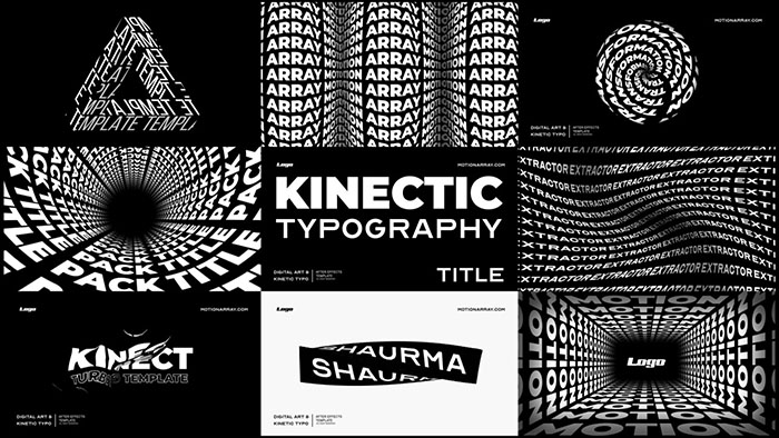
In other words, kinetic typography is moving text. This animation technique can easily grab people’s attention.
This style appears when the author needs to express complicated ideas and make users finish reading the text. Such video animations have elements of the game in it and make viewers catch every word appearing on the screen.
Kinetic Typography can be used for commercials, music videos, business presentations and even sites for gamers.
The animated text has an amazing power to keep even complex information entertaining. It makes words more impactful and adds an element of artistry. For that reason, moving text is so popular and trendy.
Talking about the text it’s important to mention the fonts’ trends. Things are getting bolder with heavily weighted fonts being used more frequently.
Designers tend to use heavy but simple fonts when they need to get the message across quickly and clearly. It’s important to keep the balance and don’t overuse heavy fonts. Also, part of the trend is a broken text. Animators play around with fragmented texts to give a video positive vibe and poetic atmosphere. And it seems to work well.
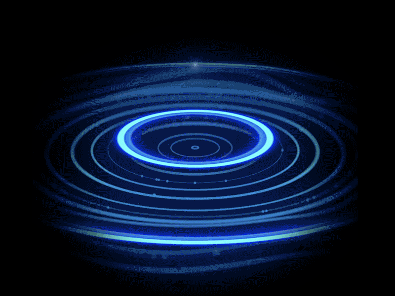
Liquid Motion
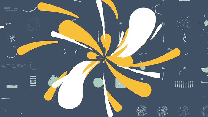
This style of animation implies the transformation of shapes in a liquid way. The trend was popular in the ‘60s with its psychedelic shapes, twists and bends.
Ant through the years, liquid motion reached a new level of creativity. This trendy style works well for many spheres including advertisement and anime movies. Smearing of forms and its quick turning into quite different objects create a bright impression and makes a viewer focused on the action.
Abstract drops and smears often appear together with people in the frame creating a surrealistic atmosphere. The characters’ body parts can be stretched and swirled. An indistinct squiggle becomes an important inscription. All this brings us to the thought that liquid motion is a way to change perceptions and emotional state of the viewers. For that reason, this style of motion design is really catchy.
Heavy CGI Glossy Idents
CGI effects have been popular for many years. On average, TV channels, programs, and movies have short sequences consisting of CGI elements. It seems this style of graphics never goes out of style. Why is it so? The thing is these heavy glossy idents are fascinating and meaningful. This style of motion design is able to identify a certain film or TV-show and become deeply ingrained in the viewer’s consciousness.
Also, CGI 3D visualization gives great opportunities for bringing brave ideas to reality. Every customer can count on the realization of his vision thanks to CGI technologies. Catchy commercials based on individual vision and made with the help of CGI techniques can be compared to business cards. These designs are memorable in their own unique way.
Isometric Design Animation
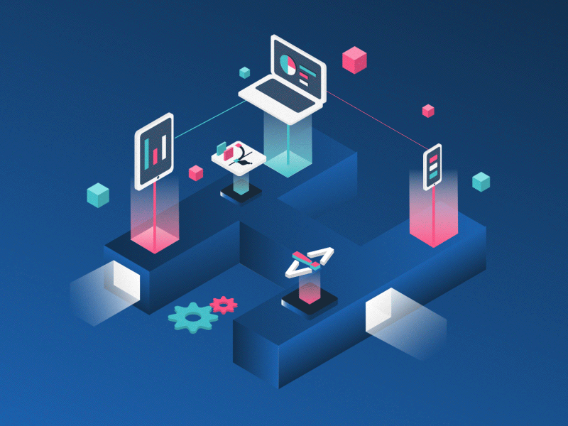
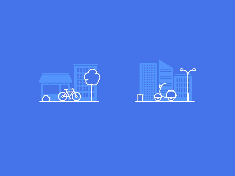
Isometric animation consists of 2D objects which have 3D aspects. This style strikes the balance between 2D and 3D design with the help of animation elements, color control, and special backgrounds. What is the power of isometrics? To be simple and give the illusion of three dimensions at the same time. Such designs apparently help to reinforce companies’ branding. It can be used everywhere – from website homepages to blog posts and social media.
Isometric animation can be a good solution for an explainer video, splashy logo, video games, advertisement, app design, and more. The isometric design contains many concepts that make it possible to create eye-catching videos for any area. It’s easy to explain to customers how things work in any sphere of business using isometrics. No wonder it becomes trendier.
Minimalist Animation
Say more by showing less. It’s the motto that fully describes the point. Minimalism is always relevant and popular. Today new minimalism goes about everything from colors and shapes to the whole concept. What makes it advanced and modern? The secrets of the fresh view on minimalism are bold styles, a lot of space, expressive textures, and more. It’s amazing how the message of the design becomes clearer when there are no secondary elements. But to escape complexity is a challenging task. One has to keep the bare necessities, leave spaces, and maintain order to create a balanced meaningful design.
Minimalist designs get more popular not only because of aesthetic reasons. Minimalist animations really help to reduce the web page loading time. And as we know, Google tends to rank pages that load quicker higher up in the search results. It is not surprising, the minimalistic trend is taking the tech world by storm.
Fantasy
Artists add more and more fiction into motion designs these days. Fantasy characters and incredible landscapes, magical creatures, and artifacts always wake imagination and call attention. And when mythical images come together with reality it makes a design breathtaking.
The mix of imaginary and real creates an inspiring feeling that everything is possible. It captivates and even charms because many people look forward to bringing their favorite fiction characters to real-life circumstances on the screen. This trend also includes the use of abstract and dreamy plots and drawings. Such a feature guarantees that your brand will stand out and look unique. The main thing here is making sure that the audience understands the meaning of the design.
Seamless Transitions
Seamless perfectly connected transitions make a viewer’s mood relaxed and keep him entertained at the same time. This style of motion design makes a video so smooth and naturally flowing that it’s nearly impossible to stop watching it. The second you hit the “play” button sleek lines, calm colors and harmonious transformations seem to be the waves carrying you away with the story. It should be mentioned that this style implies genuine muted natural colors and artistic forms. Muted color palettes make graphics more natural authentic. Rigid shapes and contrasts give way to something much more flowing and soft.
Retro Motion Graphics
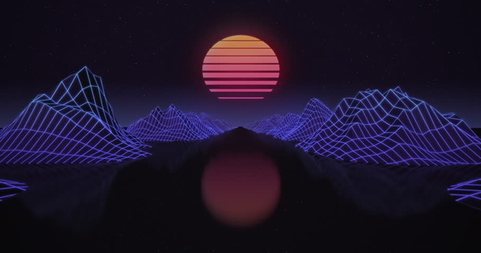
Nostalgia is one of the constant requests of adult users. It’s not surprising retro style appeared in the list of design trends. People feel engaged with such graphics which makes it catchier. Thus, designers try to refresh retro styles a bit. They use old shapes colors and textures as the source of inspiration for creating modern versions of well overlooked old.
What common features of retro graphics are? Earthy tones, grunge style, the effect of newspapers or comics magazines, noise textures, and everything that can create a retro atmosphere. Going monochrome is also one of the easiest methods for making a design look retro and trendy. It’s interesting that designers are eager to create something modern even if they are inspired by the past. Therefore they tend to use sci-fi aesthetics of previous generations as the basis for new artworks.
3D + 2D
3D is a strong trend that remains leading in many areas including the advertisement, business presentations, and game design. But in 2020 the combination of 2D and 3D becomes most urgent in design. How does it work? Objects on the screen usually are designed in 3D but they appear in 2D frames. Such mix, as well as trendy double exposure, helps to open the viewer’s mind and convey a variety of new ideas. It increases watch ability by zooming 2D / 3D transitions. These videos look fresh and futuristic which draws people’s’ attention. By giving 3D objects a 2D look, animators are able to make expressive, illustrative elements that immediately attract a viewer’s attention. Along with it, pictures deliver information in a clear and colorful way.
Line Art
No one doubts that designs consisting of thin lines look clean, unobtrusive, and inspiring. It reminds of original drawings and adds a certain charm, appeal, and allure. Also, it creates a minimalist atmosphere and makes the whole picture reserved, natural, and harmonious. Heavy complex forms aren’t so catchy and soulful as graphics consisting of thin lines. Simple and delicate style forces to emphasize key characteristics and make them understandable for the viewers. And the line art reaches this goal thanks to many effects. One of them is the thin shapes are a lot easier on the eyes. Line art is a trend for those who want to be modern and relatable.
Conclusion
Trends in motion design are all about keeping things simple, creative, and natural. No vivid colors or sharp heavy forms. Experience proves that design doesn’t need to be complex to be effective. The main attention catchers of modern users are abstract dreamy illustrations, clean minimalistic layouts, mixed ways of information delivery, and retro vibe. As for the colors, muted pallets and gradients dominate. Natural looks, creative experiments, and informality win.

