The year 2025 was quite challenging, to say the least, but we’ve all managed to come through quite well despite all odds.
Nevertheless, we are on top of the latest trends of web designs that were generating buzz in the web industry. As there is a constant increase in the number of users visiting websites every day, the demand for a better user experience has also risen exponentially.
That’s why many web designers make tremendous efforts to find innovative ways to gain traction on their website.
Website design companies in NJ are already adapting to the revolutionary design aspects, and to standout today – I recommend you start revamping your site too.
So, without further ado, let’s get started on the top eight web design trends that you surely see more of in 2026
3D Visual Elements
Websites with 3D elements illustrate a sense of realism which is captivating users for almost a decade.
Web designers make great strides in developing a website that creates a lasting impression in the users’ minds.
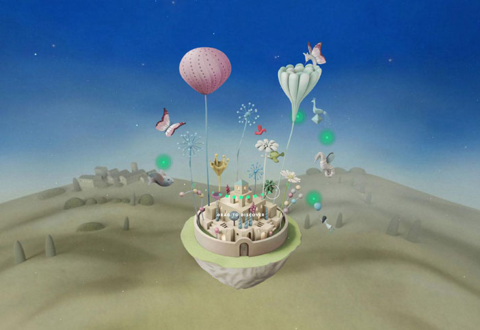
One of the prime examples of perfect utilization of 3D elements is of Camp Alle Comete. The website design of a wine store generated a lot of buzz because of the harmonic background score and the unique portrayal of a floating city on hot air balloons.
Asymmetric Layouts
Symmetric layouts have been done to death in the web design industry. They work great for highlighting all the key elements on a webpage as they are developed in a gridlock structure.
However, because of the constant repetitions, they have become mundane and, do we dare say, boring.
On the other hand, asymmetric layouts bring out a vibrant and energetic feel in web design. They illustrate the web design in motion, which makes it quite engaging for the visitors.
In 2026, aspiring web designers have to change web design norms and find unique and creative ways to make their web designs stand out.
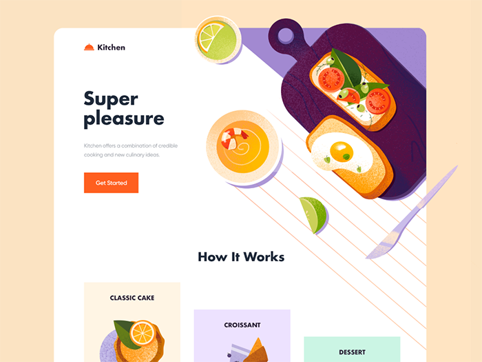
For inspiration, have a glance over the example above, where you can see all food elements are in an asymmetrical order. Still, it does a pretty good job keeping the users engaged by highlighting the content in an organized manner.
Voice Based User-Interface
The advent of Siri, Cortana, Alexa, and other similar intelligent voice assistants gave rise to what we refer to as dynamic voice search.
According to eMarketer, one-third of the US population utilizes voice features to do searches, which will most likely increase in 2026.
This feature still has a long way to become mainstream.
Nonetheless, it’s more important than ever before for web designers to adapt and incorporate voice and virtual assistance to make their web designs relevant before it’s too late!
Asymmetric Layouts
Keeping the minimum website loading time is one of the best ways to keep the users engaged and to reduce the bounce rate.
It’s not a trend but a cardinal rule of SEO to provide a better user experience.

According to John Mueller of Google, the loading time of the website should not be more than two seconds. Otherwise, the users are most likely to bounce.
So, no matter what year you’re creating a web design, you need to improve your website’s loading speed to improve the user experience.
Utilizing Lazy Loading
There are various websites that require high-resolution images to provide a better user experience. However, they tend to slow down the website speed, which is quite a dilemma for web designers.
There is a smart way to do this, which lets you upload the heavy images and doesn’t let the user suffer as well—lazy loading.
It’s a standard web design practice that is most commonly used in long and extensive web pages.
As you may already know, that many users don’t usually scroll down to the end of every web page they visit. So, why would they want to waste their bandwidth on the offscreen part of the web page?
That’s where lazy loading comes in. It lets the web browser loads only a visible part of the website to the user and tends to load further as they scroll down.
Using AI Chatbots
AI chat-bots is another dynamic web design feature that everyone is looking forward to in 2026.
Various research is conducted on artificial intelligence and machine learning. The biggest advantage of AI and machine learning is that their continuous process of learning. That means they learn from their mistakes and not to repeat the same mistakes.
There will definitely be a time when they become a part of our daily lives.
Therefore, it’s essential for aspiring web designers to include AI chatbots to be more human-like to assist the users better.
One of the prominent examples of AI chatbots is of Bank Of America (BofA) called Erica.
Erica is a customer support chatbot that helps the clients of BofA in their general queries, such as balance inquiry, credit history, transferring of money, make and schedule payments.
Erica also does advance assistance, including running analysis on the users’ financials and notify whether they are eligible for loans, and provide other financial assistance.
However, a human customer support team always on-the-clock to take over Erica whenever she reached her limit.
Augmented Reality (AR) and Virtual Reality (VR)
If you want to up the game of your 3D elements on your website, then utilize AR and VR technology.
The technology itself is quite engaging, but when you incorporate it into your web design, it will definitely skyrocket the user experience and gain traction.
In the coming years, AR and VR technology will be a prime factor in their buying decision.
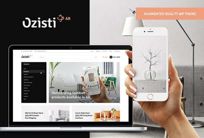
For example, the IKEA app has AR features that help potential customers view the intended look of furniture on their empty space.
Thumb-Friendly User Experience
In 2026, there will be no excuses for making irresponsive websites. Your web design will only thrive if you have a responsive design and a thumb-friendly user experience.
Typically, all mobile users use their thumb for navigation.
Therefore, when creating a website, it’s crucial to include all the key elements into the thumb zone. That includes the menu bar, contact number, live-chat option, and more.
Conclusion
As we are hopefully looking forward to the year 2026, there will be a lot of challenges for web designers in making web designs engaging for the audience.
However, when you follow the trends of making your web designs responsive, thumb-friendly, and utilize AR and VR technology, you will make a better user experience.

