According to Statista.com, developers have earned more than $86 billion through iOS apps since the launch of the App Store in 2008. Tencent, Sony, Microsoft, Apple, Google, and Nexon are among the top ten companies earning most revenue through their mobile gaming apps. The app statistics also show that mobile games and business apps rule the iOS world while tools and communication apps tend to do better in the Android app categories.
Web designing assignment help experts have been studying the web and app development trends for students and digital marketers for years. They agree that as the customers are becoming more and more tech-savvy and checking their phones to find suitable products to buy, businesses are seeing the logic behind launching their respective apps to get an early share of the global and local digital markets.
Yet, it is not always easy to translate your idea of how your app should look like to a web designer or an app developer. App mockup tools help you solve this problem within minutes. Here is a step-by-step guide on how to mock up your dream app quickly and smoothly:
Choose the Right Mockup Tool for You
You do not have to be a technical or designing wizard to be able to make a tangible app prototype. There are a number of mockup tools available online that allow you to make a clickable version of your sketch to share with your designers or colleagues or even a full-fledged prototype that you share with your investors or potential customers.
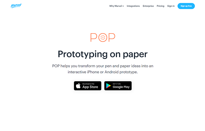
For example, Pop allows you to click a picture of your sketch and make it clickable within the app. Keynotopia allows you to use templates and design components to create sophisticated clickable mockups in various formats. Google and NASA prefer FluidUI where you can drag and drop different widgets and components and customize your designs endlessly.
The free Adobe XD app mockup creator allows you to design and prototype websites and mobile apps as well as play with touch screens and voice interactions. NinjaMock is perfect for the first-timers though.
Define the Views You Want to Use
Once you create a free account with Ninjamock, it asks a few questions to understand your need better. Answer the questions correctly and start creating.
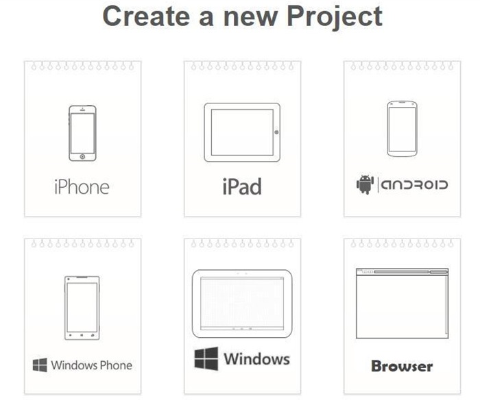
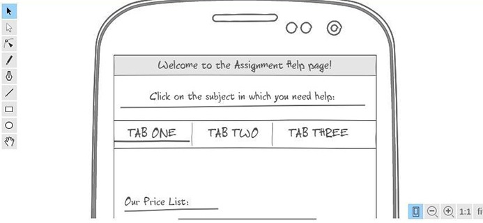
There are a number of elements in the left column which you can drag and drop on your screen. Essentially, you can create designs for different views your app will have. You may have a homepage, a signup page, a login page, profile page, a timeline of your activities on the app, a settings page, a navigation page which is essentially the sitemap for your app, an overview page of the app, Groups page, a page where users can create something etc.
You’ll have to decide which types of templates your app will need depending on its purpose. For example, an expert who offers website designing assignment help may have an app where students can sign up or log in, place an order, check out the sample assignments the expert has done, see the price the expert charges for different kind of assignments, and perhaps, check the previous orders the student has placed earlier. All these pages will have different kinds of layouts and you’ll need to prepare different templates for each purpose the app will serve.
Choose a Color Palette and a Corresponding Theme
Once the sketch or the wireframe of your app mockup is ready, it’s time to decide on a color palette. There are many mockup tools like InVision which offer a delightful spread of color themes based on your preferred colors.
Gone are the days when web designers were advised to use colors that were ‘safe’ and could be replicated on any device easily. Now, the devices have become more sophisticated and can produce richer and more vibrant shades easily.
In 2019, the electric hues and bold contrasting color schemes of the 80s and 90s are expected to make a comeback. When you choose a theme, make sure you do not go overboard with the ‘unconventional’ and compromise with your brand identity. Millennial Pink, the toned-down version of the Barbie Pink, became quite popular in 2018. You may also try gradients and duotones to make a signature background color for your app.
Customize Your Theme
It is at this point you make a theme unique by showing a little creativity. Tweak the colors, move around different elements, and modify the app titles and button names as you like them to be. While you are still experimenting, you might want to keep a copy of the original screen to which you can revert anytime you want.
At this point, you might also want to hide or delete the screens or layer groups you won’t be using and rename the ones you are going to use. It will make it easier for you to refine the app walkthrough for a prospective client or user.
Put the Final Touches and Share
Once you have a basic prototype ready, use your preferred mockup tool to animate it. Some tools allow you to make your buttons clickable, and others allow the users to scroll through different screens and test them across various devices. Showing someone how your app will work is the best way to gauge his or her user experience with the app idea you have.
Share your design with others on your team and hire the experts to make your dream come true!

