The internet is constantly changing, and with it, the trends in web design and user interface (UI) change. If you want your website to stay up-to-date and look modern, you need to know the latest trends.
Web design and UI trends update continuously, but tattoos are always in vogue. Ink-Match has many inspiring designs, and many talented tattoo artists gathered in one place.
We collected some of the top web design and UI trends for 2022. Keep reading to learn more!
What Has Influenced Web Design Trends in 2022?
A few key things have influenced web design trends in 2022:
- The rise of mobile devices and the need to optimize websites for smaller screens led to a trend towards minimalism and simplicity in web design.
- There has been a shift from traditional desktop browsers towards newer, more versatile browser-based applications. It has increased HTML/CSS and JavaScript for web development.
- The popularity of social media and other online platforms has made it essential for websites to be easily shareable and visually appealing.
As a result, we see an increase in responsive design, video content, and animation on websites.
Main Trends in Web Design and UI
The past year has been a big one for web design and UI. We’ve seen many new trends emerge, and some old ones come back in style. Here are a few of the top trends in 2022:
Memphis Design
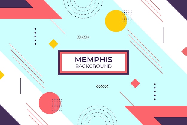
The Memphis design style was popular in the 1980s and early 1990s. It contains bold, geometric shapes and bright colors. This year, we see a resurgence of this trend in web design. Colorful, geometric patterns and shapes are used to create eye-catching designs that stand out from the crowd.
Oversized Hero Image
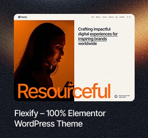
The typographic hero image is one of the most popular web design trends for 2022. This trend is all about using large, bold text to create an impactful hero image on your website. You can use it to showcase your company’s branding or make a statement about its values.
Retro Revolution
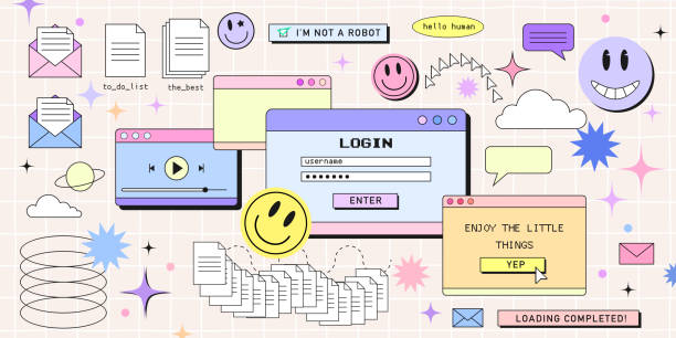
We’ve seen a massive resurgence in all things retro this year, and that will not stop anytime soon. The ’80s and ’90s are back in a big way, so get ready to see more neon colors, geometric patterns, and chunky fonts. This trend is all about having fun with your design, so don’t be afraid to experiment!
You could try using bright colors and bold patterns to create an eye-catching website or app interface. Or why not experiment with some vintage-inspired typography? Whatever you do, make sure it looks modern and fresh.
Visible Borders
One trend that is sure to stick around for a while longer is visible borders in web design and UI. This trend first gained popularity in 2018 and has been steadily growing since. Visible edges help create a sense of structure and hierarchy on a page, making it easier for users to navigate and understand the content. It is possible by using a different color for the border or by making it thicker.
Alluring Interactives
The trend for 2022 is for more engaging, interactive content on websites. We see a move away from static and towards sites that feel more like games or apps.
If you’re looking to add some interactivity to your site or app, consider using one of these top web design and UI trends for 2022:
- Quizzes and polls;
- Interactive infographics;
- Maps;
- Timelines;
- Augmented reality (AR);
- Virtual reality (VR).
Interactive Typefaces
Interactive typefaces are a growing trend in web design. Some examples of interactive typefaces include:
- A kinetic type moves as the user scrolls down the page. It creates a more dynamic and engaging experience.
- The user can customize variable fonts. It allows for a more personalized experience and gives more control over the look and feel of the site.
- WebGL fonts provide a three-dimensional look.
Scrolling Experiences
In recent years, as more and more people use their smartphones and tablets to surf the web, designers and FinTech UX design companies are starting to focus on creating unique scrolling experiences optimized for smaller screens. The most popular instruments are parallax scrolling, infinite scroll, or simply making sure that all content is easy to find and access. Parallax scrolling creates a sense of depth and movement by using layered images that move at different speeds as you scroll down the page.
Micro-interactions
Micro-interactions are another big trend that’s been gaining traction in recent years. These small animations help guide users through your website and make the overall experience more engaging and fun. Some examples of micro-interactions include:
- Animated buttons;
- Hover effects;
- Tooltips;
- Loading indicators;
- Progress bars.
Three-dimensional Elements
The popularity of three-dimensional elements continues to grow in 2022. This trend increased the use of virtual reality and augmented reality technology.
Some examples of elements that you can use in your web designs include:
- Three-dimensional images;
- Video backgrounds;
- Virtual reality simulations.
Neo-brutalism
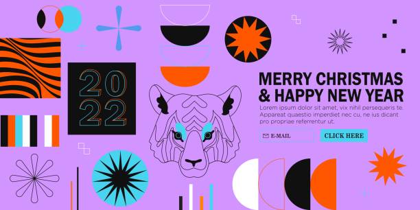
This design trend is all about raw, honest expression. It’s stripped back and eschews traditional beauty in favor of an edgy, almost punk aesthetic. This look is achieved through harsh geometry, stark colors, and often brutalist architecture.
Material Design
Material design is a visual language that synthesizes the classic principles of good design with technology and science innovation. Google developed it in 2014, and many major companies have since adopted it.
In material design, everything is based on a grid system. This system allows for consistency across devices and provides an easy way for designers to create responsive layouts. It also includes extensive use of shadows and depth to give elements a sense of place in the UI.
Google has also recently announced an update to the design, that includes new guidelines for animation, layout, and typography. These changes aim to make the material design more flexible and adaptable to different screen sizes and devices.
Handmade Graphics
The current trend is all about handmade, organic graphics. It means that designers use hand-drawn illustrations, watercolors, and other traditional mediums to create their designs. This trend is perfect for giving your website a unique and personal touch.
Flat Design
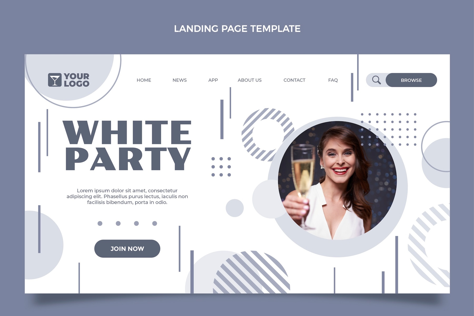
Flat design is a minimalistic style that emphasizes usability. It has simple shapes, bright colors, and typography that is easy to read. The goal is to create an interface that is clean and efficient.
One of the benefits of flat design is that you can use it on any device, from desktop computers to mobile phones. This trend will continue to gain steam in the coming years as designers move away from skeuomorphism and cleaner, more modern aesthetics.
Complex Gradients
One trend we’re seeing emerge is using multiple gradients layered on top of each other to create a rich, multi-dimensional effect. It adds depth and interest to flat designs or creates intricate patterns and backgrounds.
One more popular idea is the use of gradient maps. The image is mapped on a gradient to take on the colors of the slope. It creates stunning visual effects and is a great way to add color and interest to any design.
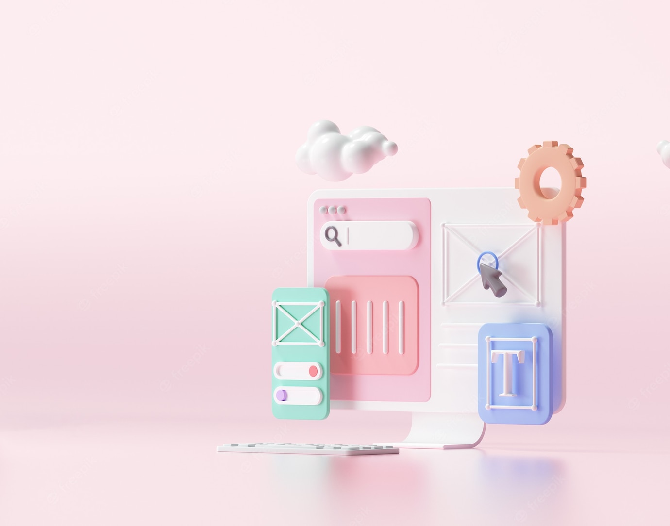
Claymorphism
Claymorphism is a design trend that takes inspiration from clay and ceramic objects. It first gained popularity in the world of product design, but it has since made its way into web and app design.
Some of the critical features of claymorphic designs include:
- Rounded corners;
- Soft edges;
- Organic shapes;
- Warm colors;
- Textures that mimic clay or ceramic objects.
Glassmorphism
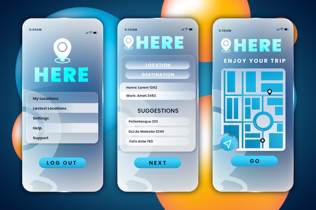
This trend involves using semi-transparent layers, which creates a beautiful effect. It adds depth and dimension to your design while still keeping things minimalistic. It is perfect for those who want their designs to be eye-catching but not overwhelming.
You could use it for buttons, headers, or even background images.
Home Pages without Images
The home page is the most crucial page on a website. Traditionally, home pages have been pretty image-heavy, with large photos or graphics that give visitors an immediate visual impression of the site’s purpose. However, more and more sites are doing away with images on their home pages altogether.
There are a few reasons for this trend:
- First, images can slow down page loading times, which is frustrating for visitors.
- Second, many people are now browsing the web on mobile devices with smaller screens, and images can take up a lot of space.
- And finally, some sites don’t need images on their homepage to communicate their message.
Split-screen Technique
We’re seeing a lot of designers using split-screen techniques in their work. It involves having two or more elements on the screen simultaneously, often with one piece being dominant. This trend is perfect for those who want to make a bold statement with their design. It’s also great for creating an immersive experience for users.
Mega Footers
A mega footer is a large, complex footer that contains a variety of content blocks. These content blocks can include things like contact information, social media links, navigation menus, etc. Mega footers are beneficial because they give visitors a wealth of information at their fingertips. They’re also great for SEO purposes because they help improve your site’s crawl ability.
Inclusive Design

With the increasing popularity of accessible design, it’s no surprise that inclusive design is one of the top web design trends of 2022. Inclusive design is all about ensuring that your website can be used by everyone, regardless of ability or disability. It includes using alternative text for images, ensuring your site navigates using a keyboard, and providing captions for videos.
Optimistic and Fun Designs
We’re seeing a lot of fun, optimistic and cartoony designs inspired by the post-pandemic world. So if you’re looking to add a little optimism and joy to your website or app design, here are some of the top trends in 2022:
- Vibrant colors and patterns;
- Playful illustrations and animations;
- Asymmetrical layouts;
- Bold typefaces;
- Imperfections (yes, really!).
Gender-neutral Design
There’s been a shift toward more gender-neutral design in the last few years. It is likely to continue into 2022 as we move away from traditional ideas about what is “masculine” or “feminine.” We see more muted colors, simple shapes, and clean lines. And while there will still be plenty of pink and blue products on the market, they’ll tend to be more subdued shades than we’re used to seeing.
One-page Websites
The one-page website trend continues into 2022. This type of website is perfect for businesses that want to make a solid first impression and provide visitors with all the information they need on one page. Web sites are more minimalistic and focus on delivering a great user experience.
Some of the benefits of one-page websites include:
- They’re fast and easy to load.
- They’re easy to navigate.
- They’re mobile-friendly.
- They make it easy for visitors to find what they’re looking for.
No Code for More Teams
No-code platforms are becoming more popular for a variety of reasons. They make it easy for people with no coding experience to create simple applications without any help from developers. In addition, they are often easier to use and more user-friendly than traditional development tools. More and more companies are turning to no-code platforms to help them build websites, apps, and other digital products.
Responsive Design
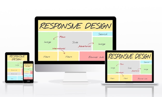
One of the most critical web design trends for 2022 is responsive design. Your website should work on all devices, from mobile phones to desktop computers. It is important because more and more people are using their phones to browse the internet.
Summary
The web is constantly evolving, which means web design trends are always changing. If you want your website to stay ahead of the curve, it’s essential to keep up with the latest trends. These are a few of the many trends in 2022. Keep an eye out for these and others as you evolve your website design. By staying up to date with the latest trends, you can ensure that your site is always on the cutting edge. Thanks for reading!

