Today’s topic has everything to do with web design that is created for us, users. The User-Centered Design (UCD) is a design that is aimed at its users in terms of who, how and when will be using the product after it is ready.
Such design has become significant because of its urgent need for usability in the world where the number of Internet users grows practically each day. There are certain principles of UCD defined by international standards for interactive systems and how they should correspond to human usage.
In this article we will try to indicate what the main principles of UCD are and which themes are the best examples and how to achieve the best user experience.
First of all, each and every designer should understand the purpose of their work. This means that every project has to come with a definite goal as to who is it being made for, what are the users’ needs, what are they going to use it for and how to make sure that the user experience is more than satisfying.
After we understand the points from the paragraph above, we can think about such a huge thing as Visualization. Eyes give us the first impression that usually is hard to change, so we want to make our products pleasant for a human eye. It is easier to concentrate on content if it is being presented nicely, accurately and with certain logic. This leads us to Navigation, another important factor for a site user. In order to contribute more to visibility the design is supposed to be emphatic, meaning that the users should be able to compose a mental model of the pages that helps predicting the behavior of the product while using it. It is also called Intuitive design.
Next principle is all about Accessibility. Using your products should be simple, clear and fast. The information should be available for the users in an effortless way, which means that navigation elements (sections, tables of content, color schemes etc.) and searches are labeled correctly and correspond to the specific type that the template belongs to. We appreciate when multiple elements that the product consists of are performed in the same style. Typography, graphics, visual effects (parallax, hovers etc.) are supposed to be implemented carefully. If your products are for business/corporate sites, the elements should emphasize the modest business “mood” of the template. If it is for a creative studio, an artist or a stylist, then the design should be creative with interesting and unusual ideas.
Another great feature that is supposed to be present in every project of yours is Legibility. Any text that is included in your product has to be easy to read. This can be achieved by correctly chosen fonts, colors of the background and texts (for the right contrast and good readability) and short sentences with simple structure.
It is probably needless to say that every designer has to know the audience that is going to be using their products. As soon as you understand the potential users, your target basically, you see all the paths of creating a perfect item clearly.
This is a collection of successful projects by different designers that nailed the User-Centered Design. (These are just a couple of themes, because it is impossible to list all the awesome ones in one tiny blog post 😉 .)
*Before releasing items, it is recommended to test them for users’ convenience.
SmartSEO – SEO&Marketing Services WordPress Theme
SmartSEO is a professional WordPress theme for corporate websites and marketing agencies in particular. We have already mentioned this theme in our Best 2015 SEO & Marketing Agencies WordPress Themes collection, and it is present in this one because of its creative idea of implementing material design into a corporate Website template and making it absolutely user-centered. Combined are vivid colors, fun graphics and marketing data that needs to be seen by the site users in order to form a model of the pages and the company in general. All components are modern, highly functional and all are of the same style.
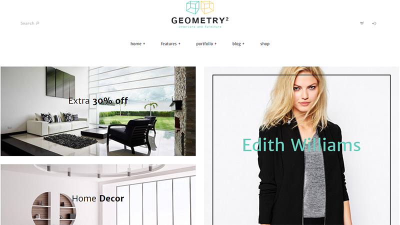
Geometry – Interior Design and Furniture Shop WordPress Theme
This is an example of super-trendy minimalist theme with excellent UCD. Not only it is nice to look at, Geometry is quite simple to navigate, browse the content (items and blog posts) and convenient to work with. The subtle creative approach leaves room for intuitive design, and this mix is a great idea for you e-store, showroom, fashion blog, business portfolio etc. Geometry includes many useful components, among which are Visual Composer, Revolution Slider, powerful Widget and Shortcode sets and Google Fonts.
Rosemary – Responsive Blog WordPress Theme
This is a Blog theme, and blogs as well as other social networks are being used frequently and require UCD the most. Rosemary is a lightweight, minimalist and elegant theme for personal blogs, fashion magazines or any creative purpose that your customers might request. The theme comes with multiple layouts for the homepage, different post types and interesting sections for Music and Travel stories. Rosemary is an excellent tool for building a successful website and attracting many new visitors.
Unicon – Design-Driven Multipurpose WordPress Theme
Unicon is a multipurpose theme with tons of nice and useful features. When creating a theme that should be able to fit several categories of sites, it is twice harder to achieve a good UCD. However, the authors of Unicon nailed the task and presented the theme that is perfect for any corporate, eCommerce, portfolio, creative agency websites etc. Included are the most necessary plugins, wifgets and shortcodes.
Vega – Photography Portfolio WordPress Theme
This is a more complicated example of a creative WordPress theme with a pretty good UCD. Meet Vega, a theme for creative artists, studios, portfolio websites and online stores. Complicated it seems to be because of an unusual layout that makes it a stand out among the usual themes that you might find online. Large images, grid style and various sliders are mixed in different combinations in these multiple demos that Vega comes with. The navigation is quite simple though, you won’t have to spend too much time looking for a piece of information or an image, or a post even.
Enfold – Responsive Multipurpose WordPress Theme
Enfold is a professional multipurpose theme that comes with multiple versatile demos for pretty much all types of websites. They all are beautifully different yet with the same functionality and awesome UCD. The design is simple, really, with intriguing effects (various hovers, lazy loads etc.) and modern techniques all just in the right places for the right topics. You can find harmony in every demo, many amazing elements that make the theme highly functional and devotion with which the designers have been working on this project.
Gridlocked – Minimalistic WordPress Portfolio Theme
Okay, this is definitely an extraordinary theme that will work for a portfolio, blog or creative magazine. Gridlocked is a nice minimalistic theme with interesting navigation and menu. It lets the users concentrate on the content, see the point of the website, the art, the information and simply enjoy reading/viewing. There is a built-in system for putting “likes”, which makes it a sort of a social network and adds a unique touch to the overall appearance.
Hoarder – Responsive Blog WordPress Theme
This theme proves (again) that creative design can still be user-centered and have a great impact on visitors. With Hoarder you will be able to create a wonderful blog, a gallery, a news portal for art, music, literature and fashion. There are several homepage layouts at your disposal where you can add videos, audio and images as separate posts. Integrated is ZillaSocial plugin and a handy contact form for the users to contact you.


