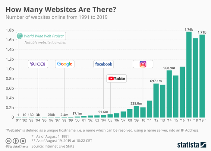
There are more than 1.94 billion active websites over the web. While each website owner wants his website to have the traffic of millions. To ensure user engagement, developers and designers focus on creating a splendid website experience.
Web design trends change frequently, and most of them come quietly and fade away without being noticed. Since mobile applications are getting popular, it has become very critical for websites to offer ultimate user experience to maintain their significance in the market.
It is a fact that a website can’t be replaced by a mobile app. However, it is essential that users must spend enough time over the website. While users’ sessions completely depend on the UX and content available over the site, offering unmatched UI experience can keep them hooked with the website.
In this article, we will look at some responsive web design trends in 2026 that are creating a frenzy among designers and users as well.
UX/UI Design Trends To Try In 2026 For Splendid Website

#1. Dark Mode
The dark mode is the most popular design trend today, as users are switching to dark mode. Whether it is about mobile applications or websites, dark mode is appealing and enticing for users. Thus, Website design development companies are embracing dark mode to improve user experience.
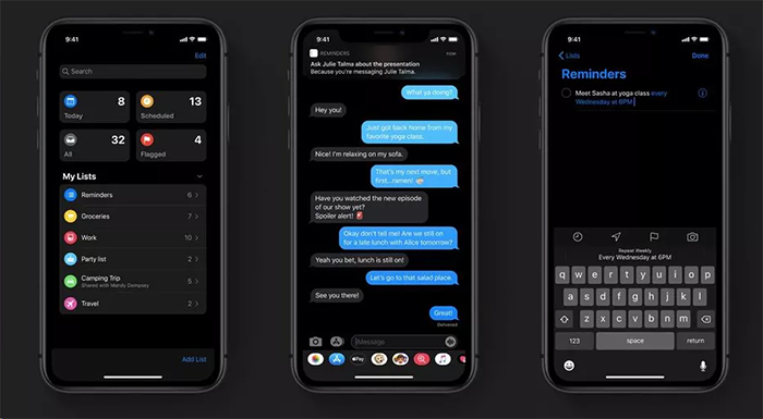
Anesthetic and somber look of dark mode please users, thus websites with dark mode can encourage users to spend more time. Actually, dark interfaces are complemented with bright elements. While the typography is also easy to read, which ensures readability.
The dark surface with sparse color content makes dark mode peculiar. While low levels of light offer high usability standards.
#2. Liquid Animation
Now animation has become an intrinsic part of websites and applications. Though liquid style animation is gaining much more significance than others. It is an animation with a movement that appears like-water.
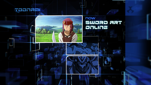
Liquid animation presentation works for entire scenes in a way that it looks like transitional video elements or a hover state to encourage clicks. While general animation only strives the users’ attention through design.
Speedy movement is the trick of liquid animation, it becomes smooth, fluid and timed perfectly, and offers a more realistic experience to users. This animation can be used in the form of background video and floating text on the screen with additional hover.
#3. Breaking Typography Rules
Another well-known web design trend is breaking typography that includes odd spacing, even line spacing or breaks, indifferent sizing. This typography is all about including art elements and less informational ones.
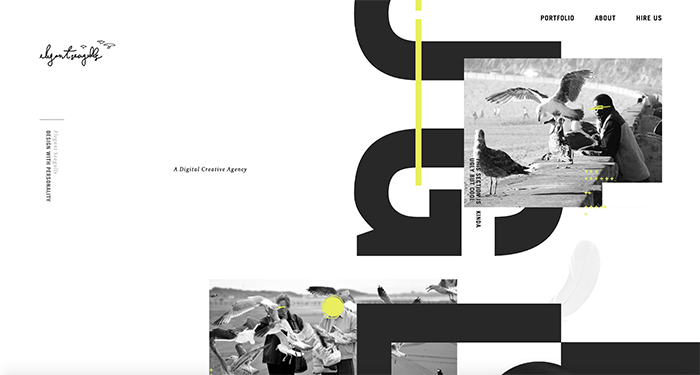
Designers break type rules in order to ensure readability in accord to the main headline that crosses into space of both foreground image and background. The most special thing about this design pattern is that it changes color with placement, which results in layer effect.
Round text elements between backgrounds are also significant as they connect the spaces. Turning and twisting typography to make an alluring web design.
#4. Mixing Illustration And Realism
Illustrations are quite popular these days that are replacing the usage of images in website development spaces. Furthermore, 2026 web design trends largely include tweener aesthetics that have incredible illos and photos.
Illustrations include funky and cool looks that include animation, shapes, and photos that move together when users scroll the page.
#5. 3D Effect
While 3D effects are quite popular among users, adding depth to the content makes it look more real. Thus, 3-dimensional imagery is being considered by a number of designers.
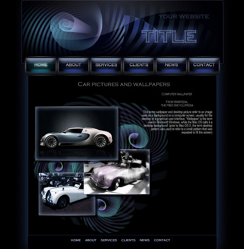
This trend is available in the web design space for a decade and will grow more in 2026. 3D designs offer users a real-like view of content that is quite unexpected.
Other Responsive Design Trends That Makes Web Design Mobile Friendly
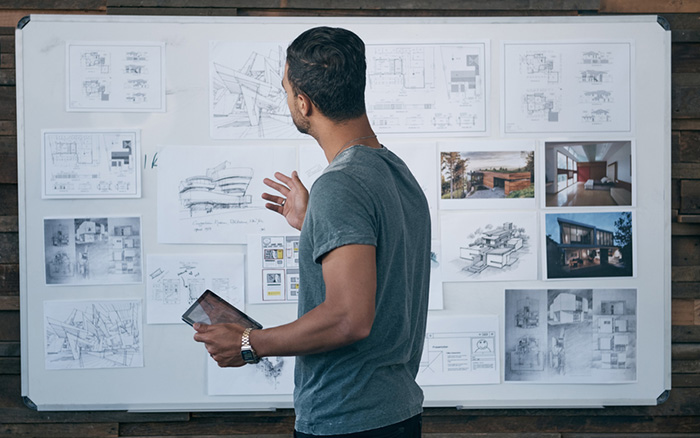
Decluttering Of Excess
Since mobile devices are a major medium of online searches, decluttering of excess elements is being considered the best practice in an attempt to make website mobile compatible.

Fusing important information over a smaller screen is quite challenging, though that is the art of UX/UI design.
Leveraging Spaces
Only reducing content from the screen isn’t the only trend, but leveraging spaces smartly also helps in accomplishing the end goal. Actually, decluttering isn’t a satisfactory solution always, you must utilize spaces in different ratios.
Changing the size and arranging them differently and using images can make the design more authentic for mobile. The mobile screen offers an opportunity to use vertical space to offer a splendid UI experience.
Best Responsive Web Design Strategies For Your Website
- Encouraging Leaner Desktop Experiences
- Enhancing Readability
- Leveraging Available Space
- Eliminating Excess Content
- Putting a Spotlight on Visual Content
- Collecting More Leads
Illustrations include funky and cool looks that include animation, shapes, and photos that move together when users scroll the page.
Conclusion
Succinctly, in the competitive landscape of the online market, it is critical to offer unforgettable interaction. Thus, following the best website design strategy is essential.
Moreover, if you are thinking about creating an unforgettable website experience for your customers, you must hire a developer and designer that can integrate modern tactics and technology for crafting unique experiences.

