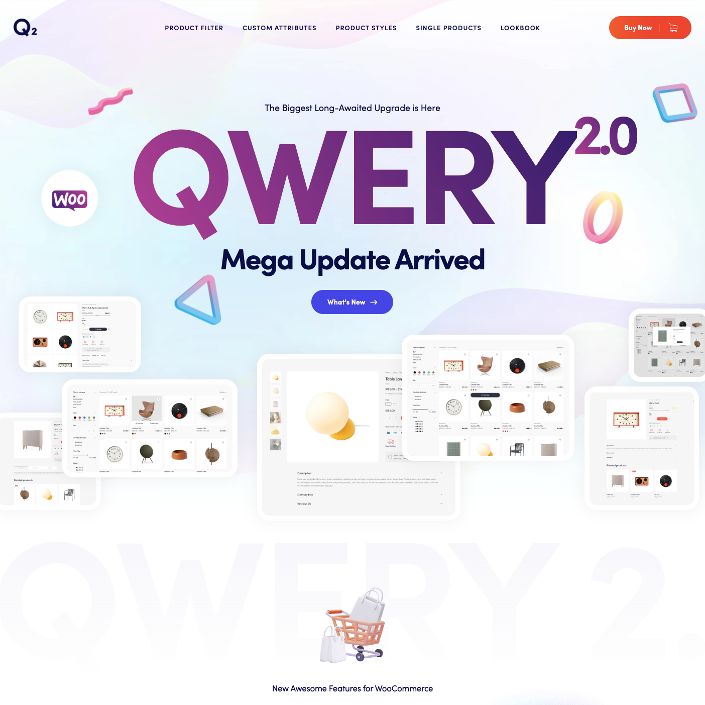
QWERY, one of the top selling multipurpose WordPress themes on ThemeForest, has got a massive update! Now you can take your WooCommerce store to a completely new level in terms of design, usability, functionality and of course, increased conversion and sales. Get rid of that generic WooCommerce look, now your store can have a similar design to those of some big brands. View the quick rundown of the features we’ve added to the new update, or read on for an in-depth overview.
AJAX Product Filter

That is a must have for any online store with more than a dozen products. Also, it’s probably one of the most overlooked features in a WooCommerce shop. Although there is a way to sort products in WooCommerce out of the box, it is oftentimes clunky and limiting. What we’ve implemented here is an entirely new Product Filter widget. It enables you to sort products based on any attribute you want, including custom ones, which we’ll talk about a bit later. The filter is AJAX-based, which means no need to reload the page to see filtered results.
The filter is an ideal solution for large product catalogs. You can fine tune it the way you like. There’s plenty of options to adjust various aspects of its behavior. You can choose which product attributes to show and in which order. Whether the attributes should be expanded by default, or collapsed. There are some extra details such as whether to show or hide the product count and names of selected attributes. You can even switch the way you apply the filter by turning on the Apply button, or you can turn the AJAX mechanism off completely, if needed. Lots and lots of possibilities here
Custom Product Attributes

Product attributes are here to help you differentiate between important product characteristics, such as color, size, weight etc. By default, there is only one type of attribute in WooCommerce, a one-fits-all type, represented as a dropdown. Although useful, it can be improved drastically, which we did.
Now you can use new attribute types, such as color, expressed as colored circles and size, which is useful for any text input, be it an actual size or weight, etc. You can also use an image type, with which you can upload small images that represent a particular product attribute. Let’s say you want to let your customers choose a type of collar for your shirts. One way would be for them to pick from a dropdown with potentially confusing names such as ‘spread’, ‘cutaway’, etc., but by providing them with a picture, the task becomes much less daunting.
As a bonus, you can also assign a particular attribute to act as a brand. With this option enabled, the ‘branded’ attribute appears on the product page in a specific spot, visible to all customers.
New Shop Page Styles

Of course, we also didn’t forget to give some love to the shop page. The main goal here was to improve usability of the product card layout, so that each button and action made sense at the first glance. There’s no ambiguity in buttons anymore, each button has a clear call to action and supporting visual cue, so that by taking a quick glance, you know exactly what to expect.
Also, we’ve integrated Quick View, a frequently requested feature by our customers. It helps you to take a quick glance at a product without actually opening a product page, which can be a nifty time saver.
New Single Product Styles

There are a lot of advancements on this front as well. First off, the product gallery can now be displayed in 4 distinctive styles. Depending on the number of product pictures you’ve got and their quality, you can choose an appropriate style for you.
Also, 2 content areas have been added to the product summary area. They can be especially handy for any extra information you want to put out for your products. This can be alternative payment methods, delivery information, money back guarantee, product certificates, a size guide link, and much more.
Additionally, you can ditch the default WooCommerce tabs now and replace them with an accordion. If you’re not a fan of hiding content under tabs or accordion, there’s also an option to display contents of each tab in a sequence of blocks. The place where you put the product details also varies. It can be the default position, or you can place them under the gallery or the product summary area.
Product Lookbook

Lookbooks are pretty much ordinary product galleries, but what makes them so special is the hotposts. By placing small animated dots in specific areas of your photo, exactly where the products are located, you point your customers directly to the corresponding product pages. This is an extremely effective tool. If a customer sees a product they like, they can instantly go to the product page, instead of trying to find it in your catalog.
Wrapping Up
Besides the major WooCommerce features, there are a few more things worth mentioning. The fixed header, a handy way of keeping website navigation visible while scrolling, is available by enabling the ‘sticky row’ option. You may also want to check out an extensive library of elements available for every demo. The collection of QWERY demos is getting bigger and bigger every week. Make sure to check out our latest demos as well.

