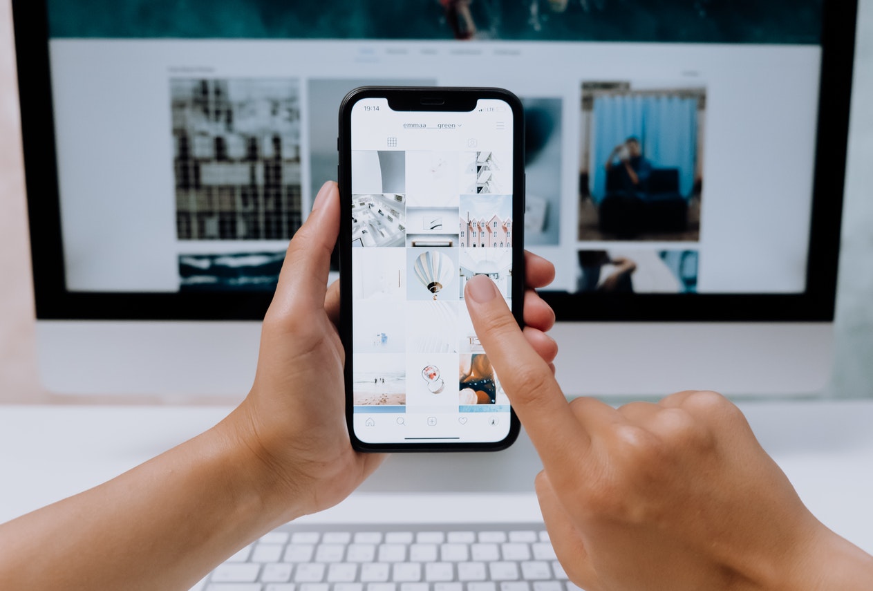
There are so many different devices that people can use to access the internet, from desktop and laptop computers to phones, tablets, TVs, and games consoles. All of these devices have different screen sizes and might be operated in different ways too, including touch screens, keyboards, mice, and controllers.
Websites need to be able to change to fit these different screen sizes and methods of interaction so that they work for everyone.
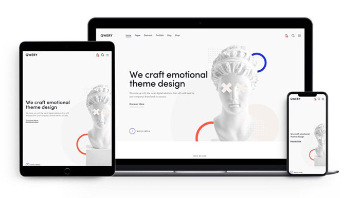
This is where responsive design comes in, ensuring that everyone gets the same great experience from a website. Responsive design is essential for any modern website to succeed, so it’s essential to invest in it.
What Is Responsive Design?
Responsive design is a way of designing a site so that it scales and adapts to different screen sizes. The content and various elements on the page change depending on the size of the screen so that it’s never too crowded and the site can easily be navigated and controlled. It removes the need to zoom in and out, scroll excessively or move the page around too much to achieve desired actions. When the design of a website isn’t responsive, it makes it a lot more difficult to use on smaller screens, in particular. According to the best website design and development companies, this can cause potential customers to be lost, as they leave your site out of frustration.
With a responsive website, there’s no need for a separate mobile site. This used to be the norm when people were first starting to go online using mobile devices. But a responsive website is now the best way to serve your website users when they’re using mobile devices like smartphones. It’s better for users and it also means that you save time because you only need to design one website, instead of multiple sites.
Why Is Responsive Design Important?
Apart from the benefits of a responsive website mentioned above, it’s important to keep in mind that over 50% of website traffic worldwide now comes from mobile devices. Many people own multiple devices and could use a phone, desktop computer, tablet, and other devices on the same day. The use of mobile devices will only increase as they become more accessible around the world, so there’s no getting around the need for a responsive website.
Another factor to take into account is SEO. Mobile responsiveness is now an important factor for search engine ranking. If your website isn’t responsive, you could find that it doesn’t perform as well in search engine results as your competitors. This makes it even more important to have a responsive site if you want your site to be useful for your customers.
You save money by having a single responsive site instead of multiple sites for desktop and mobile traffic. Plus, your site will be easier to manage when you have just one website. Responsive design makes it easier to make your own changes to the site too, even if you’re not a professional designer.
What Makes a Good Responsive Website?
So what makes a good responsive website? If you want to create a professional web design that has an excellent user experience, there are some best practices that you can follow to ensure you create a great responsive website.
One of the best practices is to put mobile first when designing a responsive website. This means creating the mobile site first, before working up to the desktop version. Doing this makes it easier to create a site that scales up or down when necessary. It also makes sense because using a website on a mobile device creates more usability concerns due to smaller screens. Putting mobile design first also requires you to think carefully about what’s really necessary for your website’s design. You need to think about what elements are really needed for functionality and aesthetics too.
As you start to build for larger screen sizes, there’s no need to be as minimalist with design. You can start to think about other elements that help you to fulfill secondary objectives. For example, while your mobile version of the site might focus more on selling your products, when it scales up for larger screens, it could also introduce a CTA for signing up to your newsletter.

In addition to making sure that a website is responsive to different screen sizes, it also needs to work with different browsers. This is another concern to take into account, especially with around five or six major browsers used by significant portions of the population.
When designing for mobile devices, you should also consider the way that people use touch screens. People interact with websites on desktop computers via clicks of their mouse, or sometimes through keyboard navigation, while those using smartphones or tablets are using their thumbs or fingers to tap and swipe. Mobile device users also typically hold their devices in their hands.
These factors change the way tap targets and other elements are designed for mobile sites. When people are using their thumbs to tap the screen, important elements need to be within easy reach. This has become even more important as smartphone screens have increased in size.
Invest in Responsive Design for Your Website
Investing in responsive design delivers a range of benefits for your website. When you use responsive design to create your site, you ensure it’s suitable for more people. Without responsive design and with no way to adapt your site to smaller screens, you risk alienating more than 50% of your audience. Investing in responsive design saves you both time and money by cutting out the need for separate mobile websites. It improves SEO for your site, makes it more functional, and makes it easier to maintain your website too.
It’s worth investing in responsive design to ensure any website that you create is prepared for current design standards and customer expectations, as well as to future-proof your sites. The use of mobile devices will continue to grow, so it’s important not to miss out on the traffic that you can get from it.