Looking for some ways to add mobile header? There are 2 ways to add a header for mobile devices on your site:
- via header Layouts
- in the Customizer
Creating a Header for Mobile Devices in Layouts
Layouts is a preferred way of creating a header since it gives you flexibility and control over your elements. It is similar to creating a standard header, except there are several features you should know about in order to use Layouts more efficiently.
Feel free to check our video tutorial for more information on customizing layouts.
Layouts Menu Shortcode
The Layouts: Menu shortcode includes an option to enable the mobile menu. Use it to transform your regular menu into a mobile menu on smaller resolutions automatically.
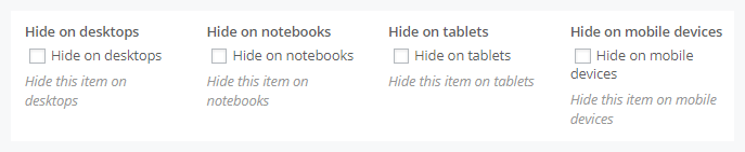
Hide Layout shortcodes on specific devices
In the settings of each Layout shortcode, you can find an option to hide it on a specific resolution.

You can also show/hide an entire row on a specific resolution. In the Row settings, go to the Custom Layouts tab.
Here’s the full list of available resolutions:
- Desktop – larger than 1680px
- Notebook – from 1168px to 1679px
- Tablet – from 768px to 1167px
- Mobile – lesser than 767px
In this way, you can create independent mobile layout by disabling certain rows on desktop and notebook devices and enabling them on mobiles and tablets.
Adding a Mobile Header in the Customizer
Instead of Layouts, you can use the default header for mobile devices in the Customizer. Enable it in the Mobile Header section in Appearance > Customize > Header.
Please note! This option is visible only if you choose default header style in Appearance > Customize > Header.
This type lets you show/hide such elements as a logo, search form, login link, and shopping cart. You can also use the Additional Info section, a text block where you can add information about your business, such as telephone number, open hours, etc.